Vertical Container
Components in a column

As with all Container components, it is straightforward to configure a Vertical - pretty much you just select components to include within it.
Components appear vertically, one after the other, including a title bar for each
Example of components stacked vertically
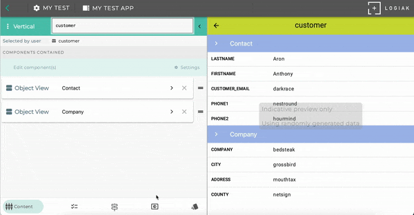
Here is an example (see the right part of the Component Editor screen) where we configured a Vertical component to contain two Object Views
Select between different display modes

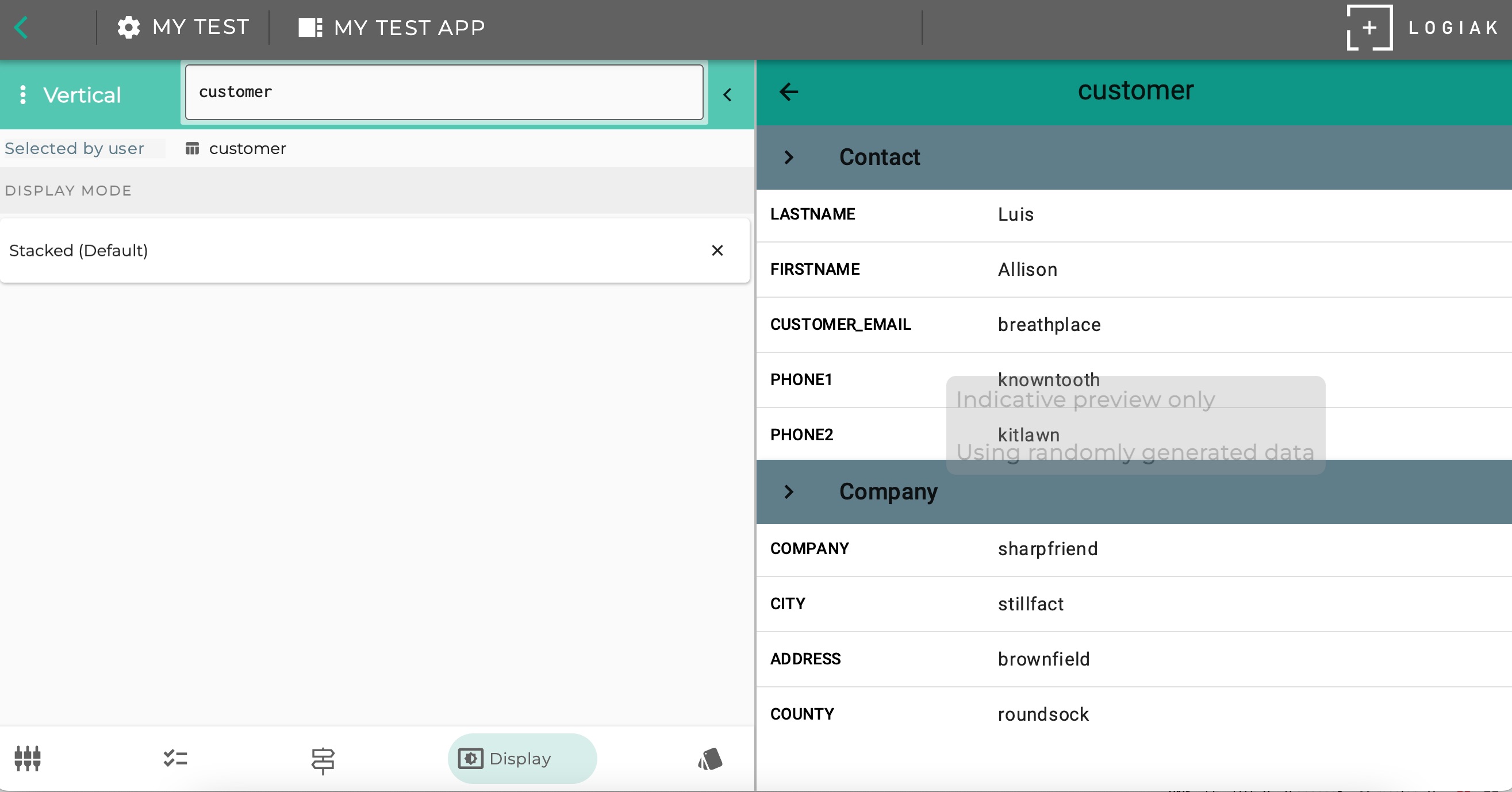
Display Mode: Stacked Vertically
The example above in fact uses one of the three Display Modes available.
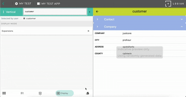
Display Mode: Expansions
Display Mode: Vertical Paging
Feedback
Was this page helpful?
Glad to hear it! Please tell us how we can improve.
Sorry to hear that. Please tell us how we can improve.