Component Editor
Component Editor
Component Editor
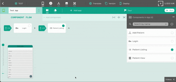
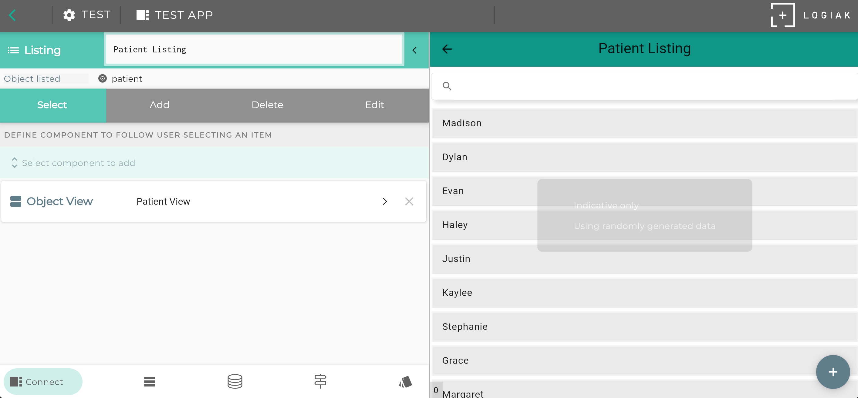
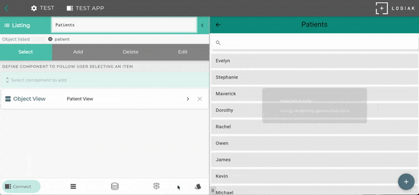
Clicking on the box in the Component Flow representing the component opens an Editor for that component
A component editor has two panes: an edit pane on the left and a preview pane on the right.
Edit Pane
The Edit Pane gives you access to edit functions, appearing in a bottom tabbar
Preview Pane
The Preview Pane show an indicative Component Preview only (not functional!)
Tabs in the Component Editor
| Tab | |
|---|---|
 |
Other components |
 |
Select how the component is rendered |
 |
Action buttons, nav drawer, bottom sheet |
 |
Colors and fonts |
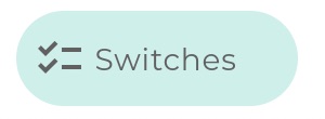 |
Container components - control when contained components are visible etc |
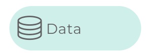 |
Defining the basis data and filters etc |
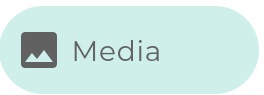 |
For GALLERY only - which media are included |
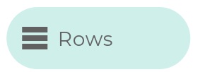 |
For LISTING only - control what rows look like |
 |
For examples fields in OBJECT VIEW |
 |
For INFO |
Navigation is possible within the component editor
Here we navigate from a LISTING to an OBJECT VIEW and back again
Feedback
Was this page helpful?
Glad to hear it! Please tell us how we can improve.
Sorry to hear that. Please tell us how we can improve.