Project UI
Tour of the Project UI
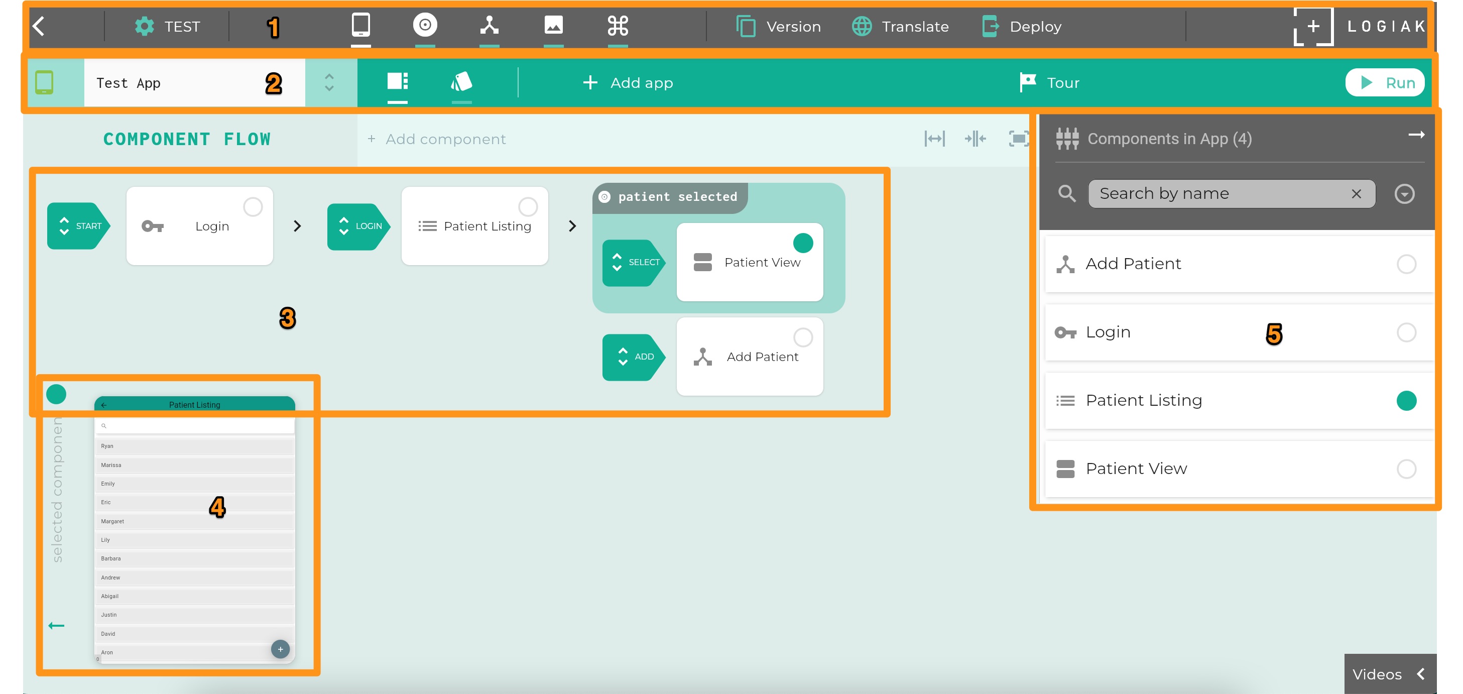
Elements of the Project UI identified by numbers in this image, are
- Project Controls Bar
- App Controls Bar
- Component Flow of selected App
- Component Preview of currently selected Component (identified by the green dot)
- Components Column: Alphabetical list of all components in the currently selected App
1. Project Controls Bar
The top bar gives you access to Project-level controls.
We split these controls into two categories:
Development controls
In the top bar you can see these buttons. They give you access to functions you need during a development cycle.

The buttons give you access to, respectively,
Post Development cycle controls
The three buttons, also in the top bar, give you access to functions you likely want to use after completion of a development cycle.
 The buttons give you access to, respectively,
2. App Controls Bar
Below the Project Controls Bar, there is the App Controls Bar This includes the ability to select which App you are working on, and then most of the other controls relate to that currently-selected-App.

Identified by letters in the App Bar are:
A. Drop-down menu of Apps in the Project - this is the control to switch between Apps
B. Top-level toggles for switching between access to: Component Flow and App Theme
C. Button to add a new App to the Project
D. Button to run the App Preview. Unlike the Component Preview, the App Preview is a pretty complete, database-backed environment in which to try out the App you have built, using largely the same code which will run when deployed.
3. Component Flow
4. Component Preview
5. Components Column
Feedback
Was this page helpful?
Glad to hear it! Please tell us how we can improve.
Sorry to hear that. Please tell us how we can improve.