Components can be added attached to Navigation UI
A Component can be in the Flow either as…
- The destination of a - transition.
- or as contained by another component which is within the Flow.
- or as a navigation element on any component within the Flow
Defining Navigation is a lot like defining the use of a Container component, but Navigation is available for almost all components.
It is very simple..
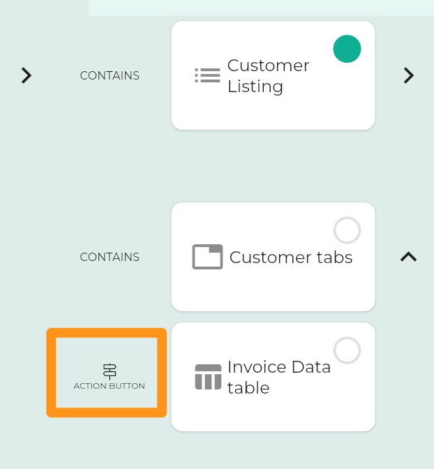
There are three Navigation UI possibilities to which you can attach one or more Components
- Action Button
- Navigation Drawer
- Bottom Sheet
So the components are sort-of contained by the parent Component, but in a particular way, and instead of the CONTAINS representation in the Component Flow, navigation components are indicated with a signpost
Creating an Action Button
Setting icon
The plus icon is ok when the Action Button has a Process behind it which adds something to a list, but often for navigation, it is not appropriate.
You can associate an icon with a Component and if you do, that icon will be used in Navigation elements instead of the default.
Creating a Speed Dial
Creating a Navigation Drawer
Creating a Bottom Sheet
| Navigation Element | ||||
|---|---|---|---|---|
| ACTION BUTTON | Speed Dial control is used if multiple components are specified | |||
| NAVIGATION DRAWER | ||||
| BOTTOM SHEET |
Feedback
Was this page helpful?
Glad to hear it! Please tell us how we can improve.
Sorry to hear that. Please tell us how we can improve.