Cards
Cards is like a mix between Gallery and Listing - visual displaying like a Gallery, but functioning like a Listing in the sense that every image represents a record which can be selected by the user.
Comparison with Listing
A Cards component presents a set of instances of a given Object type.
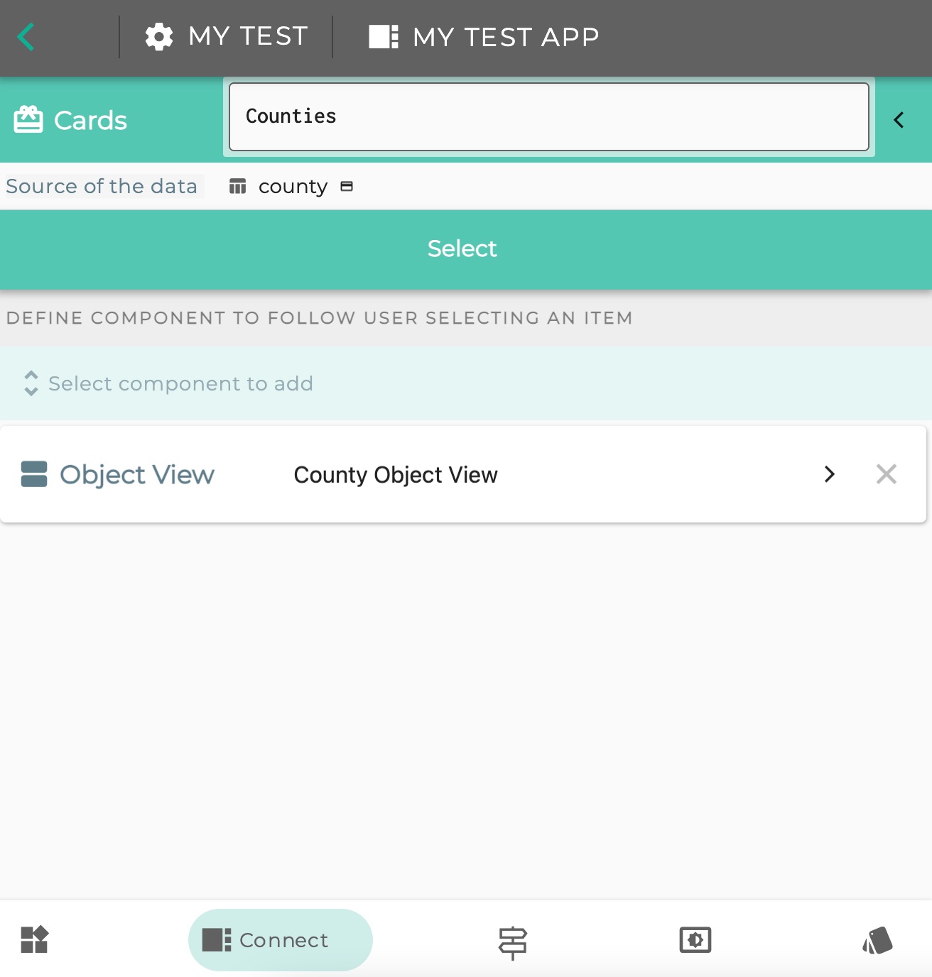
It has a SELECT transition, meaning the Cards are selectable, and the instance behind the card is remembered by Logiak - it creates a downstream area.
So you can set which component(s) should appear when a user clicks on an image.
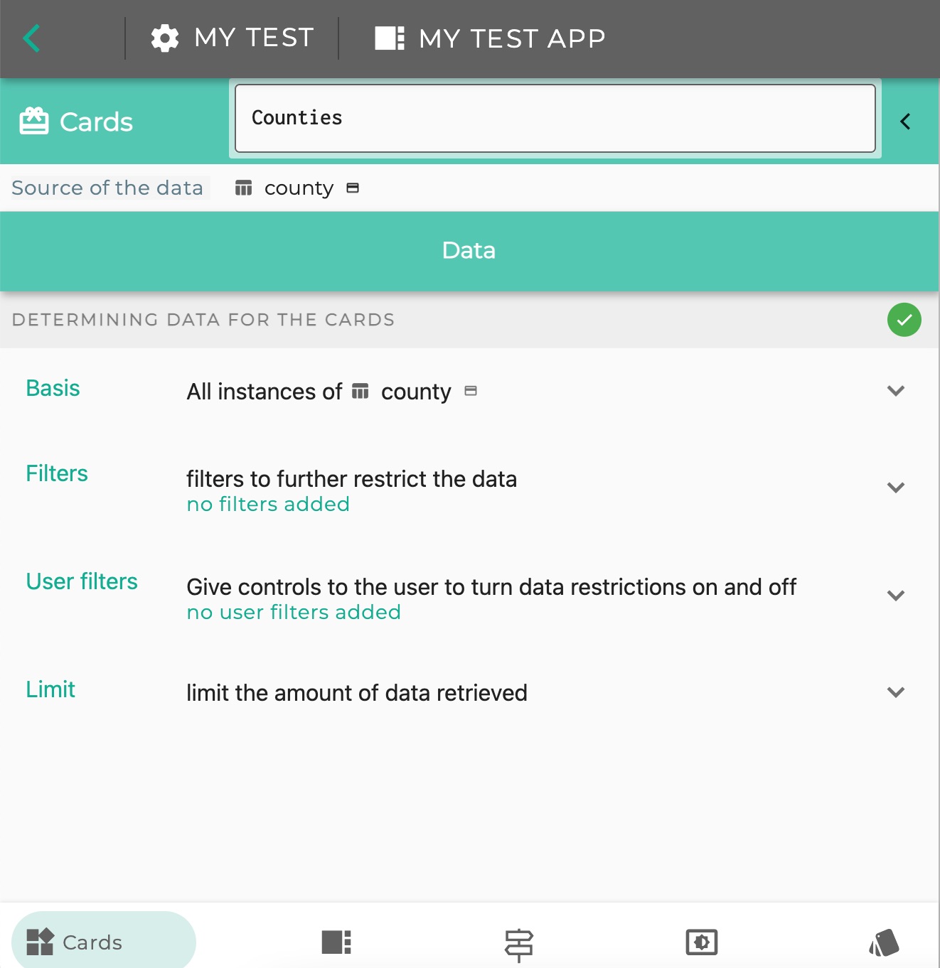
As with a Listing you can set implicit filters and also user-controlled filters, to determine which instances - which Cards - are displayed


Card Badge required
One difference between Cards and Listing:
- you can configure a Listing for any Object (any Data or Table object),
- but to use a Cards component, the Object types must have the Card badge
This is because the Cards component offers Card display modes, which requires certain kinds of information:
- title
- subtitle
- caption
- image
Example: English Counties
Let us look at an example.
Here is a small spreadsheet with some information about English Counties, including an image field.

Step 1: Set up a Table Object
We can create a Table Object in Logiak and attach the spreadsheet to it.
Note the image field has datatype “Media URL”
Step 2: Create Cards Component
Cards components require an Object, but the Object must have the Card badge
In this video, we :
- give the county Object the Card badge and
- create a cards component which shows the images.
Step 3: Choose different Card style
Step 4: Populate the downstream with some component(s) so that the Cards are clickable
Feedback
Was this page helpful?
Glad to hear it! Please tell us how we can improve.
Sorry to hear that. Please tell us how we can improve.