Tabbed Dialogue
Tabbed dialogues in Logiak contain a component on each tab
As with all Container components, it is straightforward to configure Tabs.
Once created, you just select components to include within it.
Each component is presented in its own Tab.
This means that it makes little sense to have a Tabs component containing just one Component, and also that there is an upper limit to the number of components which can be contained.
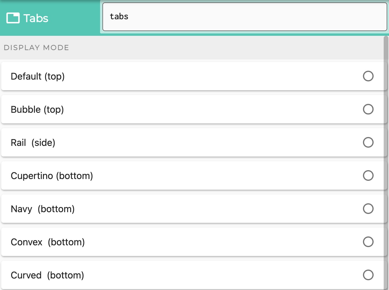
Select which kinds of Tabs
- do you want the tabs to appear at the top (relative to the contained components)
- do you want to have a sidebar?
- do you want to have a bottom tab bar?
Tabs at the top
You can choose between
- default
- bubble tabs - which sort of blow up a bit as you select them
Tabs at the side
- Also called a Navigation Rail
Tabs at the bottom
Choose between various styles of bottom tab bar
- Navy - using the same bottom bar component as is used in the Component Edit
- Cupertino - iOS style
- Convex, with sub-styles:
- Fixed
- FixedCircle
- react
- reactCircle
- textIn
- titled
- flip
- custom
- Curved
Feedback
Was this page helpful?
Glad to hear it! Please tell us how we can improve.
Sorry to hear that. Please tell us how we can improve.