This is the multi-page printable view of this section. Click here to print.
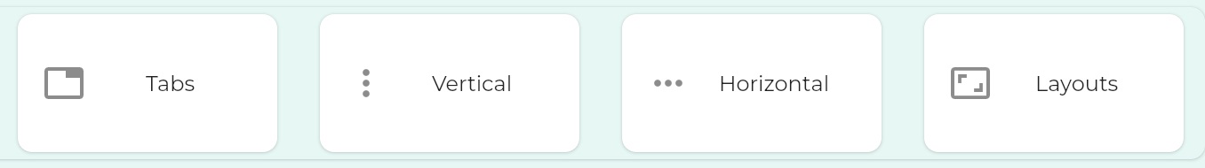
Container Components
Container components present collections of other components
- 1: Tabbed Dialogue
- 2: Vertical Container
- 3: Horizontal Container
- 4: Layouts
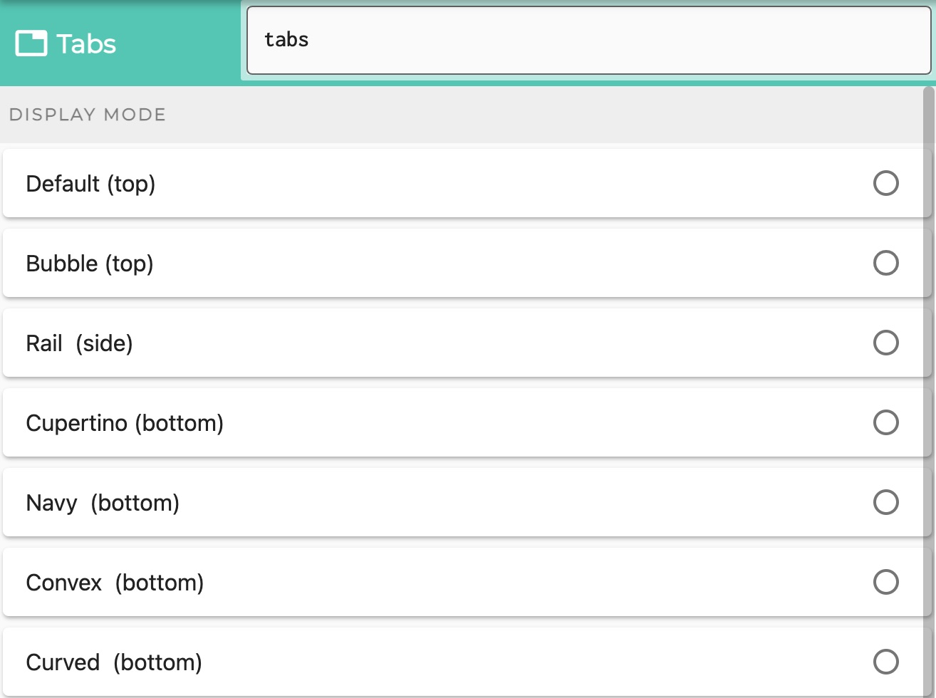
1 - Tabbed Dialogue
Tabbed dialogues in Logiak contain a component on each tab
As with all Container components, it is straightforward to configure Tabs.
Once created, you just select components to include within it.
Each component is presented in its own Tab.
This means that it makes little sense to have a Tabs component containing just one Component, and also that there is an upper limit to the number of components which can be contained.
Select which kinds of Tabs
- do you want the tabs to appear at the top (relative to the contained components)
- do you want to have a sidebar?
- do you want to have a bottom tab bar?
Tabs at the top
You can choose between
- default
- bubble tabs - which sort of blow up a bit as you select them
Tabs at the side
- Also called a Navigation Rail
Tabs at the bottom
Choose between various styles of bottom tab bar
- Navy - using the same bottom bar component as is used in the Component Edit
- Cupertino - iOS style
- Convex, with sub-styles:
- Fixed
- FixedCircle
- react
- reactCircle
- textIn
- titled
- flip
- custom
- Curved
2 - Vertical Container
Components in a column
As with all Container components, it is straightforward to configure a Vertical - pretty much you just select components to include within it.
Components appear vertically, one after the other, including a title bar for each
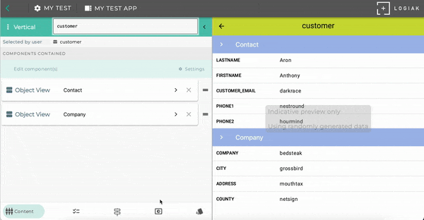
Example of components stacked vertically
Here is an example (see the right part of the Component Editor screen) where we configured a Vertical component to contain two Object Views
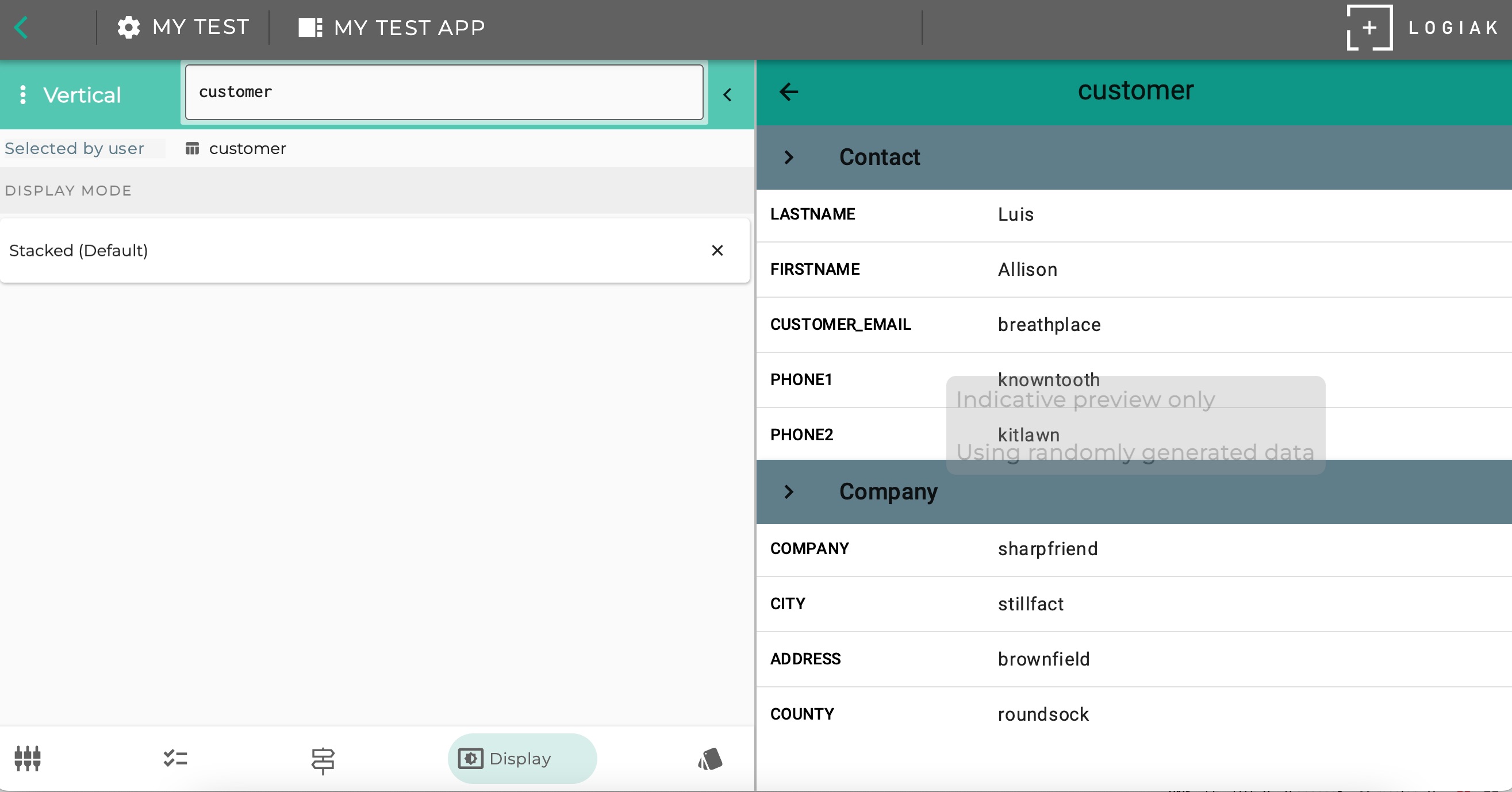
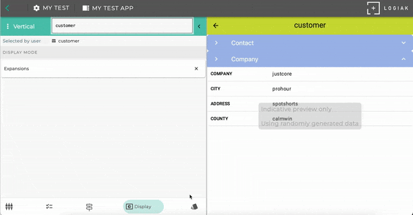
Select between different display modes
Display Mode: Stacked Vertically
The example above in fact uses one of the three Display Modes available.
Display Mode: Expansions
Display Mode: Vertical Paging
3 - Horizontal Container
Components horizontally
As with all Container components, it is straightforward to configure a Horizontal.
Once created, you just select components to include within it.
Components appear horizontally, one after the other.
Select between different displays
Display Mode: Horizontal
The example above in fact uses one of the three Display Modes available.
Display Mode: Carousel
4 - Layouts
If you need a custom arrangement of some components, define a custom layout
Custom container
Once created, you select components to include within a customer container.
Rather than being “hard-wired” with regard to how the components within the container will be presented, with a Custom container, you configure custom layouts, where each element in the layout is a component.