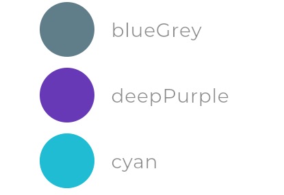
App Theme
Theme Inheritance
At the App level, it is possible to define default colors and fonts for your App.
These defaults are inherited by components, but can be overridden by any individual component, and those overrides can apply solely to that one component, or the modified theme can be what is inherited by subsequent components.
Colors
Theme colors are set in two parts:
- selection of a primary swatch (swatch is a set of three colors:
- a main color
- a light version of it
- and a dark version of it)
- selection of a secondary color (also sometimes called accent color)
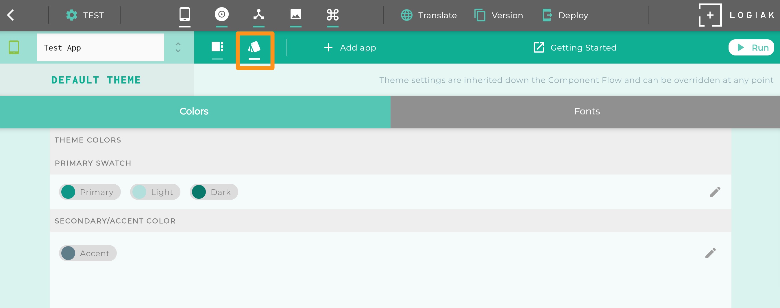
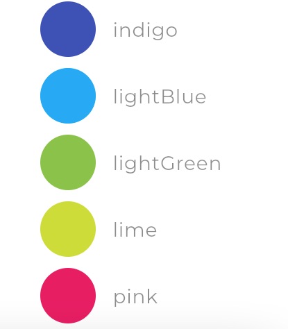
Available Primary Swatch colors
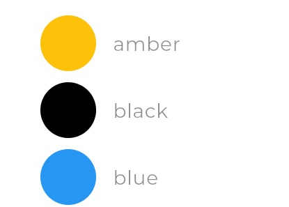
|
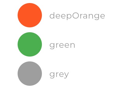
|
|
|
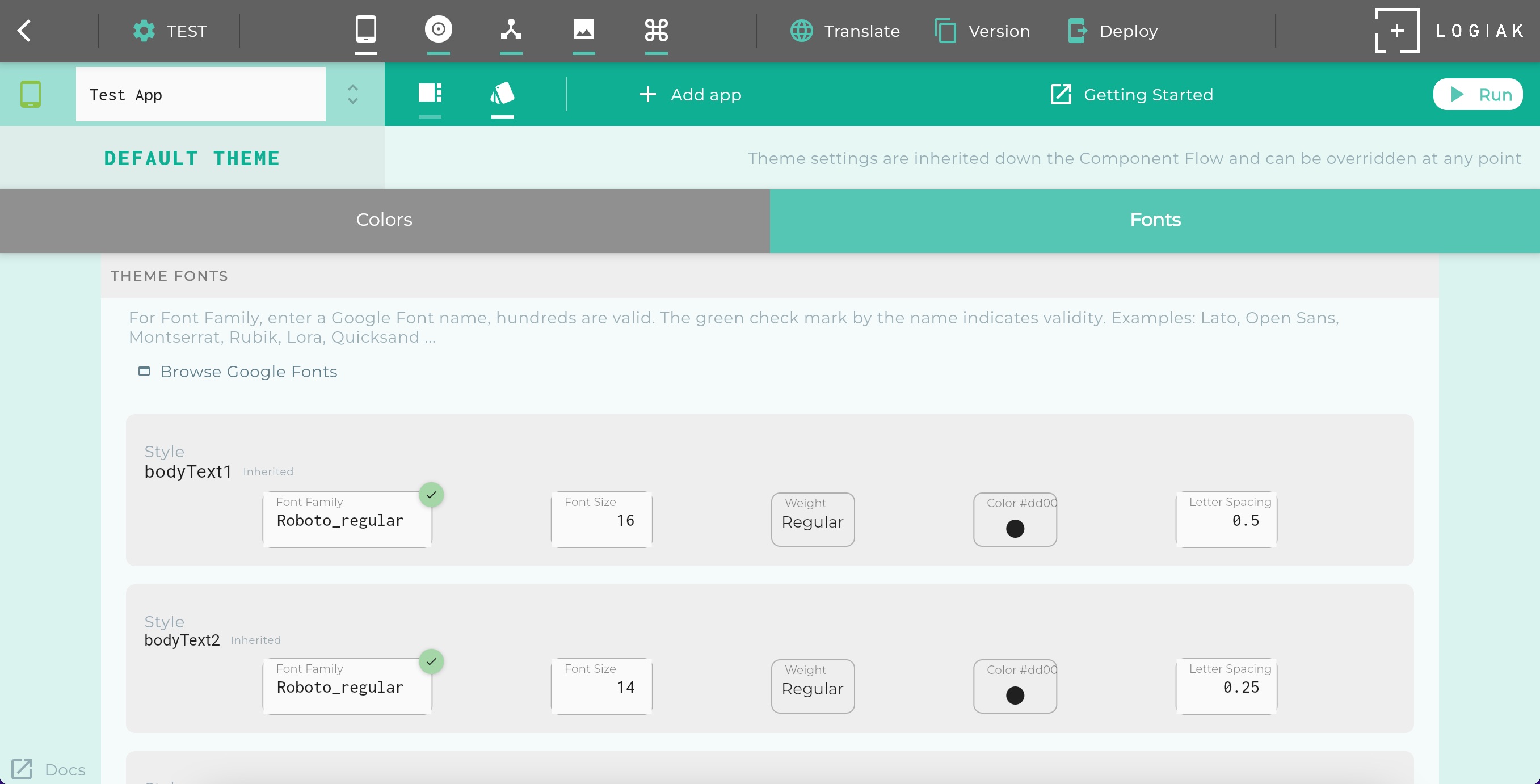
Fonts
Under Fonts it is possible to alter parameters for a number of named styles.
- bodyText1
- bodyText2
- headline5
- headline6
- caption
- button
- subtitle1
- subtitle2
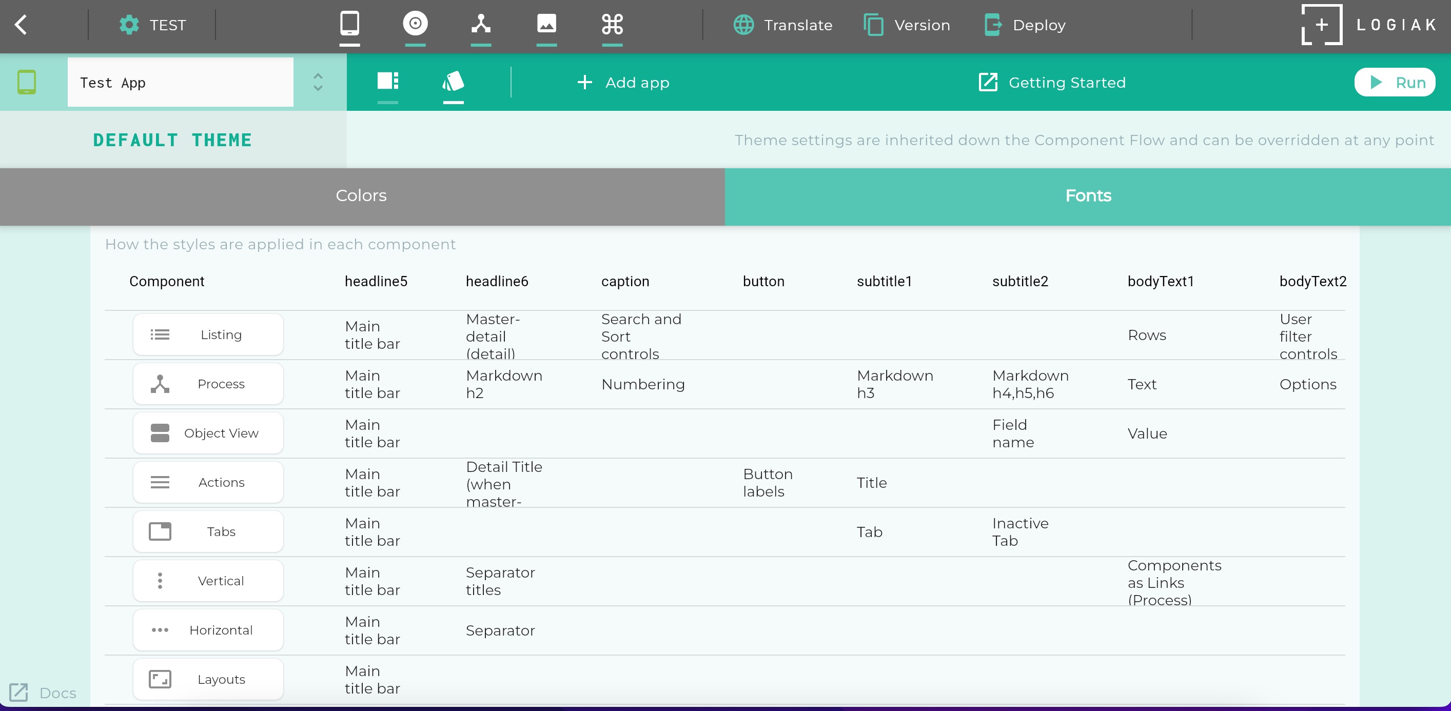
Uses of Fonts within Components
We have applied these styles with consistency, although across the very different components, so the property settings for each style apply to the whole App by default, though it is always possible to override these settings for any individual component.
The way in which these styles are applied in each component type is detailed in a table within the UI:
Font names and Google Fonts
To the question: which fonts are available to select from? there are two answers:
- any fonts available on the device
- many google fonts
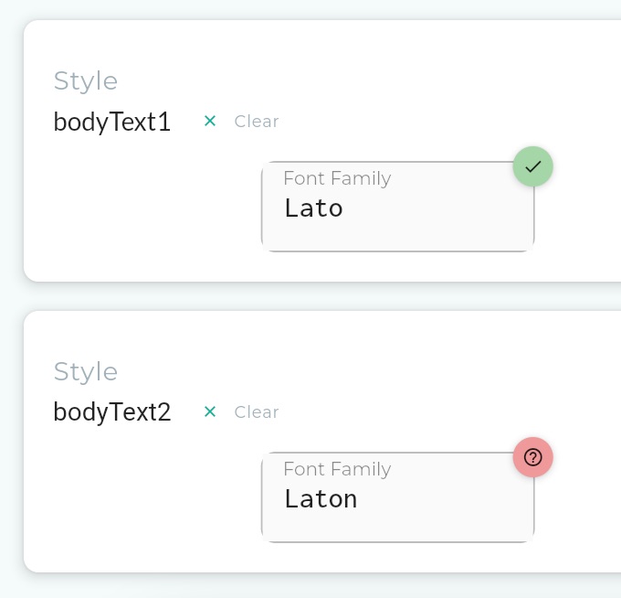
Since we do not prescribe a device, but indeed encourage running Logiak Apps on many devices, making references to Google Fonts is probably the safest bet when choosing Fonts.
There are thousands of Google Fonts available and they are changing all the time. Not every Google Font is guaranteed to work, but we do a check, and if the name you entered is one of the Google Fonts supported by Logiak, there will be a green checkmark against it, other a red warning
Feedback
Was this page helpful?
Glad to hear it! Please tell us how we can improve.
Sorry to hear that. Please tell us how we can improve.