This documentation is actively under construction.
Apologies if you encounter gaps.
We aim for Logiak to be as simple as possible to use,
and, after having used Logiak a bit, we would hope you don’t need to refer to this documentation much.
So we encourage usage and experiment with this as a backup when things don’t seem clear.
Many things are illustrated here with animated gifs or slightly longer videos, showing how to achieve things.
Please don’t hesistate to use the feedback buttons you will find on each page, and help us to improve the clarity and simplicity.
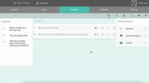
1 - Overview of Logiak
Overview
1.1 - Logiak Overview
What is Logiak?
Logiak
Logiak is a lightweight 100% No Code system with which you can rapidly and robustly
build cross-platform Apps without programming.
Logiak allows you to
build collaborative, multi-app systems, as well as single, standalone Apps
make use of fine-grained logic, of the kind normally associated with programming
work collaboratively with colleagues on developing projects
a web application. This is where you login to create and manage project configurations, available as SaaS or on-prem,
Runner Apps for iOS and Android. With these Apps your configurations are transformed into running Apps.
Logiak-created Apps are available for web, iOS and Android (with Supabase ) and iOS and Android (with Firebase )
Benefits (in short)
Quick!
Fun!
Powerful!
Robust!
Key feature: Systems, not just Apps
When we say that Logiak allows you to build systems and not just Apps, we are referring to the fact
that Logiak supports projects which involve various types of users collaborating
together.
These users need to share a common database, but have different access to it,
and different functionality.
Key feature: Declarative Logic
One of the main reasons why experts, for example those with specialist medical or legal knowledge,
have been so able to create systems with Logiak is because at the heart of the system is the ability
to express knowledge declaratively.
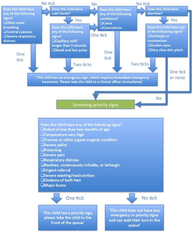
What is Logiak good for?
Logiak is good for when you have data, collect data, and want non-aggregate data to be
processed in particular ways.
Let us call that Data Management
One might also use the term Case Management: when you deal with certain
things or events and need to register/record them, and then process them individually
in certain specified ways.
And Logiak is particularly useful when you need to have close attention to
and reasonably complex processing of individual
cases.
The clearest example of this is when you set out to provide Decision Support
Benefits (longer)
Building an App with Logiak is rapid and is therefore highly cost-effective
Using pre-existing components means you are not dealing with the fragility of new code ( robustness)
Logiak automatically prevents you making some of the
mistakes common to programming. This also enhances robustness
Apps can be constructed by analytically-minded people without experience in programming, so this widens
the pool of people within your organization who can do this. If someone can use Excel effectively,
they are likely to find it possible to do the same with Logiak.
Sometimes there is knowledge/expertise which you want to build into an App
and the very best way is to have the expert(s) themselves do that.
Having an the expert communicate the knowledge to a programmer, brings communication and interpretation challenges
which create inefficiencies at best, but which can prove to be insurmountable at worst.
First thing to do is to build a functioning data managment App in three minutes !
1.2 - Logiak Approach
Logiak design philosophy
The aim of Logiak is to help people be
pragmatic
efficient
agile
Pragmatism and detail
Everything is a trade-off, and Logiak embodies one particular trade-off. Which is it?
Many No Code systems focus on presentation and lack logical power. They may look exciting initially,
but you can’t achieve the processing you need. You can link screens, but there is often
not much more to it than that.
Logiak is the counter to this. It offers components which are not low-level UI components but
high-level packets of functionality, from which Apps can be assembled in no time.
And, importantly, one of those Components is there to include Processes in the mix, and in
a Logiak Process one is able to do very fine grained processing and updating of data.
In a Process, you can achieve logial complexity in a scaleable and maintainable way. It has
been demonstrated that analytically minded non-programming experts can fashion their knowledge
into useful interactive applications by developing Logiak Processes.
We think that Logiak is appropriate for organization-internal Applications.
Logiak is for programmers and non-programmers alike. Programmers will be aware of what time this saves them.
Programmers will be aware not only of costs saved in building a system, but in maintaining one.
Logiak has two main user categories:
Those who want to create data handling Apps rapidly, robustly, flexibly
Those who want to create knowledge-based Apps, for example embodying
regulatory or diagnostic knowledge and who need non-programming experts to be involved in their construction.
Logiak is for you if you need logically expressive and presentationally pragmatic.
Logically expressive
What we mean by this is: with Logiak, in particular with Processes, you can do a lot
of the logical computation and numerical calculation you might want to do with code.
Logiak is expressive in that sense.
The Logic Just Flows
Process Logic is fine-grained, but there are logical possibilities not only in the Processes,
but also in the Components and in their Flow .
So you can configure field conditions for Lists and Data Tables.
You can use switches in Actions components to enable and disable options for the user.
You can display/hide elements with Custom Layouts, based again on Switches.
You can also use Switches to make the Component Flow itself adaptive to the state of the data.
Software is hard
Logiak is offered with keen awareness of just how difficult building software is.
While programming languages and techniques are involving and improving all the time, programming
remains, quite frankly, humbling.
No programming language which makes it easy. Some languages make it incrementally, marginally, easier.
At the same time, the demands for software are in a permanent exponential increase.
Logiak makes things easier
Logiak eases some of the complexity by removing coding from the equation.
Apps running on iPhone without having to deal with XCode, or Swift.
Apps running on Android without having to encounter Gradle, or JetPack, or Kotlin.
Logiak is a lightweight service with which you create Apps to deploy
to your backends.
That is: Logiak does not control your data, you do!
You set up the backend (with support from Logiak), and you have full control
over that backend. Logiak has zero control.
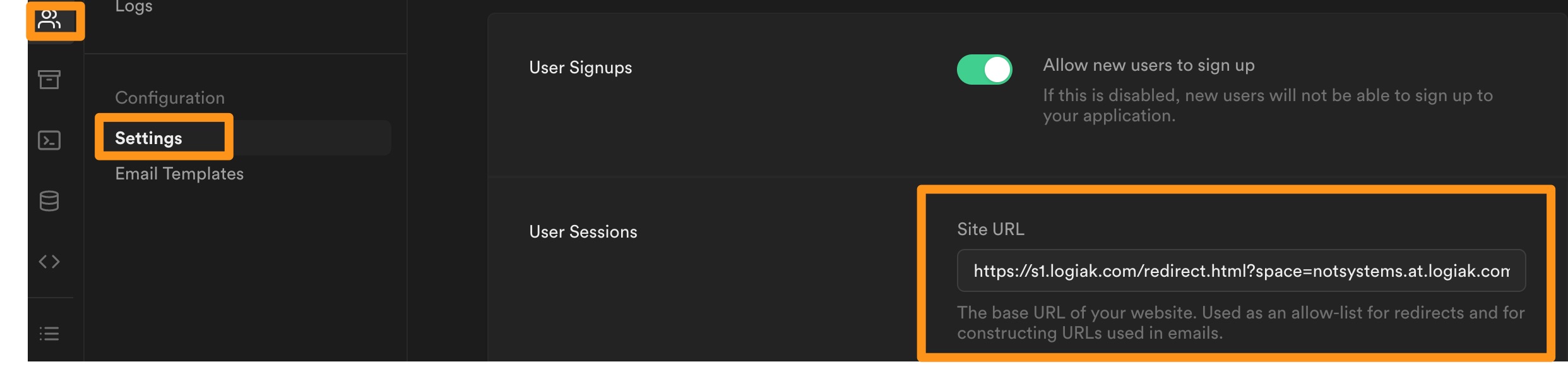
Backend Parameters
When you set up the backend, you enter some parameters from the backend into Logiak.
These parameters are required so that your Apps, and the Logiak server on your behalf,
can communicate with your backend, and but we affirm that
the parameters are used solely for the purposes of your project.
Logiak’s minimal constraints on data model
How about the data model, are there some proprietary aspects to that?
No!
Logiak is designed to be minimally intrusive in how your design your data.
Here are the extent of the constraints:
Each table has to have a primary key (this is hardly a constraint: it is good practice)
A table cannot have more than one foreign key to the same table
logiak_version system table
To support remote deployment of new versions, Logiak requires the addition of a single system table
called logiak_version to your database.
This table affects nothing else - has no relationship with any other table - and can simply be deleted without problem should you decide to stop using Logiak
No data lock-in!
We have done as much as possible to ensure there is no data lock-in with Logiak.
When you deploy Logiak, you are creating or using a totally normal database, designed by you, one that you can
continue to use with other technologies should you decide to stop using Logiak.
An advantage of this is that Logiak is a conceivable solution for someone who wants to build Apps to make
use of an existing database.
1.4 - Protecting References
References
Maintaining References
The challenge
A major source crashes in software is the unseen broken references.
For example, let us suppose I call a function foo somewhere in my code.
It can happen that I am working on the same code months later and delete that function,
forgetting all about the reference I had made to it.
Subsequently, my code crashes because of the call to foo.
In programming, this kind of bug often surfaces as a so-called Null pointer error
Automatic protection of references
Logiak automatically keeps track of all the references you establish as you are
building your App, and prevents any of those references getting broken.
So you may find that you go to delete something and you can’t. Why? It will be because Logiak
knows that you still have a reference to that something, and it will usually be able to tell you
where that reference is.
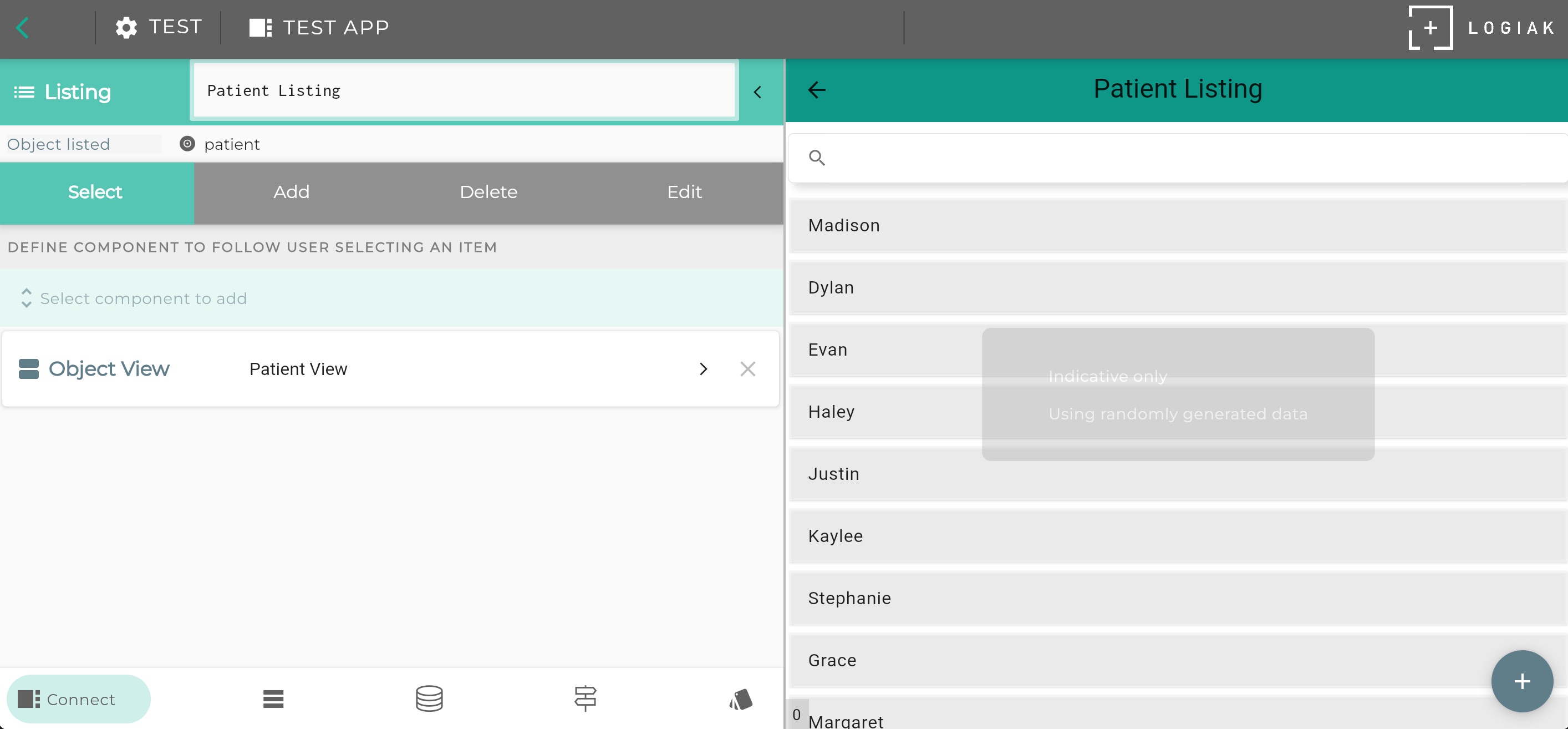
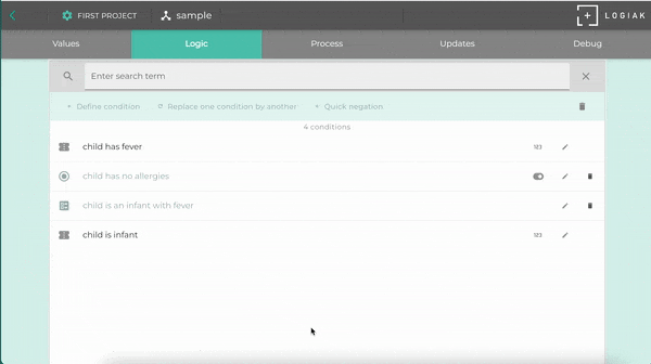
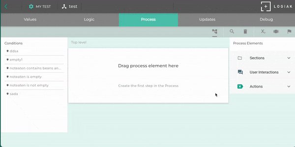
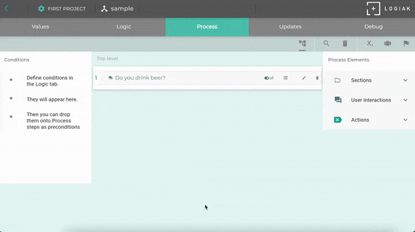
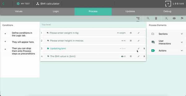
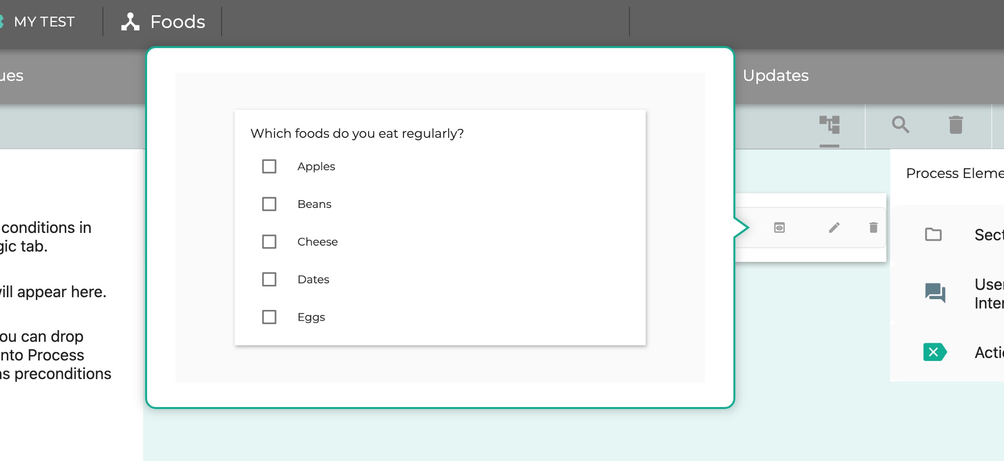
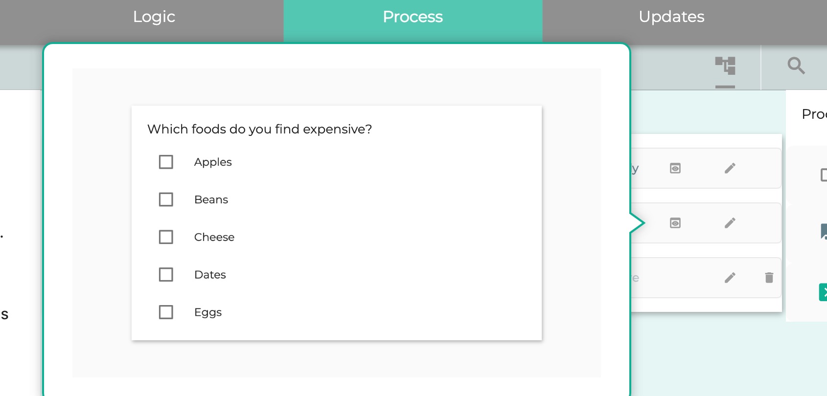
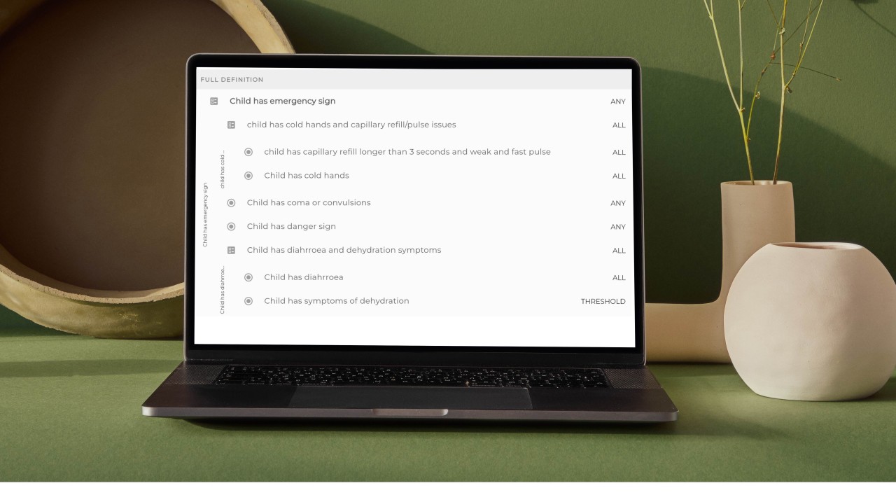
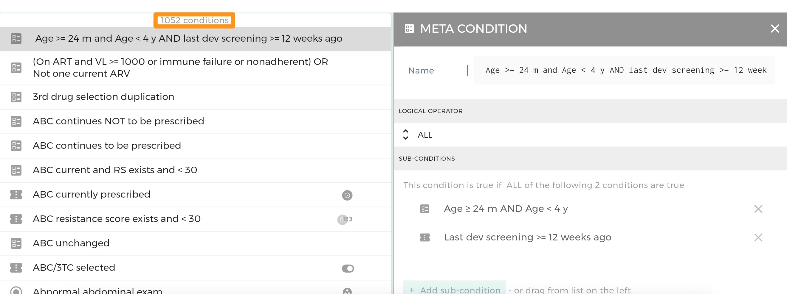
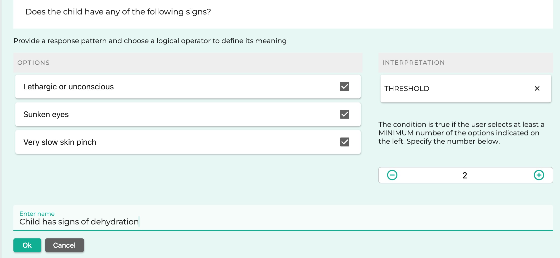
Example from Process
Look at an example here.
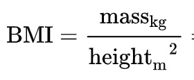
In this video you will see there are two input questions, asking values for weight and height from the user.
Then we introduce an Update variable action, and the expression we enter makes use of both weight and height.
Elements become undeletable when referenced
As soon as this action is added, the trash icons disappear from beside the two input questions: you can’t delete
them just now, because otherwise the Update Variable Action would lack a value it needs and would crash.
But you don’t need to worry about the crashing because Logiak has made it impossible to make that mistake - you
can’t delete either of the two input questions as long as they are used.
Then the video shows that as soon as the Update variable action is deleted, the two input questions once again
become deletable.
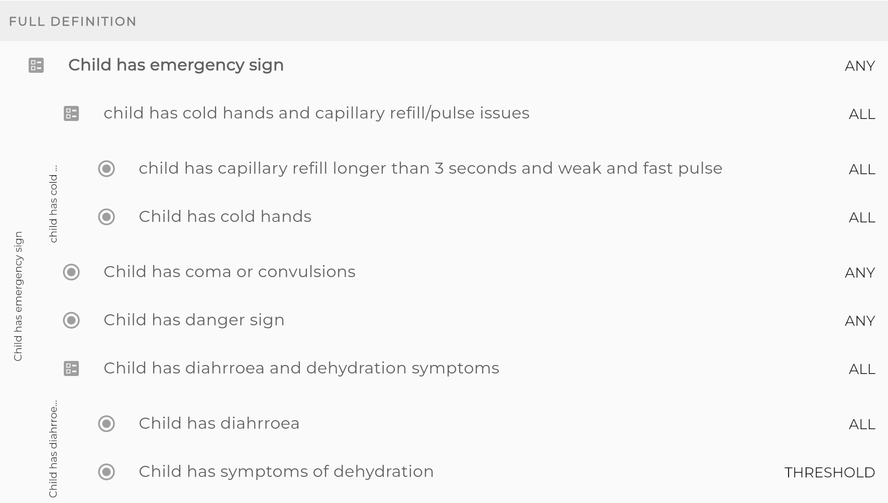
Automatic protection of references
Showing references - so you can delete them if you want
When something is not deletable, Logiak will also tell you why not - i.e. where is this thing being used at the moment?
Then, if you delete the sources of those references, the element will become itself deletable.
Where is this thing being used?
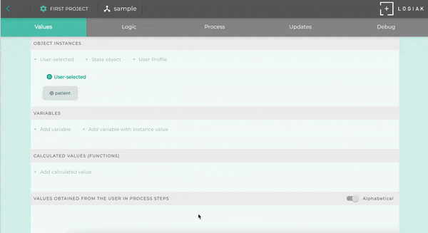
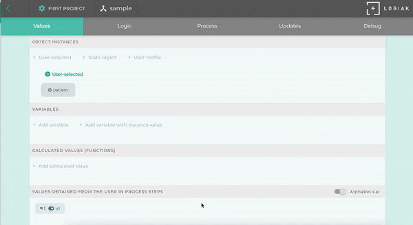
1.5 - Data Types
Data Types
Each data value has a type.
For example, it is important to identify whether something is a number or not,
so that we can determine whether it can be used in a calculation.
Six main Data Types in Logiak
Here are the main data types which Logiak defines:
Reducing dates to numbers means that it is easy to calculate with dates.
We can add a week to a date (represented as a number), by simple addition of (7 * 24 * 60 * 60 * 1000) milliseconds.
Logiak supports you in these kinds of calculations, via the Expression Wizard.
We mention this here so that you are not surprised when the Expression Wizard produces ugly-seeming expressions containing very large
numbers.
Present time
The value of the time which represents the current time, at the moment the user is using the App, is
a special variable called now.
This expression gets you “now”
{special:now}
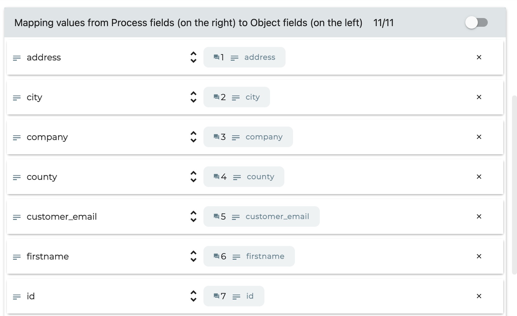
Mapping requires data type matching
When we use Process actions to create or update data, we do this by mapping Process values to Object fields.
Data type plays an important role here in ensuring Object fields get the right kind of data.
Number values are possible candidates for number fields, but text values aren’t, etc.
Mapping Logiak data types to database types
Object field datatypes in Logiak are abstract. The concrete reality is when an App is running on a device,
using a specific operating system and a specific database.
So Logiak types correspond one-to-one with types in SQLite (when running on a mobile device) and Postgres
(when running as web app, and for the Supabase backend).
1.6 - Switches
Switches
Switches
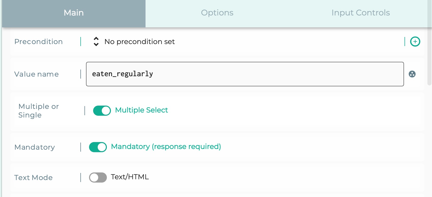
What we mean by switches is simply this:
Values of true/false fields of Object instances.
Clearly, each value is in one of two states, like a switch:
true
false
Used in workflow and other conditional behaviours
Switches are used in many places in the Component Flow to
help you implement conditional behaviours.
You can make your App’s structure and functioning adapt according to the state of the data which the user selects and
passes downstream
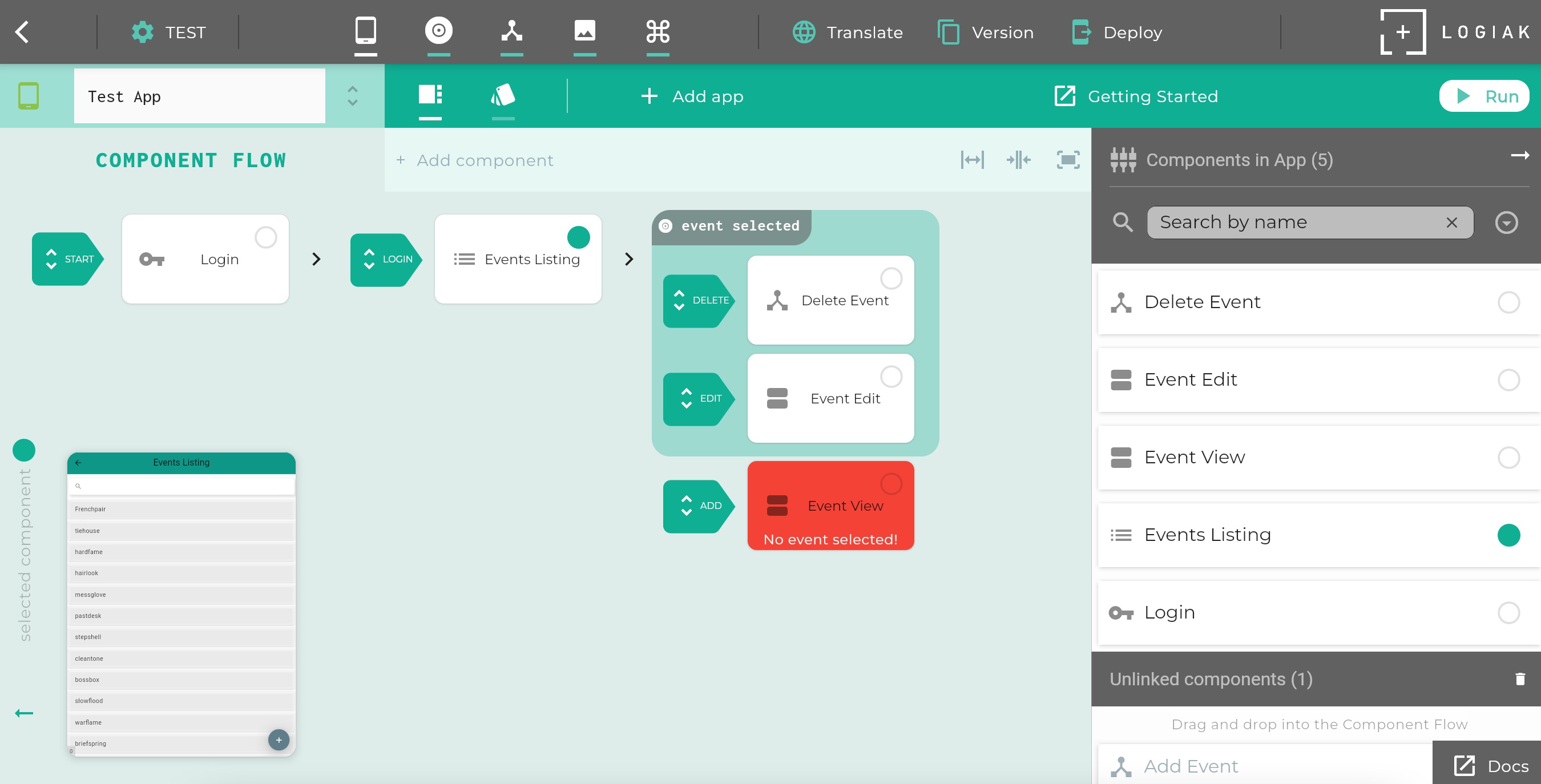
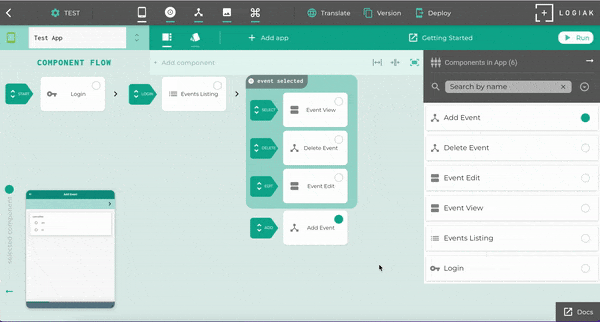
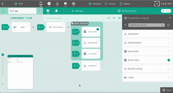
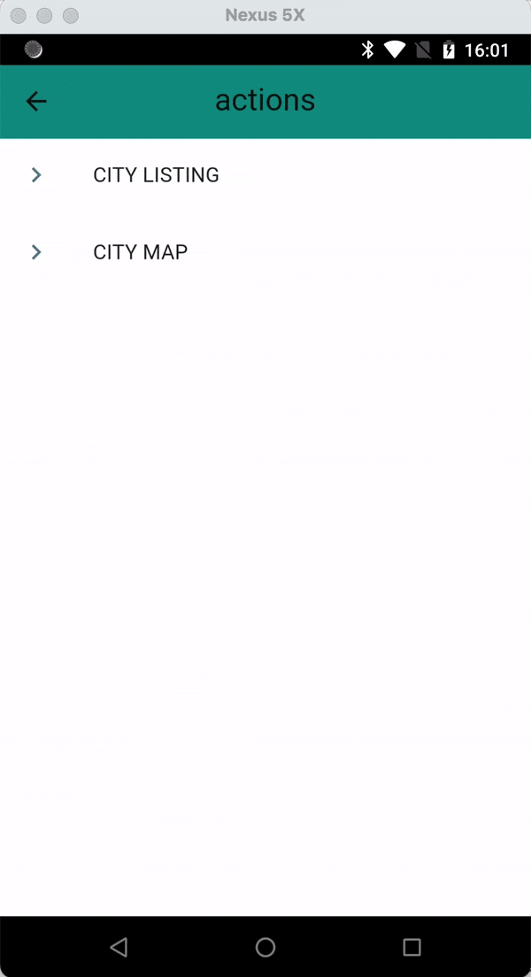
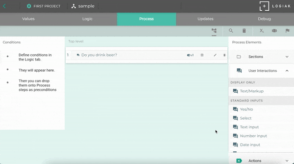
In the next video, when you create an Events Listing you have to select a field
of Event to show by default for each row
Create component to list Events
Now we will use a “quick and dirty” auto-create method to create other components
(Auto-)Create components to add, view, edit and delete events
Done!
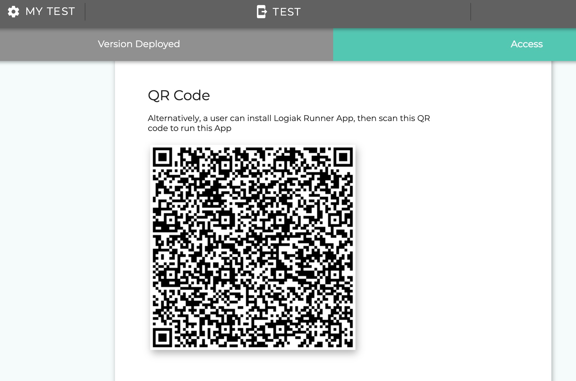
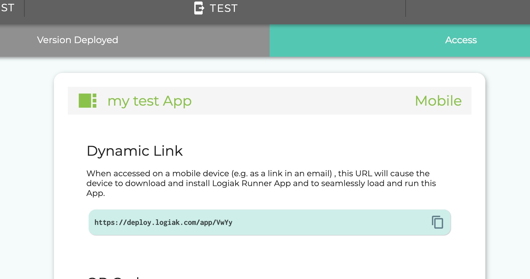
Ok, its done, let’s try it out!
We can do that within Logiak by running the App Preview.
Test App
2.3 - How to Plan an App
To plan an App is almost to build an App
You’ve created a Project Space and a Project within that Space. Now…
How would you plan an App?
Forget Logiak for the moment, consider the question: how would you plan out what you want from an App?
Events App
Let us suppose that your company manages Events of some kind and you want an App to help with this.
Suppose you want the user to login and then perhaps see all Events currently in the
database. The user should also be able to register a new one and to select one from the list.
Planning an Events App
You might start to map out by sketching a flow chart.
Something like this perhaps:
  graph LR
        A[Logs in] --> B[Views List of events in the db]
        B --> C[Can add a new event]
        C --> B
        B --> D[Can select events from List]
The Flow Diagram in Logiak
Now let’s look at Logiak.
To build an App, you do the same kind of thing as we have done above to plan an App.
To build an App with Logiak, make a flow diagram out of Components linked together.
Despite the surface differences, this is fundamentally the same
as the flow chart above: it shows a Login component (user logs in), followed by a Listing component
(user is shown all events).
The user can choose to SELECT something from the list or to ADD something to the List.
The difference is of course that once you have planned the App out like this in Logiak, you have also already
built it!
Component Flow Diagram for the Events App
Watch this short video to see how this can be achieved in Logiak
New Apps have a LOGIN component by default, then we add a LISTING…
In a Logiak Component Flow diagram, each “node”
represents a Logiak Component.
2.4 - How to Build an App
To plan an App is almost to build an App - just define a Component Flow
Further Developing the Events App
After more thought about your Events App, maybe you think your App should look like this -
When the user logs in, there is a tabbed dialogue with two tabs: upcoming events and past events.
  graph LR
        A[Logs in] --> X[Tabs]
        X[Tabs] --> B[Upcoming events list]
        X[Tabs] --> Y[Past events list]
        B --> C[Add a new event]
        B --> E[Single Event Tabs]
        Y -->E[Single Event Tabs]
        E --> F[Detailed Event Info]
        F --> I[Edit Event Info]
        E --> G[Actions on the Event]
        E --> H[Reminders on Event regulations]
        G --> N[Cancel Event]
        G --> J[Delete Event]
Build the two Lists
3 - Project Spaces
A Project Space is where you create and maintain Logiak Projects
3.1 - Free Project Spaces
You create a FREE personal space when you first login to Logiak
Start FREE
When you start with Logiak, you create a FREE Personal Project space, identified
by the email with which you log in.
The FREE space gives you the scope to explore Logiak, and determine whether it is right for your project.
In almost all cases, to make effective use of Logiak however you really need to
use a paid plan:
PROFESSIONAL
TEAM
Limitations of the FREE Plan
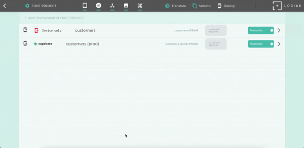
There are no limitations on App development as such, but deployment is restricted.
Deploying as a web application is not available under the FREE plan.
Deploying to “device only” is possible. This means: you can initialise devices with your App, but
any data entered would not be synced with a backend.
Deploying to a Supabase or Firebase backend under the FREE plan is limited to Minimal Projects: this
is so that you can reassure yourself that the integration works and that you can achieve it, before
upgrading to a paid plan.
Minimal Project limits
A “Minimal Project” is defined here as one in which none of these limits is exceeded.
maximum of 1 App in the Project
maximum of 4 Components in the App
maximum of 1 Process
maximum of 1 Object
3.2 - PROFESSIONAL Project Spaces
Upgrade a FREE space to PROFESSIONAL to deploy full Projects
Upgrade to a paid plan
The FREE plan permits you to connect your deployment up with a backend system such
as Supabase or Firebase only for MINIMAL PROJECTS,
so that you can satisfy yourself that the integration works.
To connect more complete Projects with a backend, you need to either
Upgrade your FREE space to be a PROFESSIONAL space
Create a TEAM space (particularly appropriate in an organizational context)
Upgrade to PROFESSIONAL
Upgrading to PROFESSIONAL is to alter the status of your existing FREE Personal Plan.
You upgrade your FREE Personal Plan and maintain all Projects you have defined so far.
There is no limit on the number of Apps you can create in a Project.
Systems not just Apps
This fact is important because it is very common to need more than one App for a particular project.
Example: Field workers and Supervisor
For example, you may need an App for a group of Community Health Workers (CHWs), and an App for their Supervisor, with
quite different functionality.
Perhaps the Supervisor has the ability to monitor CHW performance, perhaps has am ability to double check that
scheduled visits are being made in a timely fashion.
Example: Despatcher and deliverers
Perhaps you have a task which splits naturally into a “Despatcher” and “Executor” model, such as if you
are managing deliveries.
You may need an App for the drivers, so they can view their tasks, and an App for the HQ Despatcher
who takes orders and despatches them to drivers.
These are just two examples of systems made with two Apps sharing the same database. There are
innumerable other examples, and recall, the Apps do not need to be restricted to two.
–
4.5 - Project UI
Project User Interface
Tour of the Project UI
Elements of the Project UI identified by numbers in this image, are
Project Controls Bar
App Controls Bar
Component Flow of selected App
Component Preview of currently selected Component (identified by the green dot)
Components Column: Alphabetical list of all components in the currently selected App
1. Project Controls Bar
The top bar gives you access to Project-level controls.
We split these controls into two categories:
Development controls
In the top bar you can see these buttons. They give you access
to functions you need during a development cycle.
Below the Project Controls Bar, there is the App Controls Bar
This includes the ability to select which App you are working on, and then most of the other
controls relate to that currently-selected-App.
Identified by letters in the App Bar are:
A. Drop-down menu of Apps in the Project - this is the control to switch between Apps
D. Button to run the App Preview. Unlike the Component Preview,
the App Preview is a pretty complete, database-backed environment in which to try
out the App you have built, using largely the same code which will run when deployed.
Component Flow is the flow diagram which represents the blueprint of an App
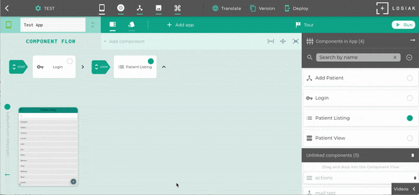
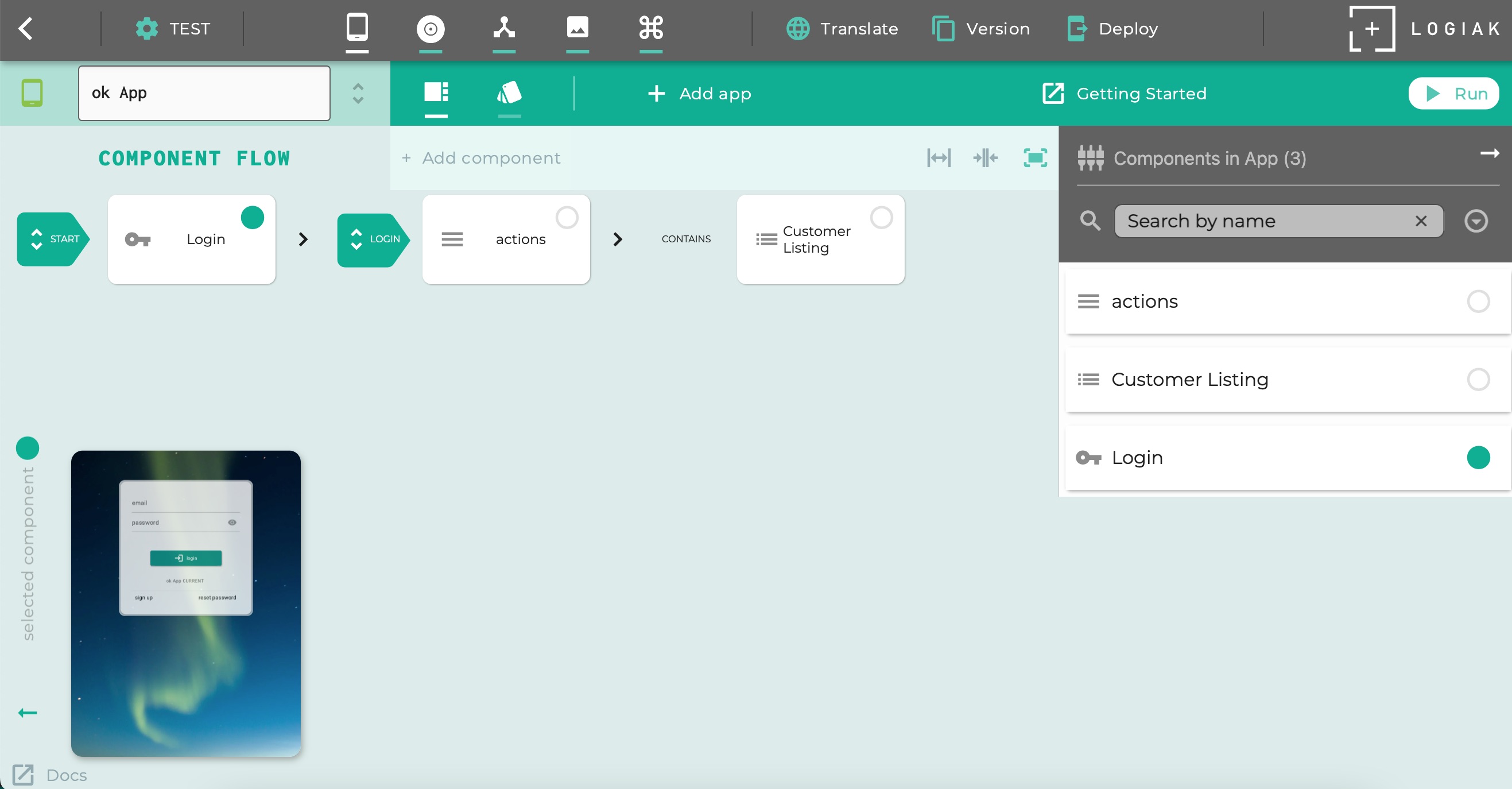
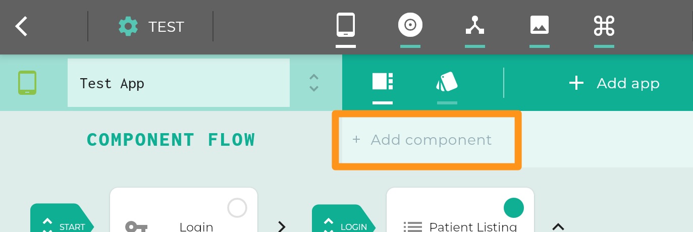
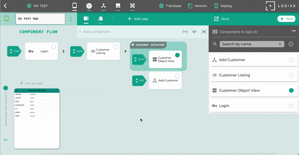
5.1.1 - Component Flow
A Component Flow diagram is the blueprint of an App
Component Flow Diagram
A Component Flow diagram is the blueprint of an App.
Planning is already building!
A Component Flow diagram is very much like the kind of diagram you might produce if you were (just) planning out an App.
The difference here is that, with Logiak, once you have planned out your App and produced a blueprint,
you have also thereby built your App!
Example
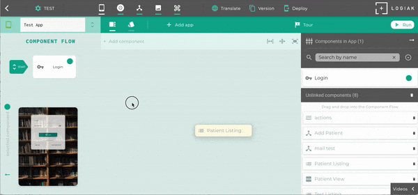
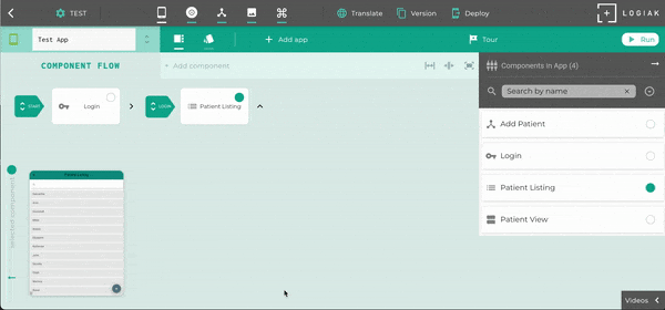
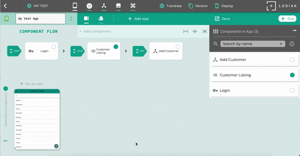
Have a look at this example Flow Digram below: this is the blueprint of an App called Test App,
and it currently contains four Components, linked together in a Component Flow.
The boxes in the Flow Digram each represent a Component.
The large green right arrows represent transitions between components.
It is to be read left to right.
It starts with a special Transition labelled START.
The START transition is always there, and setting the destination of that transition is how we tell
Logiak which Component we want to appear first.
In this example, the START transition takes us to a Login Component.
Login Components have a Login Transition, leaving
them, and we define there: which component do we want to appear after the user has logged in…
And so goes the planning/building, deciding which Component to place next..
Expand and Contract
The small right arrows are controls with which you can expand and contract the Flow Diagram.
If you have a Deployment which is in Development Mode, you can access
Component Flow editing functions from the device - you can add and edit Components.
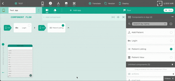
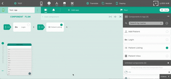
5.1.2 - Components can be added as destinations of Transitions
Transitions are the steps from one Component to another
We say the Login component is the origin of this transition.
The Patient Listing component is the destination of this transition.
Larger example
In this example, there are four components and four transitions.
A Listing component has four potential outgoing transitions. In this diagram, only two are used: SELECT and ADD
Editing Transitions: click on green arrow
The transition arrows are clickable. This produces a pop-up menu of all components in the App, plus a button to Unlink.
Changing the destination of a transition
To change the destination of a transition, just select a different component from the pop-up
Unlinking the component without setting a new component
The menu shows an “unlink existing” button at its top center. Clicking that button will unlink
the component which is currently the destination of the transition
START transition
There is a special transition called START.
The start transition is unusual because it is the only one which doesn’t have an origin component.
It has only a destination component, and whatever is the destination of the START transition will
be the first component which appears when the App is run.
Transition Types associated with Component Types
Component Type
Transition Types available
Note
START
The start transition indicates where the App begins. The destination of the start transition is the first component which appears when the App is run.
LOGIN
LOGIN
The destination of the login transition is the component which appears to the user after a successful login
LISTING
SELECT ADD DELETE EDIT
Listing plays a central role in data applications because of the transitions it has. Select is particularly important because it creates a downstream area in the flow where an object instance is selected
DATATABLE
SELECT
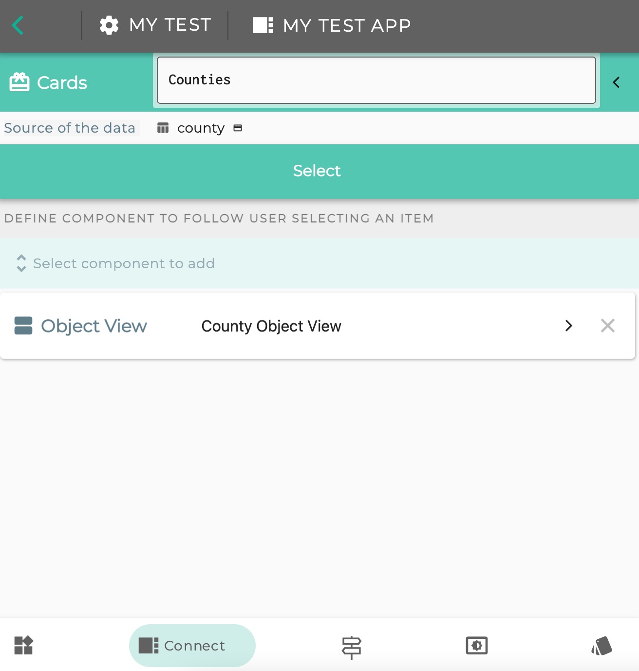
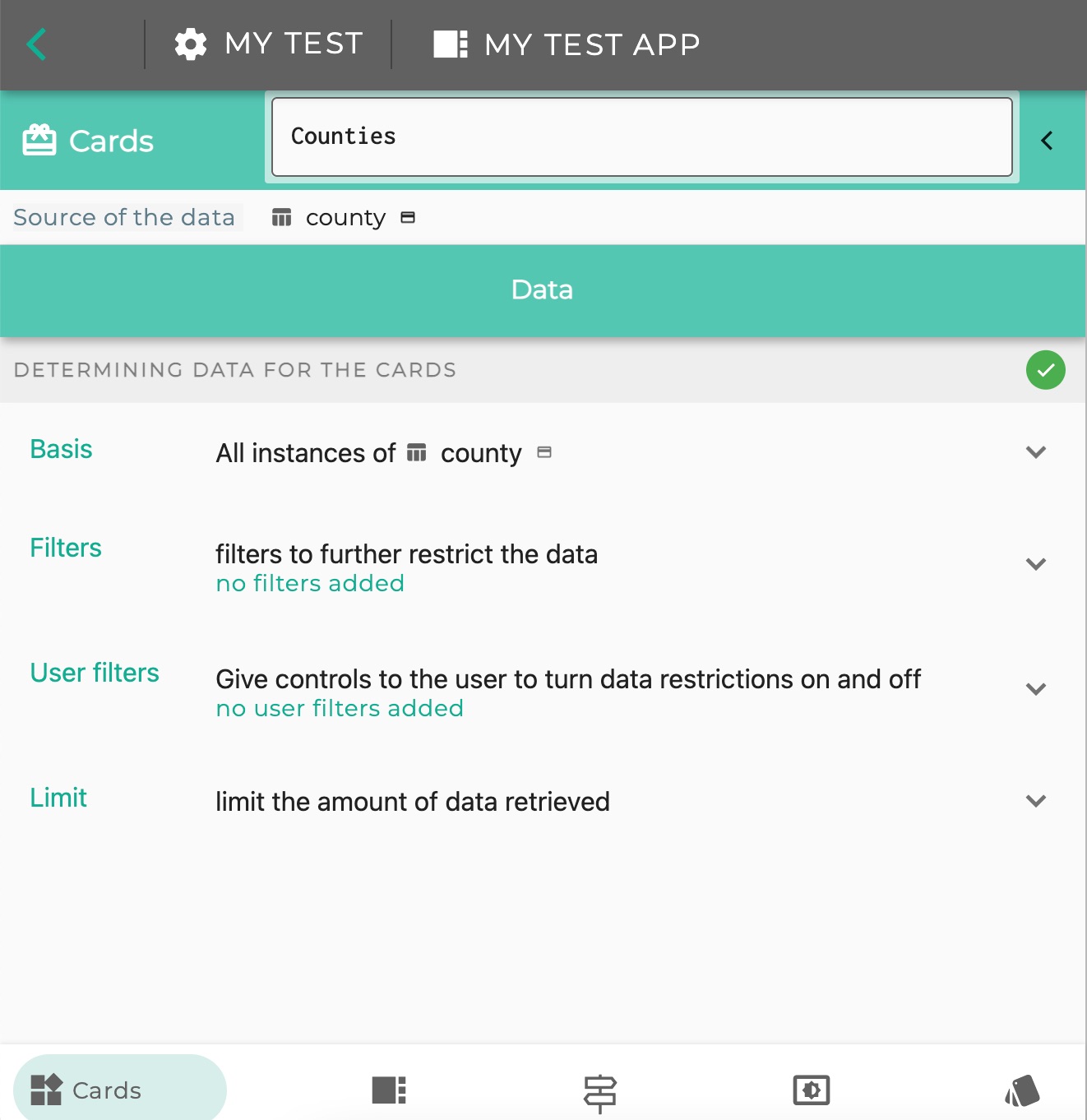
CARDS
SELECT
MAP
SELECT
GALLERY
CLICK
CLICK rather than SELECT because no instance is selected - it is just a transition to another component
OBJECT VIEW
SELECT
When a relationship field is included, user can click to create downstream area with related object selected
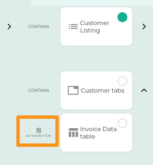
5.1.3 - Components can be added as contained by other components
Presents contained Components together in layouts which you custom design
Design different layouts for different display widths
Actually, all Components can contain other components - as [navigation elements](https://docs.logiak.com/docs/apps/flow/navigation/
Removing from parent (1)
You can remove a Component from its container, from within the Flow, by
moving the mouse over the “CONTAINS” link, and clicking the button which appears.
Removing from parent (2)
Alternatively, you can open the Editor for the parent component and remove the contained
component like this:
5.1.4 - Components can be added attached to Navigation UI
Components may contain other components as navigation elements
or as contained by another component which is within the Flow.
or as a navigation element on any component within the Flow
Defining Navigation is a lot like defining the use of a Container component, but Navigation is available
for almost all components.
It is very simple..
There are three Navigation UI possibilities to which you can attach one or more Components
Action Button
Navigation Drawer
Bottom Sheet
So the components are sort-of contained by the parent Component, but in a particular way,
and instead of the CONTAINS representation in the Component Flow, navigation components
are indicated with a signpost
Creating an Action Button
Action Button
Setting icon
The plus icon is ok when the Action Button has a Process behind it which adds something to a list,
but often for navigation, it is not appropriate.
You can associate an icon with a Component and if you do, that icon will be used in Navigation
elements instead of the default.
Setting an icon on the Action Button - associating an Icon with a Component
Creating a Speed Dial
When the action button carries more than one component, it transforms into a “Speed Dial”
component
Creating a Navigation Drawer
Navigation drawers can contain multiple components
Creating a Bottom Sheet
Bottom Sheet contains one component
Navigation Element
ACTION BUTTON
Speed Dial control is used if multiple components are specified
NAVIGATION DRAWER
BOTTOM SHEET
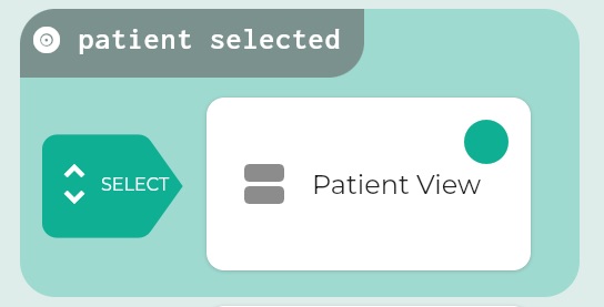
5.1.5 - Downstream
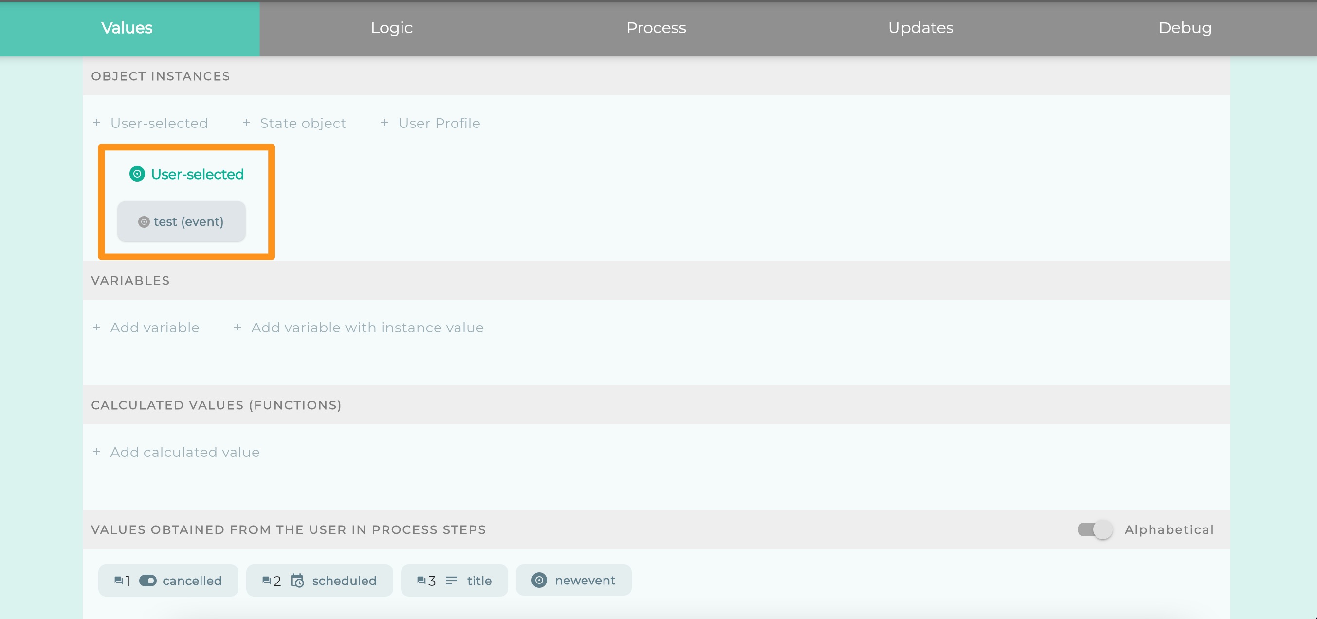
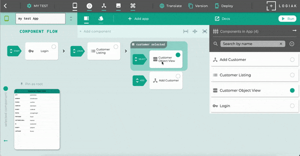
Where a user selects a record, Logiak remembers the selection
When the user selects a record
There are some Components, like Listing, where the user can select a record
When the user selects a record, Logiak remembers it, and subsequent Components can make use of it.
For example, it is really easy to configure an Object View. You say what type of Object it is going
to display, then you just locate it somewhere in the Component Flow after the user will have selected
a record of that type.
The Object View will then show that selected record.
We highlight these areas in the Component Flow, where the user has selected a record, by coloring
them and we call them Downstream areas. They are downstream of the user’s selection of a particular record.
Downstream areas
Downstream areas might contain many components and transitions. The area indicates that at
that point in the App, the user has selected an Object instance
The screenshot here has a downstream area (the shaded area).
The downstream area is whatever follows the SELECT transition from the LISTING component.
Logiak remembers the object selected
the selected instance is available to Components positioned within that downstream area.
Some components assume and require the existence of such a selected instance.
Examples of Components
Here are two components - Object View and Process - and how the existence of an instance
in a Downstream area can be used.
An Object View component is incredibly easy to configure: all you have to do is select an
Object type.
This means each Object View component you create, is configured to be able to display (and edit),
values from the type chosen.
So when you link it in the Component Flow, it *needs to be in a downstream area, where an instance
of its Object type has been selected.
If an Object View is located outside of the downstream, or in the wrong downstream, you will see
a warning that this cannot function.
Here is an example where an Object View has placed where there is no downstream area. No instance
has been selected for the Object View to display.
A Process can have selected instance as input
Perhaps the most exciting use of a selected instance is as input to a Process.
You can configure a Process in a way which assumes the Process which receive an object instance
as input.
The Process then has access to all the information in the instance.
You can say that the Process “knows about” the object. We could even say that the Process “is about” the instance.
It is safe to configure a Process like this, because then all you have to do, is to make sure the Process
Component is in an appropriate downstream area.
If it isn’t, you will in any case get a warning as with the Object View example above.
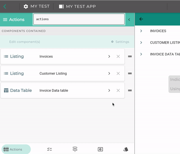
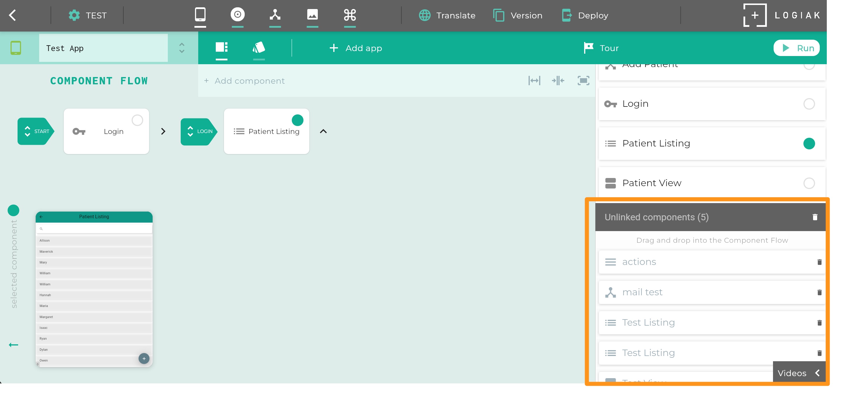
5.1.6 - Components Column
Components Column
Components Column
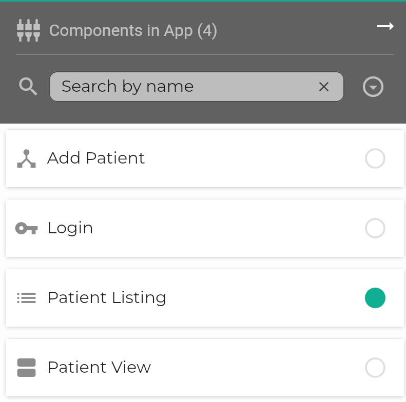
The Components Column found on the right of the screen is a important tool.
Alphabetical list of all Components
It performs several functions, one basic is that it shows an alphabetical list of all components in the App.
Navigation with Components Column
You can use Components Column to navigate within the Component Flow.
This can be particularly useful when your Component Flow grows large: when an App contains many components.
If your Component Flow is large, it may not be so easy to find a Component, but it is always easy
to find it in the searchable, alphabetical column.
Once you have found it in the column, you can click on it and all of the following happen:
The selected Component is highlighted in the Column with a green dot.
The selected Component is made visible within the Component Flow and is also marked with the green dot
A preview of the selected Component is rendered bottom left
Click on token to expose Component
Even if your component flow is huge, you can command Logiak to locate a component
for you by clicking on the token in the component in the right column.
Click on component in column
Filter by Name & Group by Type & Hiding/Showing Column
With the components column, you can also
Filter the components, showing only those whose names contain a certain text string
Group the components by Type (using button to the right of the filter box)
Hide the column - in case you want more space to view the Component Flow - and show it again by clicking on
the Components icon
These functions are illustrated one after the other here:
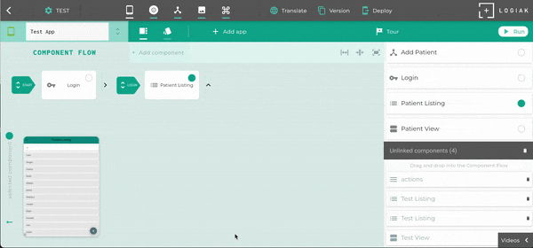
Managing Unlinked components
Unlinked components are also managed within the Components Column.
When new Components are first created, they are not yet linked into the Component Flow.
Instead, the are listed in the Components Column, available for either dragging and dropping into the Flow
or for deletion.
How to UNLINK a Component
There are several ways to unlink a component.
UNLINK via transition menu
You can click on a transition (green) arrow, and, in the popup which appears you will see
a button labelled “unlink existing” button
UNLINK via parent component editor
Edit the component which contains or links to the component you want to delete, and from the
first tab you will be able to unlink the component
How to DELETE Unlinked components
You can delete any unlinked component by clicking on the trash icon to its right.
If you have a number of unlinked components and you are happy to delete them all, you can
do this in one action by clicking on the trash icon in the header.
This will delete ALL currently unlinked components.
Delete all unlinked components at once
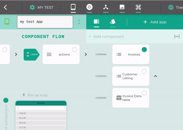
5.1.8 - Managing Large Component Flows
What to do when the Component Flow gets big?
The Challenge
Let us suppose you have a small App with just three components, including a Listing.
Then you attach an Object View as the SELECT transition for the Listing.
Oops it is hidden, already. Is there a scaling problem here? Can we manage large Component Flows - large Apps?
Yes, you can create large Apps with Logiak.
This page explains how to manage large Component Flows, without purchasing a huge monitor.
The Solution(s)
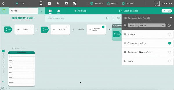
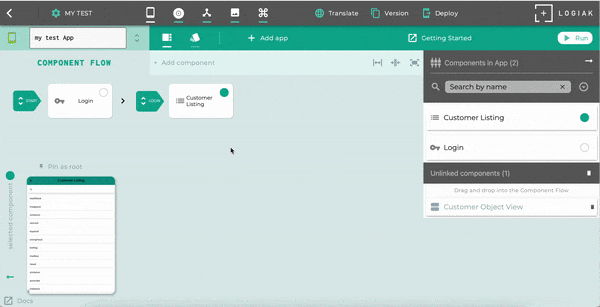
1. Pin a Component as root
You can select any component and “pin” that component as root.
What this means is that you will no longer see the whole Component Flow. You will only
see the “sub-tree” which begins with the Component you have pinned as root.
Here we ilustrate this by selecting and pinning the Listing.
We also show how to clear the pin (click on the clear button beneath the pin icon)
Pinning and unpinning the LISTING
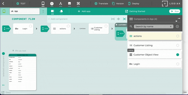
2. Click on token to expose Component
Even if your Component Flow is huge, you can command Logiak to locate a component
for you by clicking on the token in the component in the right column.
Click on component in column
3. Use Scrolling
The Component Flowscrolls both vertically and horizontally.
So when some Components are hidden behind the Components Column, you can scroll left and they will appear.
NOTE
It is possible to scroll left or up and have no Components appearing.
4. Put away Components Column
5. Switch to make Component Flow fit horizontally
5.1.9 - Component Preview
Preview Component
Component Preview
The Component Preview is a non-interactiveindicative impression of the currently selected component
(in contrast with the App Preview)
The purpose is to provide quick access to a visual reminder of the components as you are editing the Component Flow.
The Component Editor also uses a Component Preview in the right pane, so that you can
see how the configuration changes you are making in the left pane affect the way the Component appears to the user
Indicative only
Note that the preview pane contains the overlaid warning:
Indicative preview only
Using randomly generated data
The component preview being shown is not properly part of an App.
It is not connecting to a backend database. The data being shown are
randomly generated. The aim is only to give an indication of what the component
will look like.
To get a realistic preview, backed by a database, use App Preview
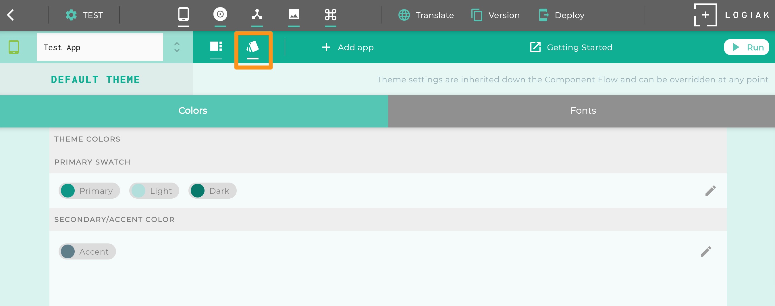
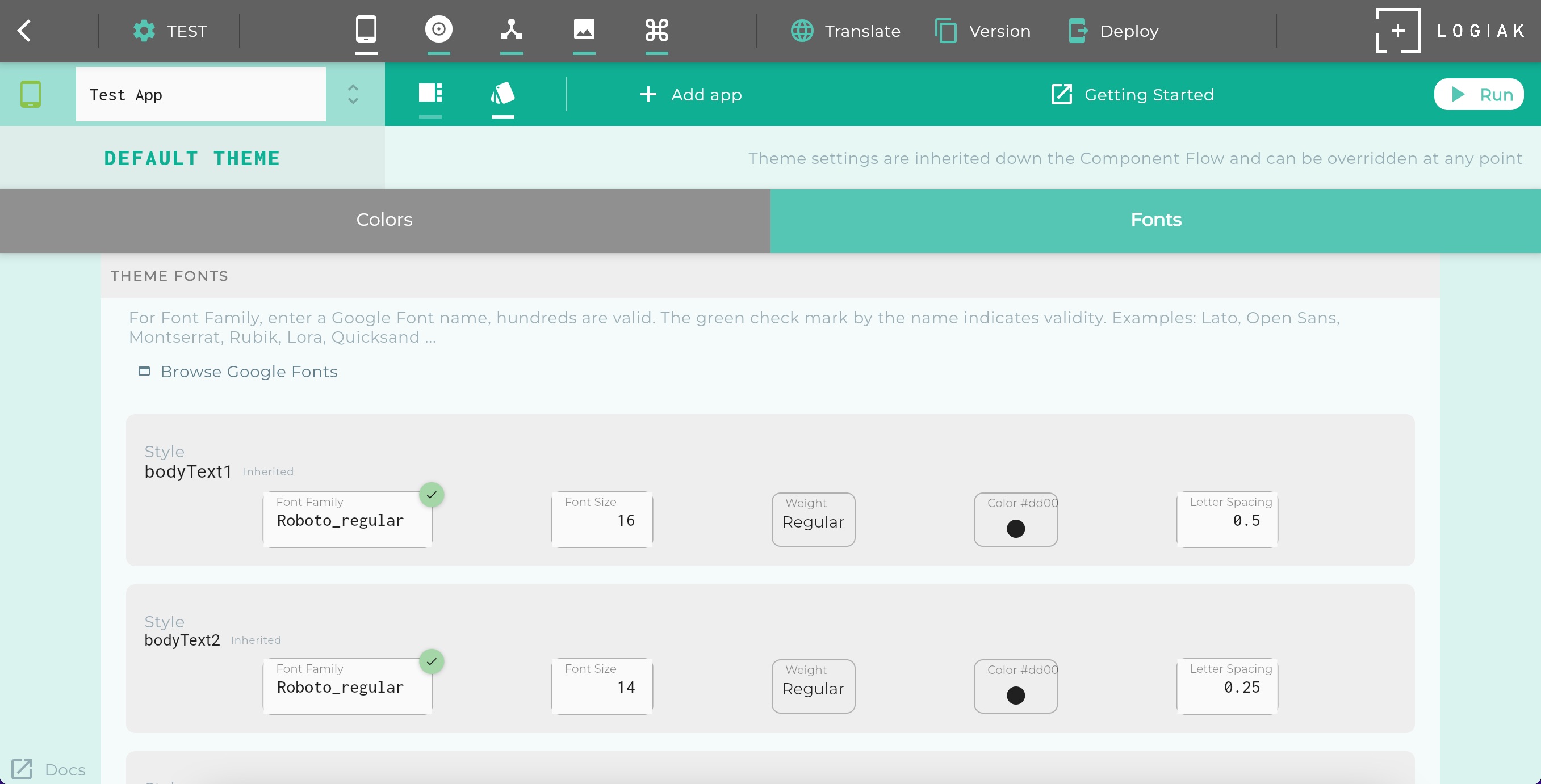
5.2 - App Theme
The App Theme defines inheritable colors and font styles
Theme Inheritance
At the App level, it is possible to define default colors and fonts for your App.
These defaults are inherited by components, but can be overridden by any individual component, and
those overrides can apply solely to that one component, or the modified theme can be what is inherited
by subsequent components.
Colors
Theme colors are set in two parts:
selection of a primary swatch (swatch is a set of three colors:
a main color
a light version of it
and a dark version of it)
selection of a secondary color (also sometimes called accent color)
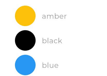
Available Primary Swatch colors
Fonts
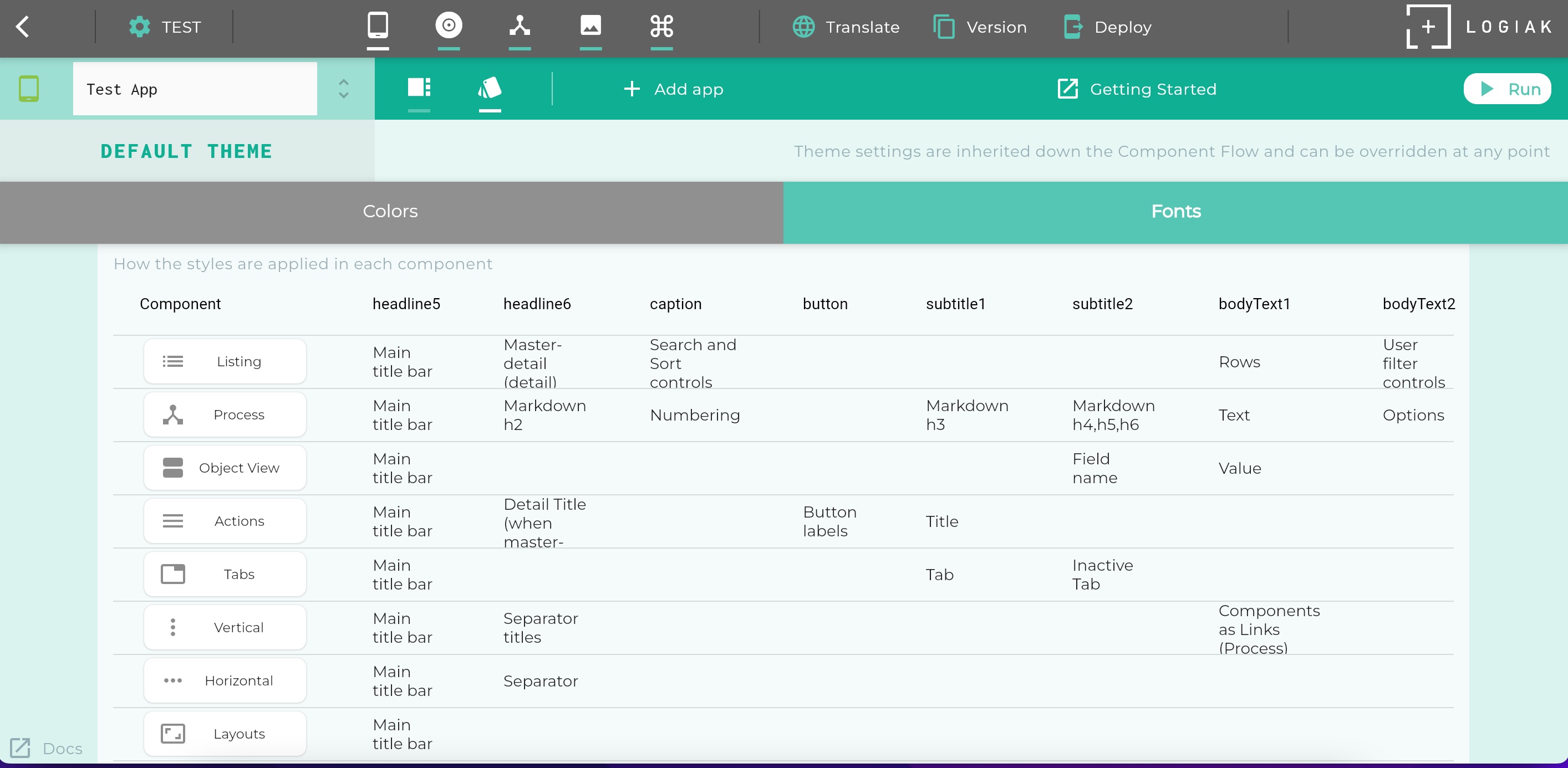
Under Fonts it is possible to alter parameters for a number of named styles.
bodyText1
bodyText2
headline5
headline6
caption
button
subtitle1
subtitle2
Uses of Fonts within Components
We have applied these styles with consistency, although across the very different components, so
the property settings for each style apply to the whole App by default, though it is always possible
to override these settings for any individual component.
The way in which these styles are applied in each component type is detailed in a table within the UI:
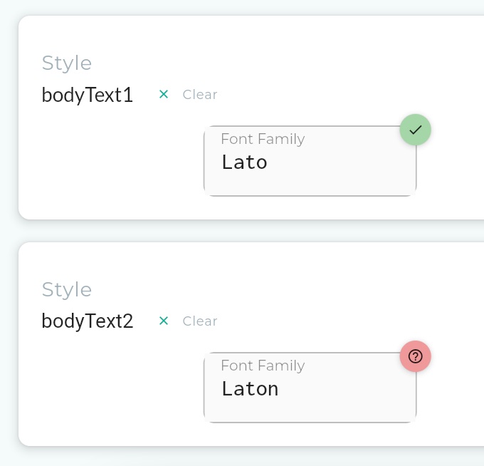
To the question: which fonts are available to select from? there are two answers:
any fonts available on the device
many google fonts
Since we do not prescribe a device, but indeed encourage running Logiak Apps on many devices, making
references to Google Fonts is probably the safest bet when choosing Fonts.
There are thousands of Google Fonts available and they are changing all the time.
Not every Google Font is guaranteed to work, but we do a check, and if the name you entered is
one of the Google Fonts supported by Logiak, there will be a green checkmark against it, other a red warning
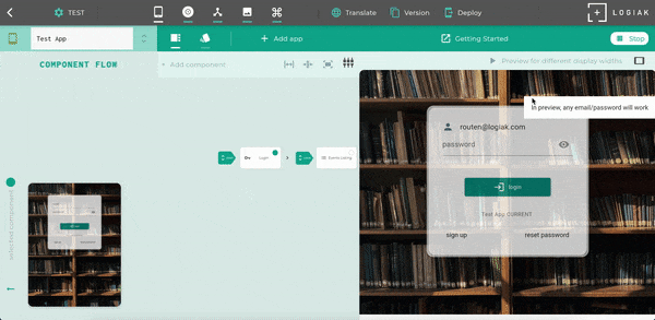
5.3 - App Preview
Preview App
App Preview: the Run button
It is possible, at any time, to run the App you are in the process of constructing.
The App Preview uses lots of the same code as would be used by your final deployed App,
with a few exceptions.
Note
anything will work as password when in App Preview!
Run
Unlike the Component Preview which illustrates components using randomly generated data,
the App Preview is backed by a database and will persist data you enter.
App Preview Data Persistence
Please note that the Preview database will be recreated (and therefore emptied) whenever you modify
Object definitions within the Project.
Previewing App at different display widths
The design of Logiak anticipates that Apps may need to run on devices with different widths,
and there is considerable configuration possible to make sure that Apps adapt well.
App Preview permits you to try out the App at different widths.
Select the width you want to review in the top bar. Widths are in logical pixels.
5.4 - App Controls
App Controls
App Controls Bar
App Menu & App Name Edit
The App Controls includes a drop-down menu.
If you are defining more than one App in the Project, this allows you to choose the one you want to work on.
The App name can also be edited there
App Functions
Once you have selected an App, there are basically three functions available to you:
They are put together in a Component Flow to make an App
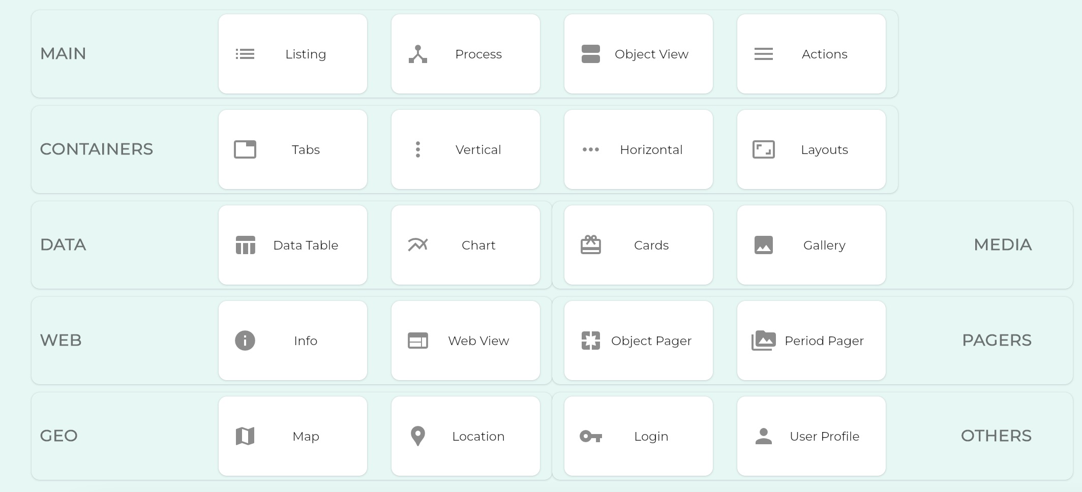
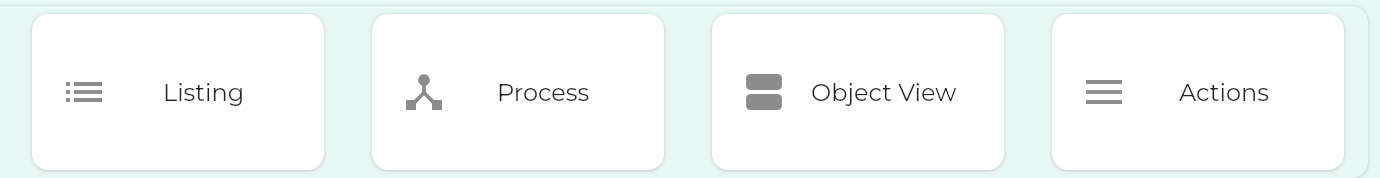
Component Types
The presentation of these Component types in a grid can give the impression they are all
of equal significance when building an App, but this is not true.
The first row of Components in particular are central to most Logiak Apps.
Subsequent rows largely contain more specialised Components, which some Apps might need and other Apps not.
Processes are where the meat of the computation is done.
Process Interactions
We should also note that there are user interactions within Processes which can be thought of
in some way as components/widgets. In the terminology of Logiak, they don’t belong to Components though.
Drop it onto a component that you want to link it to, or that you want it to be contained by, and
the component flow will update to show the new component within the flow. It will no longer appear under “UNLINKED”
2.2 LINK via editing parent component
Alternatively, you can edit the component which you want the new component to be linked to,
and add the component there.
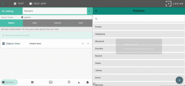
6.2.2 - Renaming Components
Renaming Components in Logiak
How to RENAME a Component
You can rename a component from within the Component Editor as shown here, where we edit
the name of a component from “Patients Listing” to “Patients”
So you may find that you go to delete a component and you can’t. Why? It will be because Logiak
knows that component is still used somewhere, and it will usually be able to tell you exactly
where.
So Logiak protects you from breaking references you have made.
This is why, here, you can’t just delete any old Component. If the component is linked into the Component
Flow, deleting it would result in broken references.
First you have to explicitly Unlink the Component. Then we know it is safe to be deleted.
1. Unlinking
When you remove a Component from the Component Flow, we refer to that
as Unlinking the Component.
This is all about: what happens when the user click on an item in the list?
Simple read functionality
If you create an Object View for the
same Object type which is being listed, and attach that as the SELECT transition of the list,
a user would be able to click on an item
in the list and view the data contained in the instance.
Beyond simple read functionality
However, you don’t need to limit the SELECT transition to an Object View.
The SELECT transition is important because the user selects an Object instance from the list,
The selection of an object creates a downstream within which
Logiak remembers the object chosen and can pass it on to other Components.
You can define a whole sub-tree of Components in the Flow with the selected object in mind, to
show the data in the object
if the object has relationships, perhaps show a filtered list of related objects (e.g. invoices for a selected company)
offer the user a workflow of Actions all related to the chosen object
So, yes you can attach an Object View so that the user can look at the data,
but you can instead attach a Container, such as a Tabs Component, and make the Object View
one of the Tabs, while adding other Listings and Actions in other tabs..
2. ADD Transition
If you have a list, you may want the user to be able to add an item.
For example, if we have defined an event object, and we present the user with a list of events,
you might want the user to be able to register a new event and it appear in the list.
We do that in Logiak by attaching a suitable component as the ADD Transition.
This usually means
defining a Process - an interactive dialogue - to elicit information from the User
wrapping the Process in a Process Component
attach the Process Component as the ADD transition
Setting a Component for ADD
3. EDIT Transition
A third functionality you may want to have is for a user to be able to edit the data in an instance,
or at least the values of certain selected fields.
This can be done with an Object View, set to edit mode.
4. DELETE Transition
If you have a list, you may want the user to be able to delete an item.
For example, if we have defined an event object, and we present the user with a list of events,
you might want the user to be able to delete any specific event from the list (and from the database).
We do that in Logiak by attaching a suitable component as the DELETE Transition.
This usually means
defining a Process - an interactive dialogue - to confirm the delete with the user, and to a delete instance update action
wrapping the Process in a Process Component
attach the Process Component as the DELETE transition
What can you do with a list?
You can
define filters to restrict which instances to display
define user filters which users can turn on and off
define what appears in each row by using a template
make what appears conditional on true/false fields of the Object listed
define custom layouts for rows
define custom layouts for rows which are adaptive to display width
define what component appears when the user selects an instance (clicks on a row)
define what component appears when the user decides to add an instance (clicks on the action button)
define what component appears when the user wants to edit an instance (long clicks on a row)
define what component appears when the user wants to delete an instance (swipes left on a row)
lists have a search control built-in
define sort fields and thereby display a sort control to the user
Any of the values from within the Object can be shown to the user.
If the Object being listed has a relationship with another object,
fields from the related object can also be available to be shown to the user.
There are two ways to define what gets shown for each row.
Using a template, and choosing fields to provide values for the template
Configuring your own custom layouts, which can also involve making the rows adapt to different display widths
TEMPLATE row formatting
Configuring list rows using Templates is the simpler and more limited of the two ways, and it is
the one selected by default.
CUSTOM LAYOUT row formatting
Filtering what instances appear in the List
There are two kinds of filters you can define:
implicit filters
user-controlled filters (filters that the users can turn on and off)
When a LISTING is initially created, by default it displays ALL instances of the chosen object
found in the database.
You can specify filters which constrain which instances are shown.
Implicit filters
Implicit filter: show only cities in China with a population > 10 million
User filters
User filters are configured almost exactly the same.
Instead of being implicitly applied to the Listing at all times, User Filters instead are
represented by controls with which the user can turn them on and off.
The only difference in the configuration is that one is able to define a user-friendly label for
each control.
User filter: show only cities with a population > 10 million
Sorting the List
Sorting is specified by selecting one or more fields from the listed object.
You specify a field order (for neted sorting) and a default direction of sort (ascending or descending) for each.
Whichever sort fields are defined here, they become available to the user via a dropdown on the list.
Precisely, the display names associated with the fields appear in the drop-down. An arrow control permits the user to switch direction of sort.
Adding sort controls to a Listing
Scaling - is the List usable on a mobile device when there are thousands of records?
The LISTING component can deal with many thousands of records.
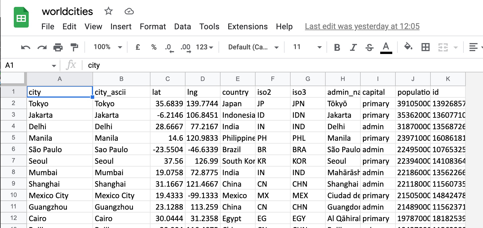
As an illustration, we downloaded the city Data,
and defined a Table Object to be able to incorporate the data
into a Project
The data contains 42,905 rows.
We created a LISTING component to present 42,905 rows (i.e. without any filter applied).
The number of instances is shown by the number in the bottom left-hand corner..
PROCESS components are the most powerful components
Processes are interactive dialogs with the user which can be used to calculate and compute
using complex logic, and update the database, affording great flexibility and power in processing data.
To bring a Process into an App, what you do is to create a Process component to “wrap” the
Process.
Once you have a Process component representing a Process, you can drag it into the
Component Flow the same as any other kind of component.
So this page of information is short because a Process component is just a “wrapper” which lets you
locate a Process within the Component Flow .
To read about creating a Process, please have a look here .
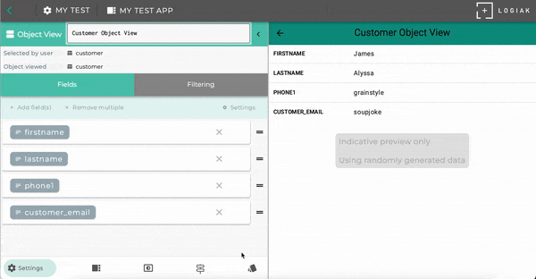
6.3.4 - Object View
Object View presents data from an instance
What is an OBJECT VIEW?
An Object View is a component for displaying and editing values within an object instance (a record).
An Object Type defines fields and relationships and an Object instance has values for each of these.
An Object View normally displays field names and values.
How to create an OBJECT VIEW
As with several other components, to create an Object View, you need to select an Object Type.
The Object View is then configured to show instances of that given type.
An Object View has to be located downstream of the selection of an instance of that type.
Selecting and ordering Fields to show
When an Object View component is initially created, all non-autofill fields are included
in the view.
The fields of the object shown, and their ordering, can be modified at any time as shown here..
How to remove fields
Note
Removing fields from the Object View component, does not remove the field
from the Object definition itself.
How to re-order fields
How to add fields
How to use Object View as Editor
An Object View component presents values within an Object instance.
It has two modes: you can use it so that the user can view the data within a record,
or you can give the user the opportunity to edit some values
You can switch between these modes.
Note
When used as editor, the values of all fields included in the Object View are editable by the user.
Relationship fields within an Object View
Relationship fields can also be shown within an Object View.
Using template to show related record
A relationship field is really a pointer to another record of another type.
For example, suppose we have a health application and we are dealing with records
of patients and their visits: each visit is a visit of a particular patient, so the
visit object type has a relationship to patient.
When we view a visit record, we want also to show which patient, but how exactly? Which fields
should we show?
To configure the display of the patient within a visit Object View, we use the same
templates as in the Listing component.
You select a template, and then choose fields of patient to display.
Relationship fields are clickable and cause the related instance to be selected
Because relationship fields point to another object instance, we exploit an opportunity here
to give the user the ability to select that instance and create a new downstream .
Hence there is a tab in the Object View editor where you can select which component is to
be used for the SELECT transition, if the user indeed clicks on the relationship field in the object view.
Using multiple Object Views in a Container Component
If the object you are displaying has many fields, you might want to consider creating a view based on a
Container Component, such as Vertical (but of course you could use any other Container) , and partitioning the fields into groups.
For example, you might have an Object View with basic information from a person’s record - name, address, etc.
and separate group of fields displayed in a second Object View..
Composing two Object Views together in a Vertical
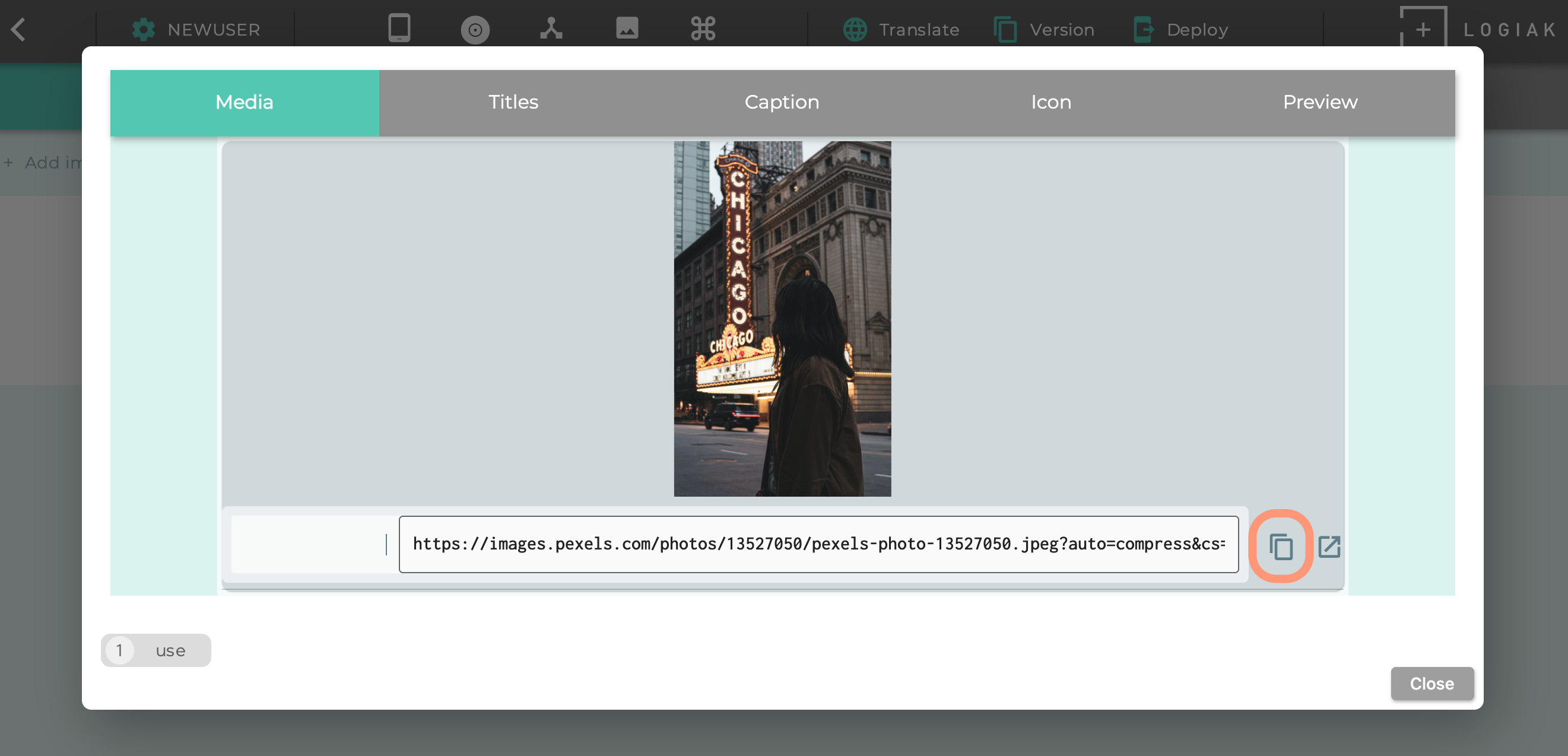
Media fields within an Object View
One of the Logiak’s data types is Media URL.
Values of such fields can point to images, audio files, or videos.
The Object View will render medias pointed to.
6.3.5 - Actions
Actions can be a simple list of links, or can be used for workflow purposes
Actions
An Actions component is useful if you want to present the user with a list of options
or tasks.
Each of those options or tasks is a component: like the Container components, an Actions component is configured by selecting
one or more other components to put into it.
By default, the Actions component presents the possible actions as clickable links.
Using Switches to control the user’s Workflow
An Actions components presents a choice of possible tasks or functions to the user.
Where an Actions component is located within a Downstream area, where an Object has been selected,
the Actions component can be configured to adapt to the values in the true/false fields of that Object.
It is possible to configure a single action to be:
By default
Can conditionally be
Shown
Not shown
Enabled
Disabled
Not marked
Marked with a tick
Since the values of the true/false fields of the object can be updated by Processes, this
gives an easily modifiable system which presents tasks to the user appropriate to the current
circumstances.
Or, it can present a sequence of tasks to the user so that the user completes one after the
other and ticks indicate which ones have been completed and which remain to be done.
Use images to represent the choices
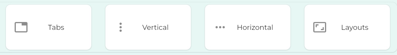
6.4 - Container Components
Container components present collections of other components
6.4.1 - Tabbed Dialogue
Tabbed dialogues in Logiak contain a component on each tab
As with all Container components, it is straightforward to configure Tabs.
Once created, you just select components to include within it.
Each component is presented in its own Tab.
This means that it makes little sense to have a Tabs component containing just
one Component, and also that there is an upper limit to the number of components
which can be contained.
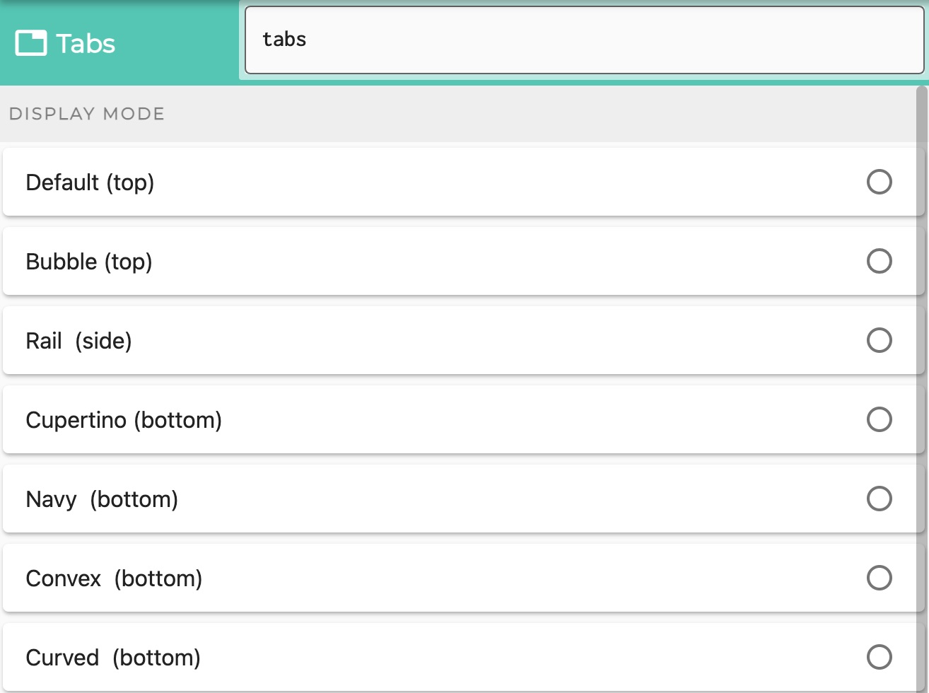
Select which kinds of Tabs
do you want the tabs to appear at the top (relative to the contained components)
do you want to have a sidebar?
do you want to have a bottom tab bar?
Tabs at the top
You can choose between
default
bubble tabs - which sort of blow up a bit as you select them
Tabs at the side
Also called a Navigation Rail
Tabs at the bottom
Choose between various styles of bottom tab bar
Navy - using the same bottom bar component as is used in the Component Edit
Cupertino - iOS style
Convex, with sub-styles:
Fixed
FixedCircle
react
reactCircle
textIn
titled
flip
custom
Curved
6.4.2 - Vertical Container
Components in a column
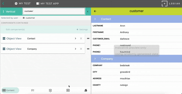
As with all Container components, it is straightforward to configure a Vertical - pretty much you just select components to include within it.
Components appear vertically, one after the other, including a title bar for each
Example of components stacked vertically
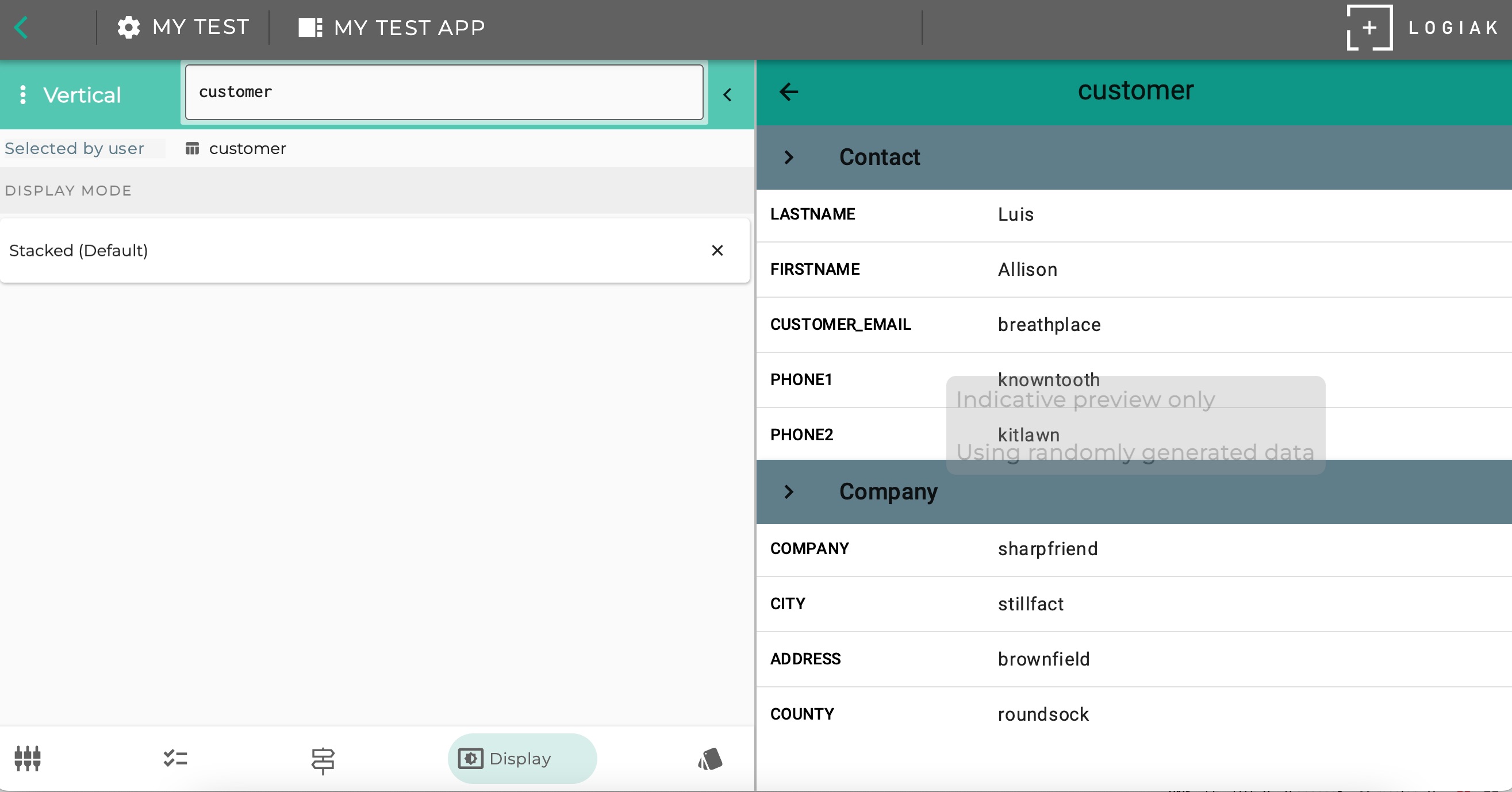
Here is an example (see the right part of the Component Editor screen) where we configured a Vertical component to contain two Object Views
Select between different display modes
Display Mode: Stacked Vertically
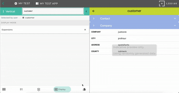
The example above in fact uses one of the three Display Modes available.
Display Mode: Expansions
Display Mode: Vertical Paging
6.4.3 - Horizontal Container
Components horizontally
As with all Container components, it is straightforward to configure a Horizontal.
Once created, you just select components to include within it.
Components appear horizontally, one after the other.
Select between different displays
Display Mode: Horizontal
The example above in fact uses one of the three Display Modes available.
Display Mode: Carousel
6.4.4 - Layouts
If you need a custom arrangement of some components, define a custom layout
Custom container
Once created, you select components to include within a customer container.
Rather than being “hard-wired” with regard to how the components within the container will be
presented, with a Custom container, you configure custom layouts, where each element in the layout is a
component.
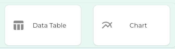
6.5 - Data Components
Components to present aggregated data
6.5.1 - Chart
Chart presents common visualizations of numerical data
Chart types
With the Chart component, it is possible to create
Bar Charts
Line Charts
Scatter Charts
Pie Charts
First Charts
Let us dive straight in and make some charts from some data
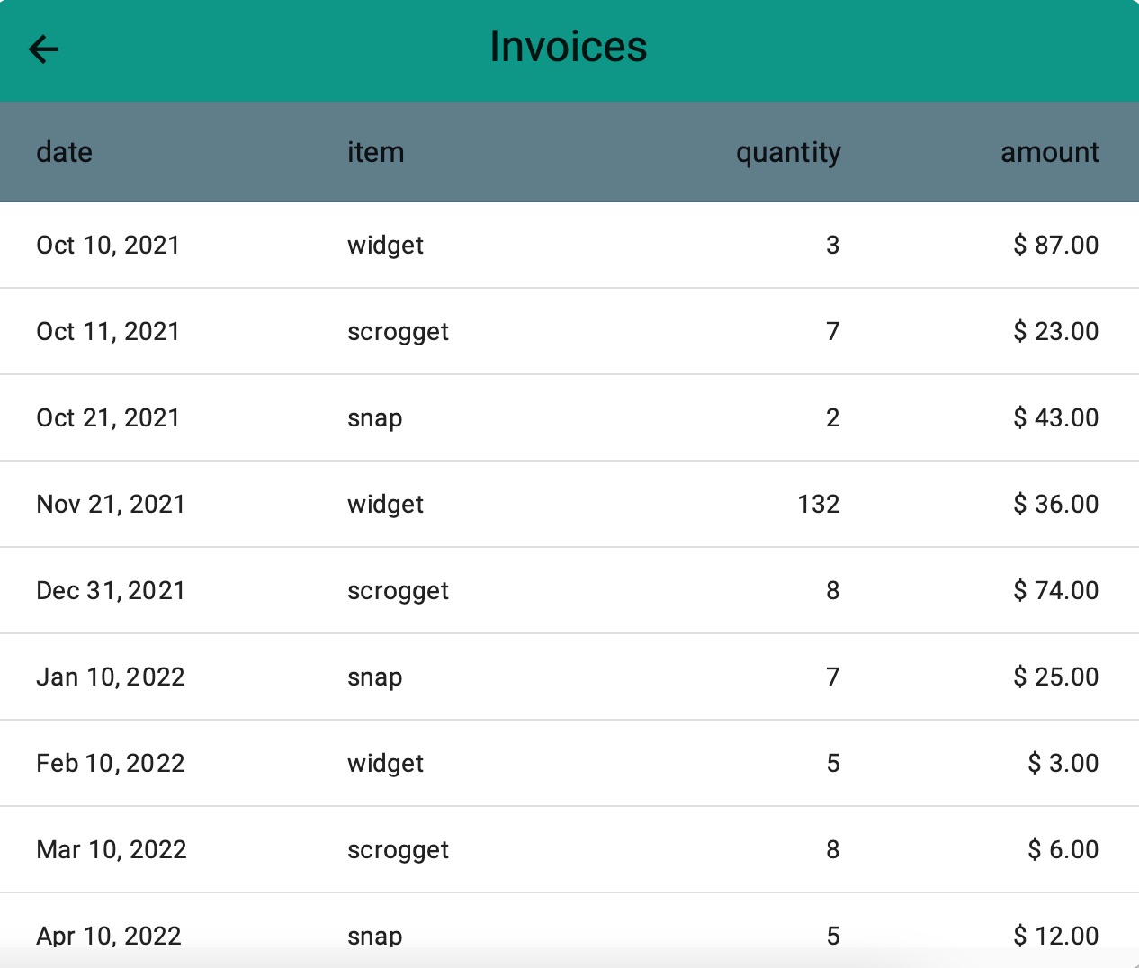
Invoices for sproggets,widgets and snap
We’ve define an Object called invoice with some typical fields and a relationship
to a customer
And, supposing we sell three kinds of product - sproggets,widgets and snap - we have defined some sample instances of invoice:
1. Example Bar chart - showing total units sold
Now let us make a chart which will show us how many units of each product we’ve sold.
this takes just 2.10!
Bar chart to show quantities of products sold, by product
2. Example Line chart - showing amounts grouped by week
Now let us make a line chart which will show us how income has been developing, taking week as
the period of analysis (i.e. amounts in the same week are summed together and considered one amount)
this takes just 1.14!
Line chart to show income grouped by week
3. Example Scatter Chart - showing product success in size of spots
A Scatter Chart scatters dots which represent two values:
one value determines the y-position of the dot
the other value determines the radius of the dot
this takes just 1.46!
Scatter chart to show turnover and units sold per product together
The query and results underlying the scatter chart look like this:
mysql> SELECT    sum(amount) AS "amount", sum(quantity) AS "quantity", item AS "item"   FROM invoice group by item;
+--------+----------+----------+
| amount | quantity | item     |
+--------+----------+----------+
|    167 |       28 | scrogget |
|     84 |       44 | snap     |
|    136 |      212 | widget   |
4. Example Pie Chart - showing product income proportionally
this takes just 1.06!
Pie chart to show turnover from products proportionally
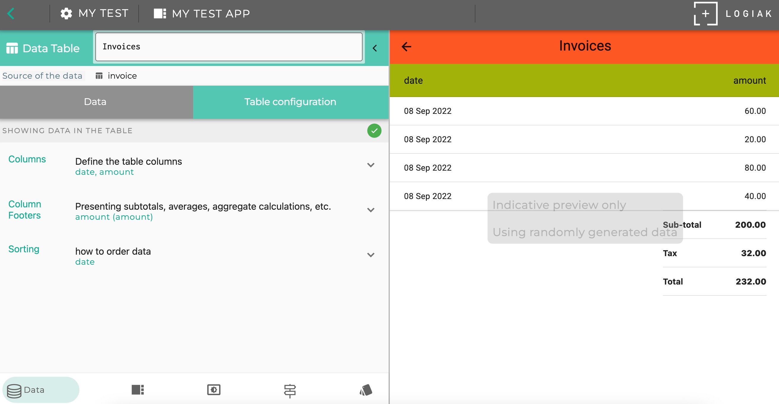
6.5.2 - Data Table
Data table presents numerical data in columns
A Datable has similarities with a Listsing , in that each row in the table represents a record
and is selectable.
How to create a datatable
It is straightforward to create a datatable.
Choose which kinds of records - which object type - you want to present
Select the fields you want to be in the table
Choose number and date formatting
Choose which column to sort by
this takes just 1.49!
Creating a data table
Adding Footer Calculations
It is possible to add Footer Calculations to the table.
Footer calculations are one or more rows of calculations, like this
The first row is an aggregate calculation based on a specific numerical column on the table,
and then subsequent rows are calculations based on this figure.
So here, as in Process, we use symbolic names to refer to values.
How to configure a footer calculation
Step 1 : do the main calculation
First you choose
a column you have added to the table which contains numbers (i.e. represents a number field)
an aggregate calculation. One of:
count
sum total
average
maximum
minimum
symbolic name for the value which is being calculated
Subsequent Steps : calculations making use of named values
Now you can add as many steps as you want.
At each step, you can refer to values by their symbolic names, and use them in new calculations.
Footer Calculation Example
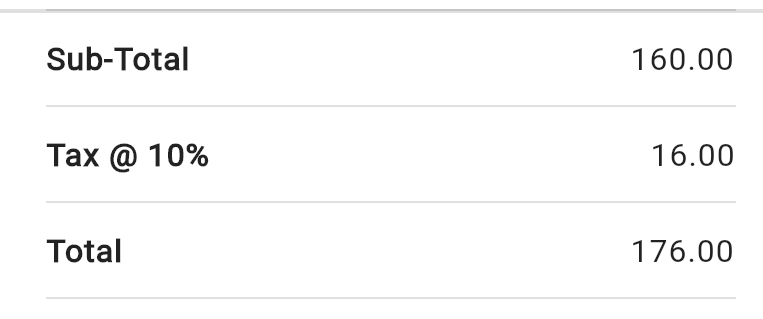
Suppose we had chosen to calculate a “sum total” of a column represent an invoice amount, and suppose
we had introduced the symbolic name subtotal for the amount calculated.
Then we could add a second calculated value, let us use the symbolic name tax
by providing expressions where you can use the name of the aggregate value as variable
e.g. we could achieve the above example by choosing to calculate the Sum of a column and give it the value name 'sub' , then we could define a second value to represent 10% of the Sum (maybe call it 'tax') by giving the expression
(sub * 0.1)
Then we could define a third value (maybe call it 'total') like this:
‘(sub + tax)’
For each value, you provide a label which is what the user sees next to the value in the column
this takes just 1.26!
Adding a footer calculation
Display Modes
There are two different ways of presenting the data to the user.
One, suggested by the name of this component, is to present the data as a table.
The second, is to use the configuration possibilities to calculate a number you want to highlight,
and then present that calculation, without the accompnaying table, perhaps on its own.
1. Default - as table
2. Calculation highlight mode
Making a calculation highlight component
You can compose such a “highlight” with together with other components in a Container Component
6.6 - Media Components
Components focused on presenting images, videos etc
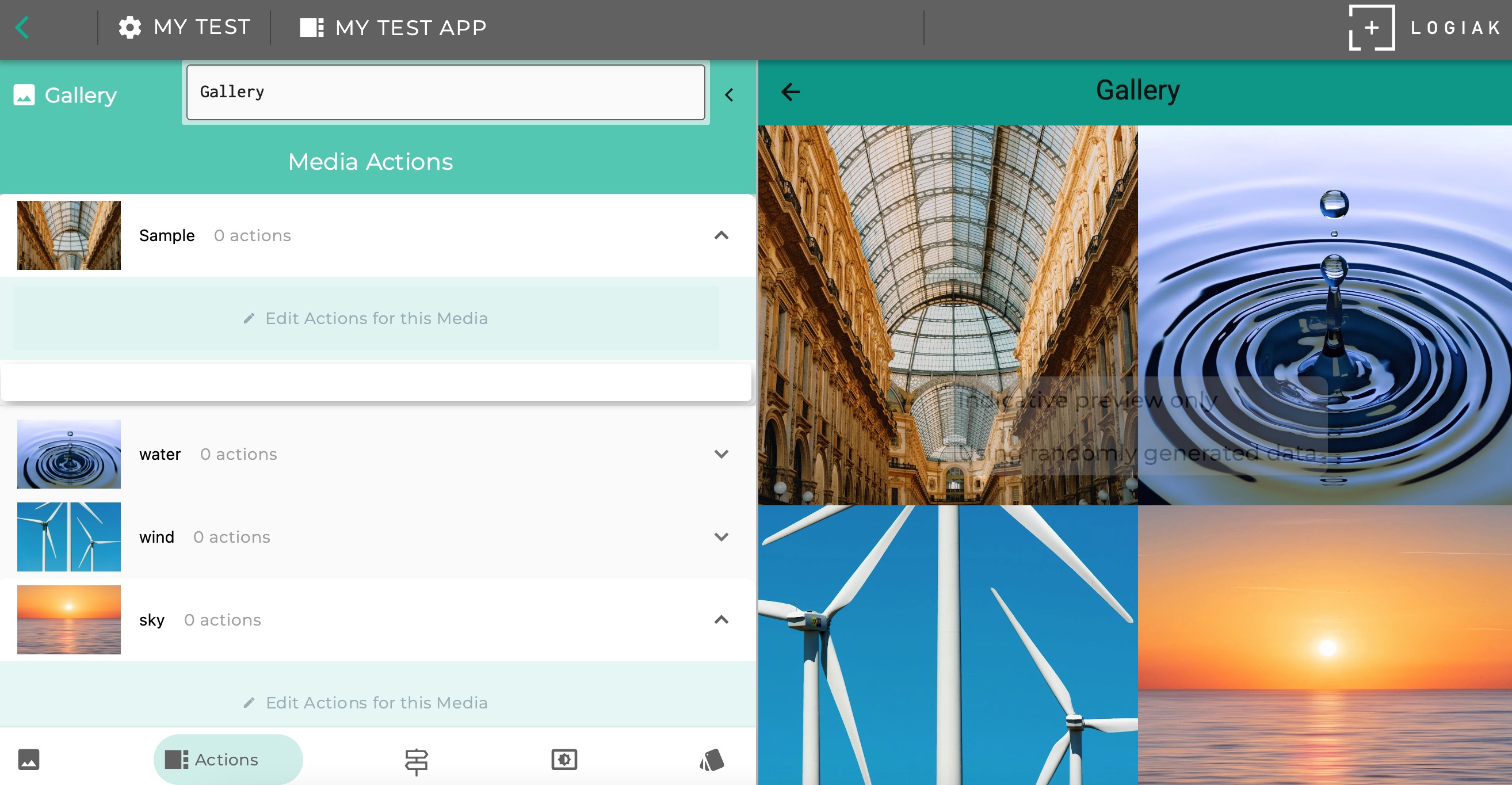
6.6.1 - Gallery
The gallery component presents media
Simple Gallery
A Gallery is the presentation of one or more media elements
contained in the Project.
In this video, we go the Media tab and find and add an Image to the Project media.
Then we create add a new Gallery component to the App, selecting some images from the Project media.
this takes just 0.58!
Gallery of the elements
Making images clickable
Like the Cards component, it is possible to make images selectable by the user.
Unlike with the Cards component, there is not an Object instance underlying each of the images,
so the user click does not create a downstream area in which an Object is remembered.
Instead, to make the contents of a Gallery clickable, you have to select destination component(s)
for each image:
Supplementing images with text(s)
In the Media tab, when you edit an Image, you can add Title, Sub-title and Caption, thereby giving
sufficient fields that each Media element can be treated as a Card for the purposes of using
the defined Card Renderers.
Adding texts to image - then able to use Card display modes
Comparison with Cards
Similarities
Displays use “Card” concept - can attach texts to Media to fit Card model
Images can be made clickable
Differences
In Cards , each card represents an instance, and the selection of one creates a downstream
Because there is no backing Object, there are no implicit or user filters to restrict which Media to display
Some display modes
Gallery offers several display modes and parameters, including the option to render the
Media as Cards or not.
Here is a video which shows some options like
Masonry
Carousel
Gallery display modes
6.6.2 - Cards
Cards represent instances
Cards is like a mix between Gallery and Listing - visual
displaying like a Gallery, but functioning like a Listing in the sense that
every image represents a record which can be selected by the user.
Comparison with Listing
A Cards component presents a set of instances of a given Object type.
It has a SELECT transition, meaning the Cards are selectable, and the instance behind the card
is remembered by Logiak - it creates a downstream area.
So you can set which component(s) should appear when a user clicks on an image.
As with a Listing you can set implicit filters and also user-controlled filters, to determine which instances - which Cards - are displayed
But they have the common features that each of these items represent a record,
the items are clickable, and you can set which components come next, including
components that make use of the selected record.
SELECT transition like List
Data filtering like List
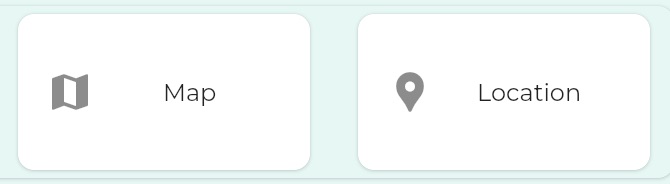
Example Map
In this video we show mapping from data about some cities which include population.
We set an implicit filter - we want to show only cities with a population > 20 million
Then we create an Object View and attach it to the SELECT transition to demonstrate the
markers are clickable and open up a downstream where an instance of the object has been selected
Mapping some large cities
6.7.2 - Location
Location presents a single location
6.8 - Pager Components
Pager components augment functionality of LISTING and CHART/DATABLE
6.8.1 - Object Pager
An object pager creates a swipeable view of a collection of instances
Object pager
An Object pager components gives you a swipeable display, each swipe representing a record
of a chosen Object type.
SELECT transition like List
Data filtering
You determine which instances will be paged through using the familiar interface
On each swipe, what happens?
To configure this is just to choose a Component (or component sub-tree), which can handle
instances of the kind being swiped.
You could choose to have a simple Object View for example,
but you could also have a Tabbed View , with several tabs giving access to actions to do with the
instances etc.
The point is, an Object pager mediates between the collection of records available and a
component which handles the individual records
Using an ObjectPager in conjunction with an Object View to page through (swipeable on device) invoices one by one
Object pager selects an instance - creates a downstream
At any point, when using the Object pager, an instance is selected by the user.
Swiping is a different UI gesture than clicking on a list row, but the effect is the same: an
instance has been selected, and a “downstream” is consequently opened up.
This means you specify a component to show the instance, but it can simply be the root
of a sub-tree of components dealing with the instance.
Downstream of a selection, the Object Pager begins swiping at the selection
If the Object Pager is located downstream of the selection of an instance of its type,
then the paging will start at that instance, unless, given the filters defined within the Object
Pager, that instance does not appear in its target set of data.
6.8.2 - Period Pager
Define a downstream in which time is divided into periods
The App includes the requirement to Login (i.e. Login is the START component)
Enabling users to edit their Profiles
This is really simple.
User Profile is a dedicated Object View, and so you do the same thing you do to make
Object Views editable.
User Profile available everywhere
Normal Object Views need to be located downstream of the selection of an object of their set type.
In contract, as long as a Profile Object has been defined,
User Profile components can be placed anywhere in the Component Flow .
In effect, the Profile Object is always selected. There is only
one for the current user, so no selection is necessary to identify it.
6.10 - Web Components
Components using web technology
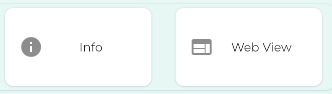
6.10.1 - Info
Another name for INFO could be Page
Info
The Info component is the component most like a “page”.
It allows you to present information to the user.
It can contain media as well as text
Display Mode
Text/Html
You can also include html markup, and/or use the Html Editor
Text/Markdown
If you prefer, you can select the Markdown mode.
6.10.2 - Web View
Include an external webpage in your App
Webview
Webview is like an embedded browser.
You configure webview by giving a URL, and webview presents the webpage
available at that URL.
7 - Objects
Data Structures
7.1 - Object Categories
Object category
Categories of Object
There is really only one kind of Object: a structure with fields and relationships
which map onto a database table.
But then we have three other purposes that we are treating in the same way as objects,
so that we can reuse as much as everything else in Logiak: they share the same UI for
being configured, can be used in much the same places as “normal” objects.
Avoiding proliferation of concepts, is part of minimisation to avoid large learning curve.
User settings
User profile
Lookup table
We’ve conceptualised these three things also in terms of objects.
Data Object
Normal data object - for your Apps to create, update and delete records
Can have relationships
Each type maps to a database table
You can have any number of Data Object types
There can be any number of instances of any of these types
Table Object
Data defined statically
Data maintained offline in a Google Sheet
Each type maps to a database table, but with data
Can have relationships, as long as keys exist
You can have any number of Table Object types
State Object
Not in the database, but local storage
You can have any number of State Object types
Exactly one instance of each State Object exists
No need to create
Can be updated (only)
User Profile Object
Maximum of one User Profile Object type per Project
Requires Apps to have Login
Has auto-fill email field as unique field
Exactly one instance per User
Can be updated
7.2 - Object Types and Instances
Object can be used to mean type or instance depending on context
Object Type
An Object Type is the definition of a data structure. A template for a specific kind of data.
An Object type maps onto a database table when Apps are running on mobile devices.
If you define
an Object type customer with fields “name”,“phone”, as the App is running on device,
there will be an SQLite database table called customer with
columns “name” and “phone”.
Object Instance - a record
An Object instance represents actual data - an instance is a record of one of the defined Object Types
Every instance of an Object Type will contain values for all of the fields and Relationships defined by the type.
Comparison with databases
Logiak Object
Spreadsheet
Type
the definition of the database table (which columns and relationships it has)
Instance
a row in the table, containing data valuess
Comparison with spreadsheets
Logiak Object
Spreadsheet
Type
the column headers of a spreadsheet - definition of what the column contains
Instance
A row in the spreadsheet, containing data
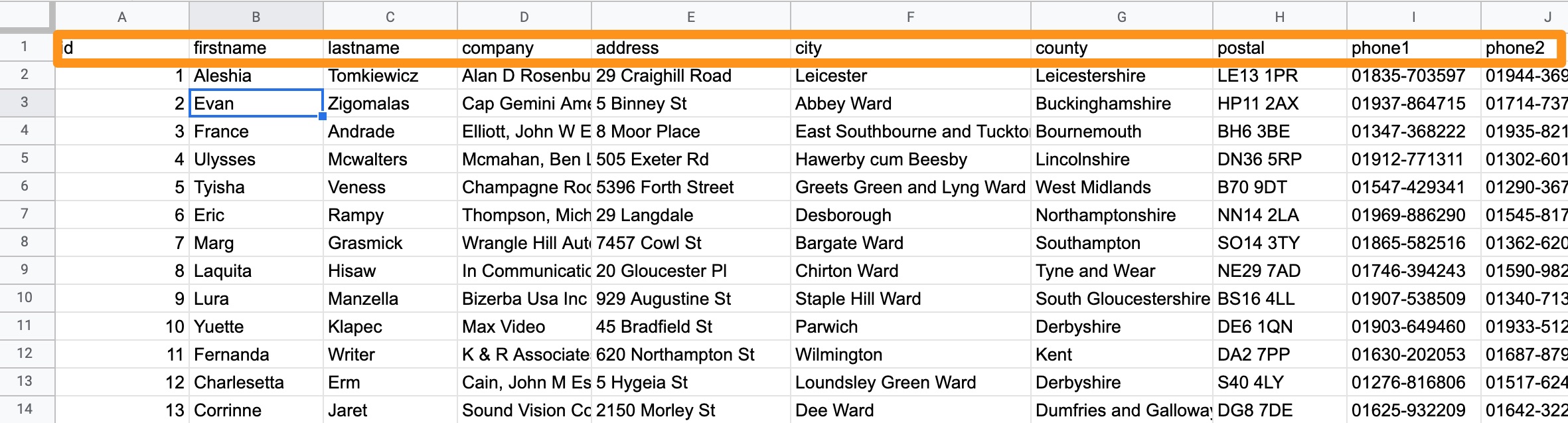
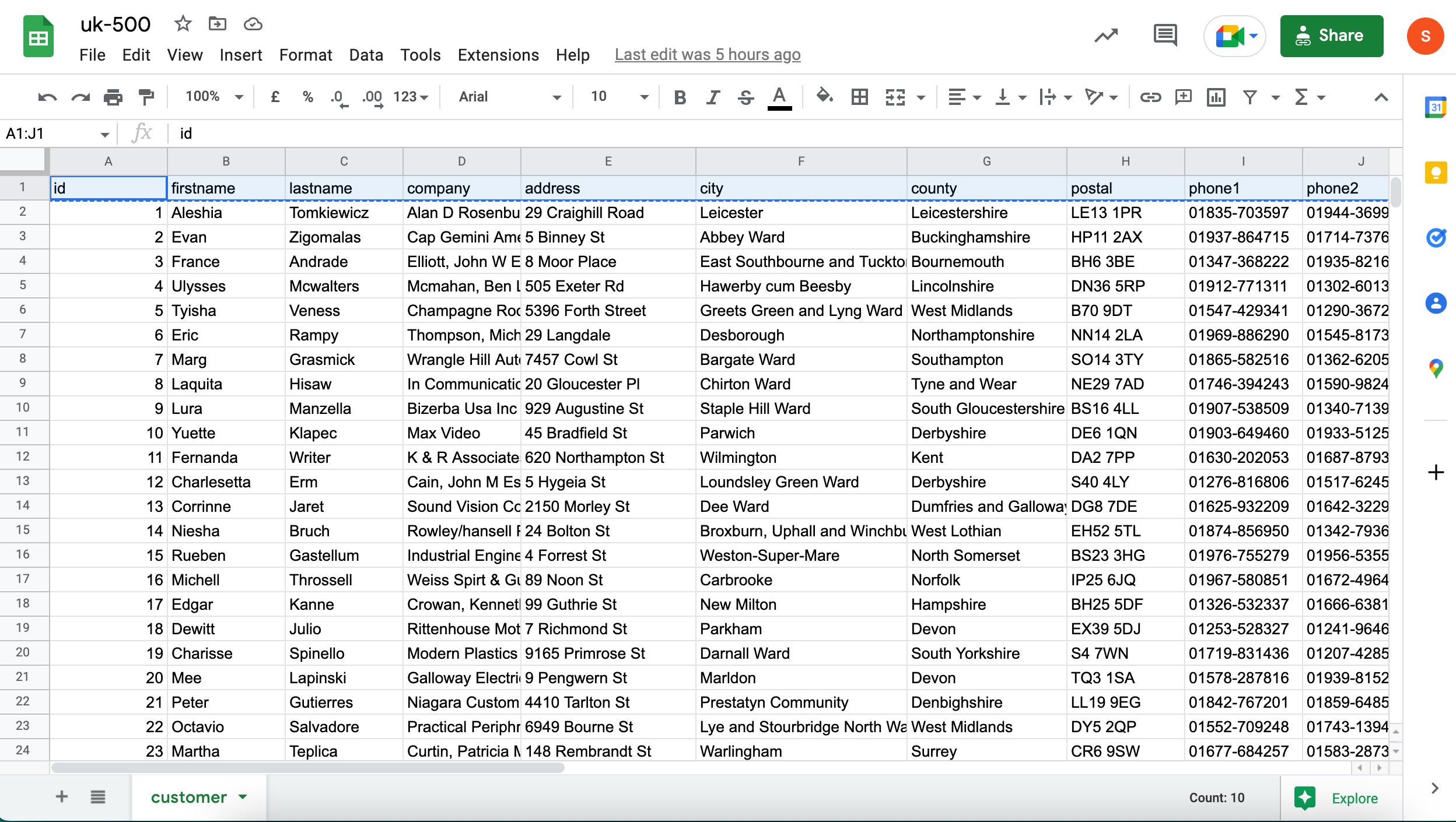
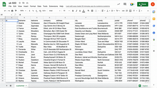
Example spreadsheet
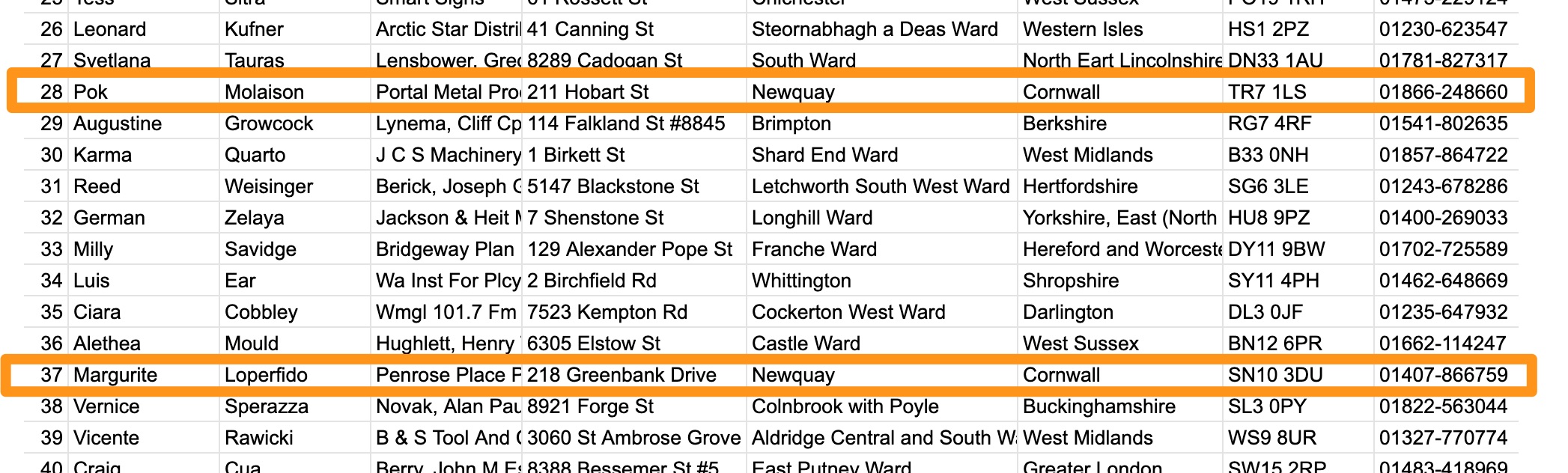
This spreadsheet, for example, would correspond with a Logiak Object type which had the fields:
id
firstname
lastname
company
address
city
county
postal
phone1
phone2
While the rows from 2 onwards each represent an instance of that type
Object field fieldnames have to be “symbolic” - meaning they should not be like a normal name or sentence. They have to be:
lowercase
containing no spaces or hyphens
Field names have to be unique within an Object (you can’t have two fields called remark) for example.
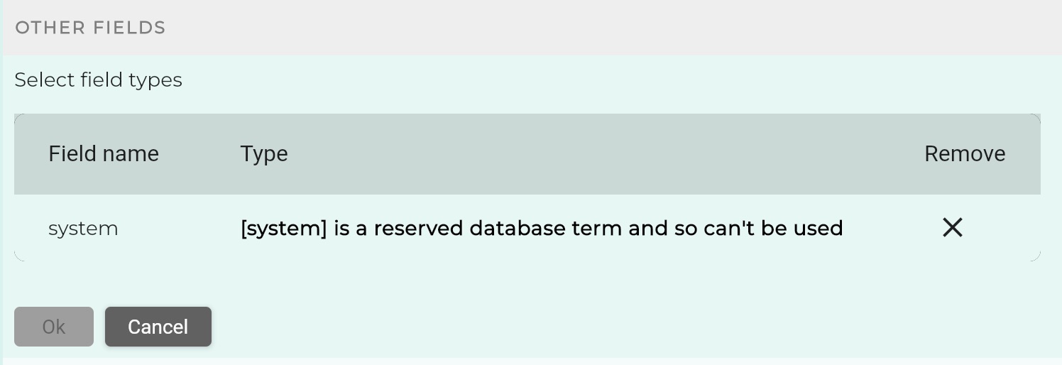
Avoid database reserved words
Object field names will also becomes the names of database table fields, so there are certain database keywords
which cannot be used. Logiak will notify if any of these occur.
Display names
Display names are free text. If given, the display name is used when the field is presented to the user
(e.g. in an Object View), otherwise the fieldnames are used.
Editing display names
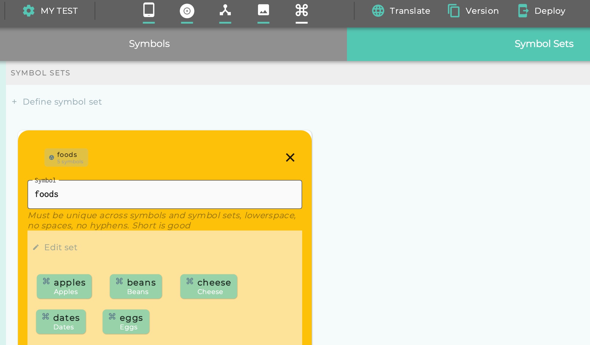
Symbol “Edit sets”
When you have a symbol field, the idea of the user being able to edit fields of an instance
raises an issue. Whereas the user will know how to edit a number, text, or a date, how does
the user know what to do with a symbol field.
Symbols are eseentially Logiak-internal things.
The solution is to select a Symbol Set (defined at the Project level), to be the field’s
“Edit Set”.
Then, when the user goes to edit the value of the field in an editable Object View,
there will be a drop-down menu containing the options within the set.
7.4 - Field Content Tags
Tags give extra meta-information about what a field stores
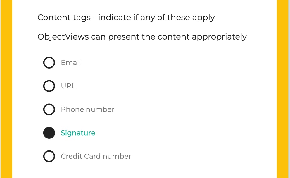
Content tags
We keep the data types to just a few and use tags to note types
of content which should be handled specially.
Example: Email
If you want to store an Email in a field, it makes sense for that field to be a text field.
But when emails are presented to the user, it makes sense that they are not just presented simply as
text - ideally there should be some indication that this is an email, and perhaps the UI should
afford the user of clicking on the email to open a mail client.
This is how you tag a field to denote that it is an email field
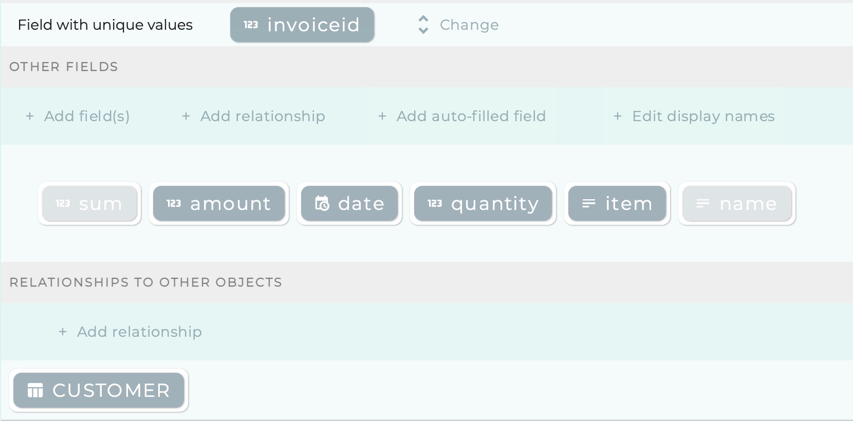
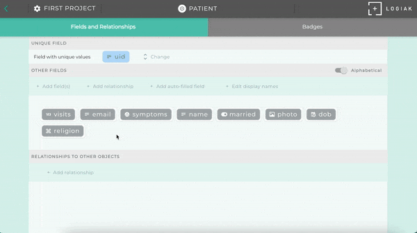
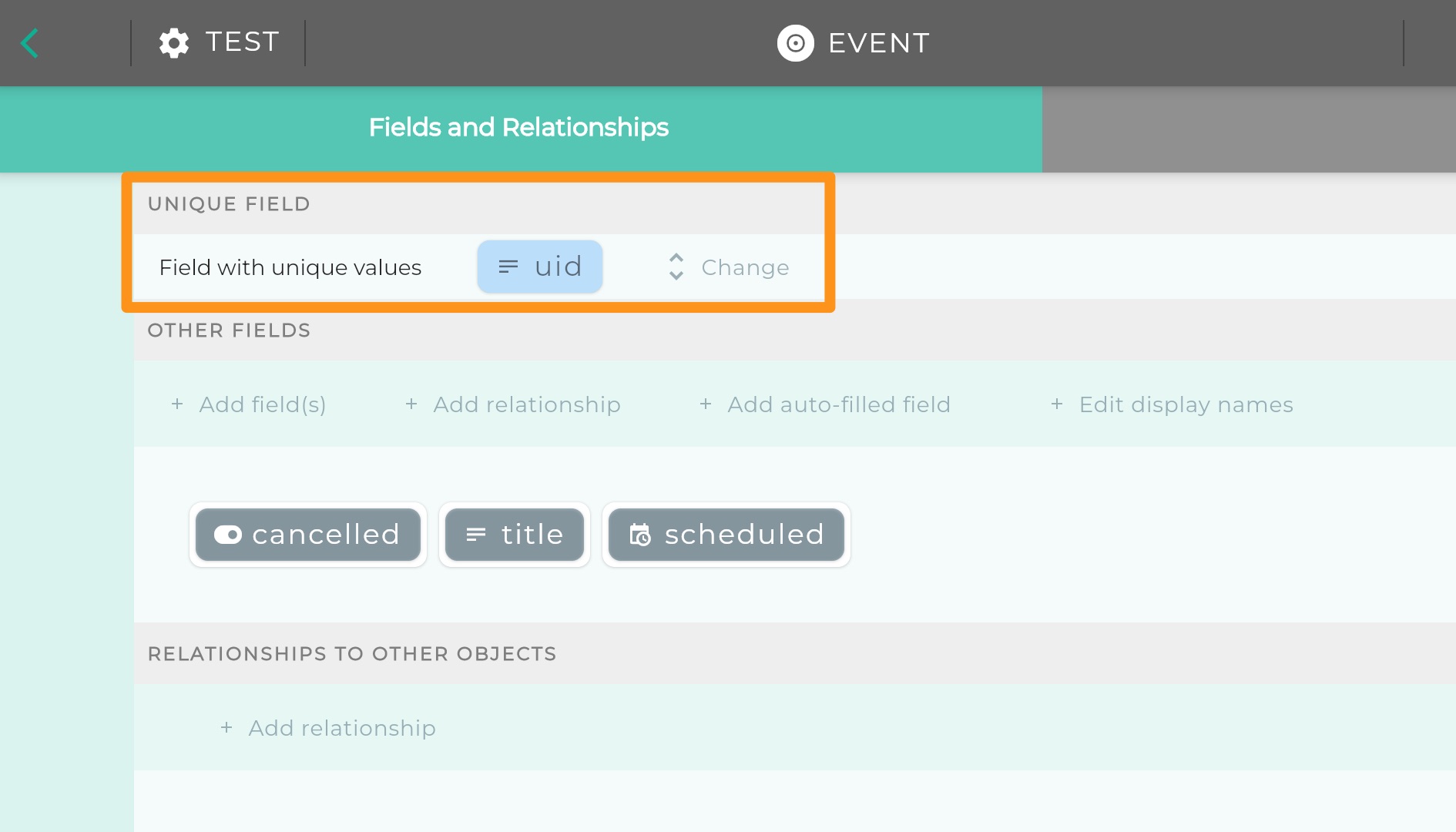
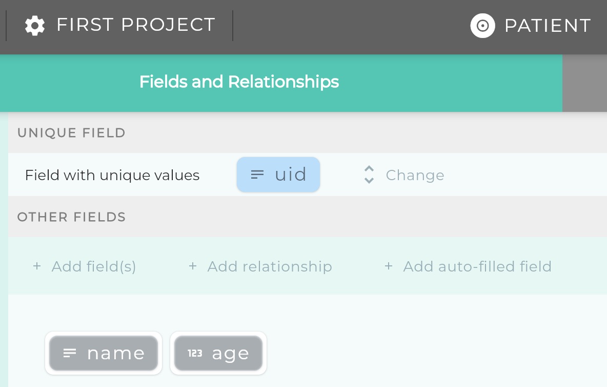
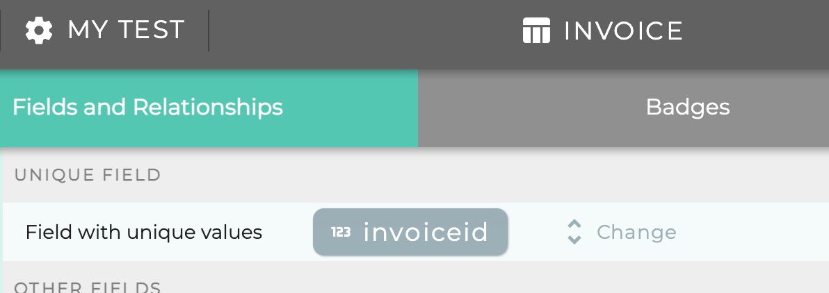
7.5 - Unique Field
Field guaranteed to have unique values for each instance
Field with unique values
There are few restrictions object definitions but one of them is that there must be, for every object,
a field whose values are guaranteed to be different for each instance.
In familiar computing terms, what we are saying here is that every Object must have a Primary key,
with the limitation that the Primary Key must be one field rather than a composite.
UID
For this reason, by default, when an Object type is first created,
an Auto-Fill field called UID is automatically added
and assigned as the unique field.
UID stands for Unique Identifer.
When an Object type is first defined, by default the unique field is assigned as a UID field.
Auto-Fill fields are fields where Logiak assigns values automatically.
So, quite frankly, you don’t need to worry about the uniqueness issue.
But if your data already has an “id” or some field which is guaranteed to be unique for each row,
then you could assign that field as the unique field for that object, and delete the UID field.
Simply click “change” and select the field you want to use as the Field with unique values
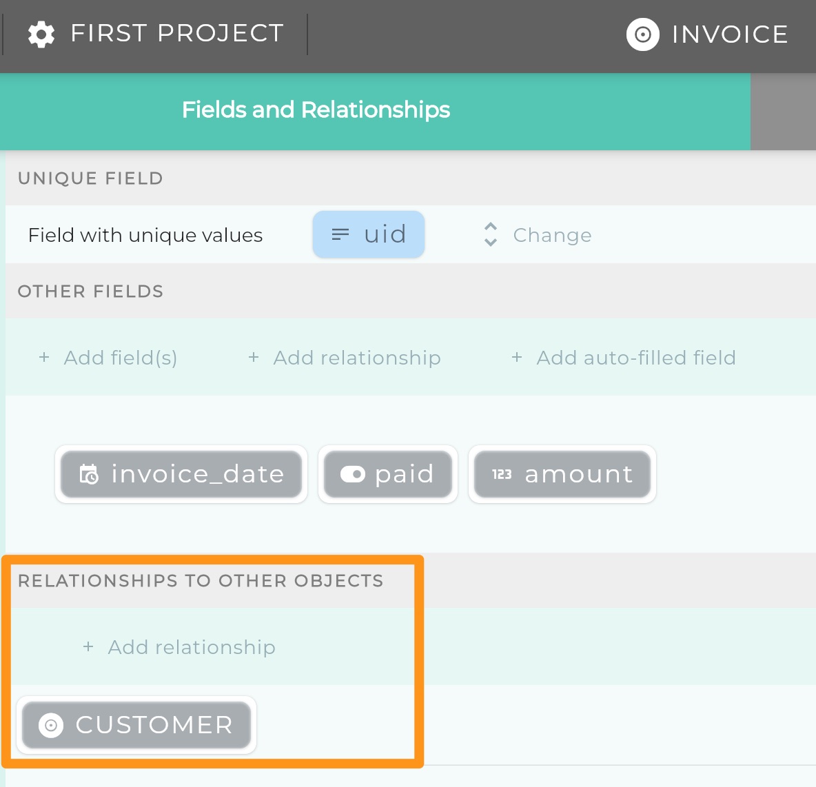
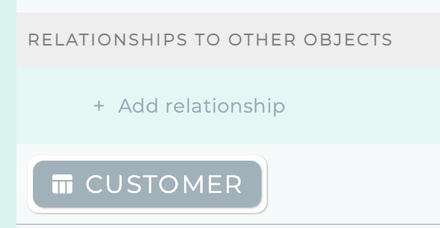
7.6 - Object Relationships
Objects can have relationships to other objects
Relationships
An Object in Logiak is defined by its name and its fields, but also its _relationships- with other
objects.
Relationship example
Let us think of an example to illustrate.
Suppose we have a customer Object which has three fields: name, company and email, and
you bill customers by sending them invoices. Each invoice applies to a customer therefore,
and any customer “has” zero or more invoices which apply to them.
  erDiagram
    CUSTOMER ||--o{ INVOICE : has
    CUSTOMER {
        text uuid
        text name
        text company
        text email
    }
    INVOICE {
        text uuid
        date invoice_date
        number amount
        boolean paid
    }
Same example in Logiak
In Logiak, the fact that each invoicehas a customer is represented explicitly in the definition of
invoice, like this:
This video shows how customer and invoice are configured:
Example of defining a relationship
Relationship values
Relationships are represented by fields at the database level, so in the above example,
when looking at the data in your backend, you would see a “customer” column in the invoice table/structure.
As with traditional databases, the value of that field will be the value of the Unique Field
of the customer object to which the invoice belongs.
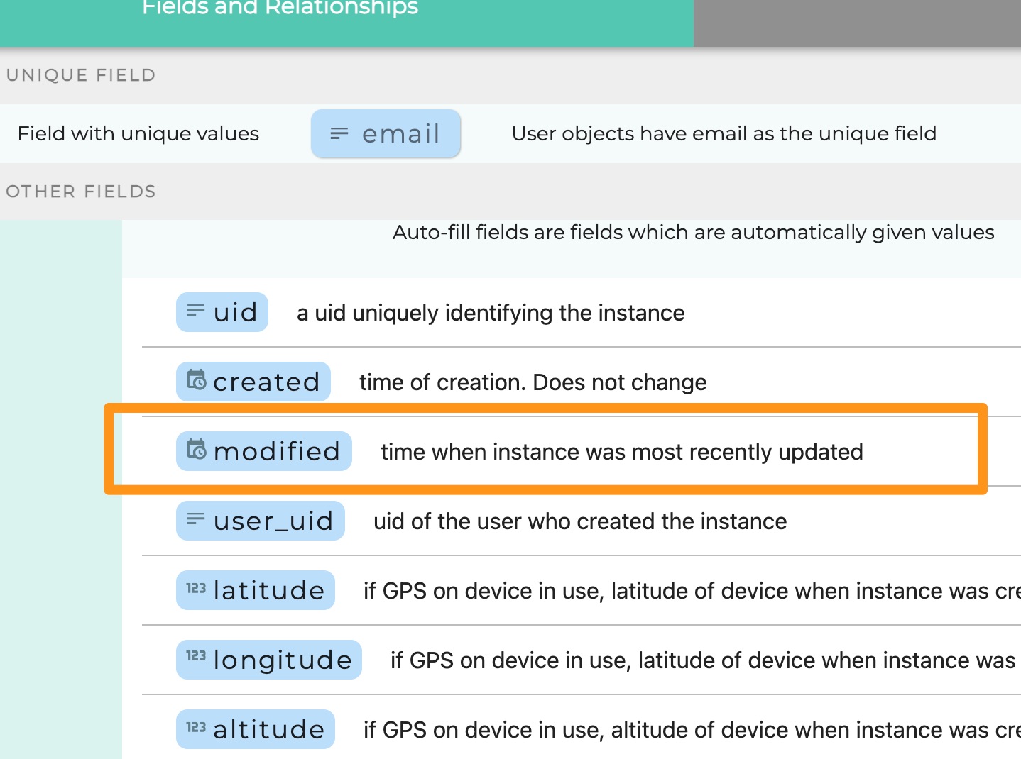
7.7 - Autofill Fields
Object fields which are automatically given values by Logiak
Auto-fill fields
Auto-fill fields are special object fields you can add to an Object
They are automatically given values by Logiak.
They are given values when an instance is created or updated.
UID example
When any Data Object is created, by default it is given a field called uid
and this field is assigned to be the field with unique values (which database people call ‘primary key’).
Note auto-fill fields are represented in light blue to distinguish them from normal fields.
This UID is an example of an auto-fill field. When an instance of invoice is recorded by Logiak,
it obtains values for all fields and relationship from configuration, but the uuid it just
assigns a value itself (and it assigns a UUID).
There are several such fields available and they are all are given specific semantics by the Logiak system:
Fieldname
-
UID
each record is assigned a unique uuid at time of creation. Does not change.
CREATED
each record is assigned time at creation. Does not change.
MODIFIED
initially same as created, is changed whenever record is updated
USER_EMAIL
email of the user who created the record (if anonymous user => this will be null)
USER_UID
Backend system uid of user who created the record
LATITUDE
if GPS on device in use, latitude of location when record was created. Is overwritten on upd
LONGITUDE
if GPS on device in use, longitude of location when record was created. Is overwritten on u
ALTITUDE
-
APP_VERSION_CREATED
the x.y.z of the apk version being used when record was created
APP_VERSION_MODIFIED
7.8 - Data Objects
A Data object is the “normal” database object
Data object is the “normal” database object
What we mean by “normal” here is that a Data object very much corresponds
with a spreadsheet on the one hand, and with a database table on the other.
A Data Object is a defined structure for holding certain kinds of data.
We will pretend that these represent a table of important Customers.
Normally, customers may be dynamic data rather than static data, but this is convenient for illustration.
How to define a Table Object
These are the steps, that we will explain below. The user interface is also very supportive of these
steps.
Prepare data in a Google Sheet
Create the Lookup Table Object
Add fields to the Object corresponding with Column Names
Give Logiak Access to read the Data
Paste in the Google Sheet Link to let Logiak read the data.
Prepare data in a Google Sheet
Open a Google Sheet and copy and paste your data table in
Make sure the data is in contiguous columns (i.e. no empty columns) and that the first row of the sheet
contains column names.
Column names
Column names will correspond with object field names, so they, like object field names,
need to be lower-case, without spaces or hyphens.
Create a Lookup Table Object
Now let us create a Lookup Table Object in our project. Call it customer
You see that for Lookup Table Objects, there is a third tab called Sheet which
guides us step-by-step through the configuration we need to do to be able to use
the data in our App.
Add fields to the Object corresponding with Column Names
Make sure you have a column with values which are unique for each row
copy and paste the column names into the fieldnames box and select the data types
select the unique field..
Give Logiak Access to read the Data
Click on the Sharing button of the Google Sheet
Change the Access to “Anyone with the Link”
Then copy the Link
Paste in the Google Sheet Link to let Logiak read the data.
7.10 - State Objects
Think “settings”
State is NOT in the database
A State Object has nothing to do with the database.
It is a collection of information stored locally on a device.
So it is a very different thing in a way, but it is treated as an Object along with all
the others, which means that you can refer to data within a State Object instance in
exactly the same way as with all the others
Single instance
There is always only one instance of any particular State Object, but you can
define any number of State Object types.
Available everywhere
A State object instance is “available” everywhere, meaning you can locate an Object View
for the State Object anywhere in the Component Flow and it will work.
In contrast, normal data object have to
be located downstream of a user selection.
7.11 - User Profile Objects
User Profile objects define profiles
User Profile Object
In defining the fields of a User Profile object, you are defining the information
maintained about each user, whether the users do that themselves, or it is done on the backend.
User Profile Object is like any other..
You define a User Profile object just as you define a Data Object.
There are some special characteristics of User Profile objects:
Particularities of the User Profile Object
You can define a maximum of one User Profile object per project .
Apps using User Profiles must have Login as their START component, so that users authenticate themselves.
User Profile objects have no relationships with other objects
Editing a User Profile
The User Profile component can be used to give users access to ,
and the ability to edit, their own profile information.
7.12 - True/false fields as Switches
True/false fields play a big role in opening up possibilities for configuration
Switch
A switch is something with two states - on and off.
A true/false field has two states: true and false.
There are several places within Logiak where true/false fields of an Object can be used to
guide how the App behaves.
Actions Component
List row formatting
List Filtering
Custom Layouts
7.13 - Badges
Badges are how an existing Object type can be used in Maps and Cards components
We want to be able to have Cards and Maps which have clickable elements. Not only should they be clickable,
but they should be the selection of a record, as with many other components in Logiak.
Then we can have these components as integral parts of chains of user interactions within an App -
a point can be clicked and a record therefore identified, which can lead to other displays and functions
relating to that record.
For example, if we have a system dealing in “incidents” of some kind, and the incident data includes a lat,lon pair,
then we can have a map where the selection of a marker in the Map is a selection of a whole incident.
The problem Badges address
There are some components which require not only that you specify an Object type, but
also that the Object has specific kinds of data which the component makes use of.
For example, to configure the Map component, as with many others, you simply specify an Object type.
Then, the Map component plots a location, one for each Object instance of the given type.
To plot points, the Object type evidently needs to contain the right kind of information: either latitude and
longitude values (which makes it easy), or else some address information that we can
use geodecoding to find latitude and longitude from.
So it seems like you would have to define Objects specifically for use in Map, with fields labelled “latitude” and
“longitude”.
However, you might already have data with fields not named in that specific way.
Maybe the fields are labelled “lat” and “lng” or something, and maybe it is very inconvenient or
for whatever reason impossible to do so.
This is where Badges come in.
To use an Object with Map, it doesn’t have to have any specific names for fields, it just has to have
the right kind of information. If it has the right kind of information, you can make it have the “location”
Badge. Any Object type with the Location Badge can be used with Map.
How Object is given a Badge
All you have to do is to go into that Object, go to the Badges tab, and indicate from which field
the latitude value should be taken, and from which field the latitude value should be taken.
Then your Object has the “Location” badge. The Map needs not a specific object, just any object
with the Location badge.
Adding LOCATION badge to an Object called city
Polymorphism
In computing people use this fancy term to refer to when one can treat one thing
as if it were also another thing (poly = many, morph = form).
8 - Processes
Processes are at the core of Logiak: powerful interactive dialogs
8.1 - Process Overview
What are processes?
Process
A Process is an interactive dialogue which allows you to compute things and guide
the dialogue with the user by defining conditions which control the flow.. Finally, it also
lets you update the database.
Using an expression to calculate Body Mass Index (bmi)
Five tabs
So you can see from the example that a Process is defined using five tabs!
It sounds like a lot, but it is precisely the clear separation of things,
most importantly the clear separation of Declarative Logic and Procedural Logic,
which makes it possible to achieve complex results from seemingly simple steps.
The central Tab, labelled “Process” is where you land by default, and this is where
the main Procedural logic is defined - the Steps of the Process.
Process Steps
Processes are step-by-step interactive dialogues with users, and at any time, you can test out the
interactive dialogue you are creating, using the Debug Tab
Many steps define interactions such as yes/no questions, but it is also
possible to have other steps which execute background actions such as updating a variable.
Steps can be grouped in sections.
So, there are three kinds of Process elements which you can add to the sequence.
Process steps can be added in the Process tab. There is also an Updates tab where you can also add actions.
The reason for the separation between Process and Updates between the two: within the interactive dialogue,
it is important that the user can go backwards instead of forwards,
We also want to have the ability for a Process to do things like make database updates and
send mail notifications.
It would be unfortunate to have the user go forwards and backwards
over a send mail action - the mail action would be executed more than once.
The same is true of database changes : it would be very difficult to handle the user going
forwards, executing a database update action, only to want to go back (and have the database change undone).
So, the action steps in the Update tab are all executed once the User has completed the steps under Process.
The Update tab contains no interactions, so from the User’s point of view, the Process has completed
once the steps in the Process tab have completed.
Once the steps in the Process tab have completed, the User cannot go backwards. After Process, the
Update actions, if there are any, are executed.
are executed once User has completed Process steps
Once User has completed Process steps, the Process is over as far as the User is concerned
User cannot go back
Logic tab: steps can be protected by preconditions
It is possible to define conditions in the Logic tab, and in the Process and Update tabs,
to set these conditions as pre-conditions for an interaction, an action, or a group of them, to be
executed.
At any point, you can test out the steps and the logic you’ve defined by using
the step-by-step debugger.
The debugger has sub-tabs which show the current values at each step, and also the
evaluation status of all conditions.
8.2 - Logic
Logic
8.2.1 - Declarative Logic
Declarative Logic
What is declarative logic?
Declarative logic is the kind of logic we are most familiar with as human beings - it is reasoning
about states of affairs.
Jim is 17 years old
Driving is permitted from 18 years of age
Jim cannot drive yet
These are three declarative statements.
Statements are things which can be evaluated to be true or false.
If the first two statements are true, we can conclude the third statement is true.
Declarative Logic in Logiak
If the above is easy to understand (which of course it is), that is good because,
as you will see, Logiak lets you do a huge amount of computation simply by creating declarative statements like this.
The separation between declarative and procedural thinking is one of the core selling points of Logiak
We call these statements: conditions
We refer to these statements are Conditions, because of one primary role they play in Logiak Processes,
and that is as pre-conditions for Process steps.
But definitions would also have been a good name for them, as would statements.
There are three kinds of Conditions you can define
Then we define a condition Child has no allergies by simulating a possible user
response (in this case user selects “no”) and giving a name to the state of affairs described by that response.
define a condition Child has no allergies
8.2.4 - Meta condition
A condition defined from other conditions
Meta Conditions
A Meta Condition is a statement which can be true or false.
Its truth depends on the truth of the sub-conditions it contains.
Example: Defining child is an infant with fever
Suppose we have a value condition “Child is an infant”;
Child is an infant
age-in-years < 5
And suppose we had a second value condition “Child has fever”;
Child has fever
temperature > 37.5
We could define a meta-condition with both of these conditions as sub-conditions, and
choosing to require ALL sub-conditions to be true.
We might name this meta-condition: “Child is an infant AND child has fever” or “Child is an infant with fever”
Child is an infant with fever
Child is an infant (age-in-years < 5) AND Child has fever (temperature > 37.5)
define a condition Child is an infant with fever
Note that named condition which are defined but nowhere used are in a light font.
When conditions are in use (e.g. as subconditions of a meta condition), their names are presented with a regular font weight.
Meta Conditions can be sub-conditions
Meta conditions are conditions like any other, so they can be used as sub-conditions in defining
other meta-conditions.
Once you have defined “Child is an infant with fever”, you can simply select that as a sub-condition
in defining a further meta-condition
Paracetamol should be prescribed
Child is an infant with fever (age-in-years < 5 AND temperature > 37.5) AND Child has no known allergy (..)
8.2.5 - Preconditions
Using the logic defined
How to use the logic defined
When we have defined conditions, we can use them to affect the
execution of the Process.
We can set any condition to be a precondition for a step.
If a step has a precondition, it is only executed if the precondition evaluates to true.
Example: “prescribe paracetamol”
create prescribe message - 2. set precondition on message - 3. debug to show message appearing - 4. debug to show message not appearing
8.3 - Interactions
User interactions
You can choose to make an interactive dialogue with any number of these interactions
8.3.1 - Process Interactions Overview
What are process Interactions?
Interactions
Interactions are Process Steps which, if executed, engage the user.
By default, each Interaction appears on its own screen, but it is possible
to display multiple interactions together by defining screens
Find yes and no under System symbols and amend their display names.
Please note: this will alter the presentation of ALL yes/no questions in the Project
Can I completely customize the yes/no options?
Answer
Yes, but the way to do this is use a Select question, where you are free to choose the
number of options, text of options, etc.
In a sense, yes/no is superfluous because of what you can do with Select questions, but it is something used so frequently,
that it is good to have it as a separate, simple option.
Alternative yes/no controls
If you don’t want the vertically arranged radio buttons, you can select a different kind of interaction.
The Value of a yes/no question is true/false
The user’s response to a yes/no question yields a value with DataType true/false.
If the user selects “yes”, the value is true, otherwise false.
8.3.5 - Select Question
User chooses one or more options
Select question
A select question is where you ask the user a question, and a set of **options++.
The question could be a single select, where you are asking the user a question
such that only one option could count as a valid response.
OR it could be a multi-select in which the question you have posed admits of more than one
possible option selection in response.
How to ADD a select question
Enter question text
Decide: do you want the user to be able to choose a Single option, or Multiple?
Enter the initial text of options, one per line (can be modified later)
How to RE-ORDER options
Edit the question by clicking on the edit icon
Click on the Options tab
Click on the two-bars icon against an option and drag vertically to re-order.
How to DELETE an option
Edit the question by clicking on the edit icon
Click on the Options tab
Expand the option you would like to delete.
Click on the trash icon at the bottom of the Option card (The icon might not be there: see below)
NOTE
If any option is used in defining any Select Conditions, the option will not be deletable
until all conditions which use it are deleted.
How to choose different input controls
If you don’t want to use radio buttons/checkboxes, there are other options such as toggles, switches..
Edit the question by clicking on the edit icon
Click on the Input Controls tab
select-input-controls
The Response Value of a Select Question
The response value of a select question is a set of symbols : the set of
symbols associated with the options selected by the user (can be empty).
You define a select question by defining a number of options.
Each option is represented by a symbol
The user selects one or more (if the question is a multiple select) options in responding to the question.
The user’s selection is represented in the data by the symbols associated with the options selected. It is a set.
Where can I see/edit which symbol is associated with an Option?
Select to edit the question
Click on the second tab Options
Expand the option you want to edit
This is shown here:
Using Project-level symbols
The options in a Select question might involve concepts which have relevance
not only in a single Process but across the whole Project.
You can ensure that you represent such concepts consistently across Projects by defining symbols at the
Project level and choosing to use them within the Process as option values.
Using project level symbols
How can the response value be recorded in the database?
Everything is recorded in a field or relationship of an Object.
This is another interaction making use of the device camera (i.e. for devices only with cameras).
It makes it possible for the user to scan in Barcodes and QR codes within a Process.
The Response Values of both of these can be mapped to a Text field of an object.
Showing in Object View
Unlike Signatures, when viewed in an Object View, we don’t reproduce the codes
of course, but the values which have been read from them.
These are in text form. They may or may not be URLs. If they are URLs, we endeavour to present them as active links.
With a barcode, the value is likely to be a number. It will be stored in a text field. We assume it
to be an identifier rather than a number to calculate with.
User scans a QR code
User scans a barcode
8.3.7 - Dynamic Select Question
User selects from options which may be dynamically determined
Dynamic Select - select from a set
A Dynamic Select question is very much like a Select question,
except that it has no options defined - the options come from elsewhere.
Sources of Options
There are two possible sources for options -
You can use any set value within the Process (e.g. the value of a preceding Select question)
Or you can use a Symbol Set defined at the Project level
Using a Process value as source
Options chosen by user are the choices in subsequent question
Options are symbols defined in a set at the Project level
8.3.8 - Text/Number/Date Input Questions
User enters some text
Input Questions
These input questions are straightforward to understand - we can
request text,number or date input from the user.
Text Input question
How to ADD a Text Input question
Using an input mask with a text-input question
Build up a mask to format the value entered, and let the user just enter numbers/letters
How to define placeholders in the mask:
Use “#” for numbers
Use “A” for letters
Use “?” if a position can hold either number or letter
Input modes
email
credit card
phone
Number Input Question
Defining upper and lower bounds
Input controls
Date Input Question
Defining upper and lower bounds
Input controls
Calendar (default)
Spinners
8.3.9 - Object Select Question
User selects an object instance
Object select
An Object select question presents the user with a collection of instances of a particular object,
and the user selects one of them. (Imagine showing the user a spreadsheet and asking the user to pick a row).
Value is an Object Instance
So the response value of this question is a whole object instance - a collection of fields with values,
and you can access those individual values within the instance in other steps of the Process, by using
dot notation
User selects an instance when presented as a table by selecting a row:
Configuration
To configure this, you must select fields of the Object. Each field becomes a column of the table displayed
You can add filters so that not all of the instances of the Object are displayed, rather only a selected sub-group.
2. User selects via successive drop-downs
The other mode lets you choose and order any number of fields, and then the user is presented
with drop-downs which successively narrow the search, until the user ultimately identifies a single
instance.
This is typically used with addresses, for example, where a large geographical region can be selected at
first, followed by the selection of all sub-regions within that region…
Example
If we look at the uk-500 data (modified for illustration).
The data is a table of customers.
We select three fields and order them: county, city, company
The first drop-down presented to the user contains an alphabetical list of all unique entries in the county column
Once the user has selected county, this narrows down the search.
So the next drop-down presents an alphabetical list of all unique entries in the city column where the county column contains the user’s selection
Once the user has selected county and city, this narrows down the search further.
The final drop-down presents the user will all company which have county = and city =
8.3.10 - Objects Table
Display only: user is shown some data in a table
User views data in a filtered table
8.3.11 - Recording Photo, Video, Audio
How to take photos, record videos, record sounds
Record media and store in database
Your project might deal in regular data, but also you might have a need for your users to record photos -
of building problems, of people, or whatever.
Similarly, you might need to record video, or audio.
Logiak Processes has interactions for these tasks. Of course, the device on which the App is running has
to be suitably equipped with camera and microphone.
The media is recorded by the device, and then pushed by Logiak to the backend Storage, so that it
can be shared by other users if required, and retrieved if the device is re-initialised.
Like all others, you specify question/prompt text and can assign a meaningful
response value name.
Sample interactions on a mobile device
Here are some videos showing what the photo/video/audio recording interactions look like for a user
on a device.
Taking Photo
Recording Video
Recording Audio
8.3.12 - Signature Input
User signs name
Signature
This interaction allows you to ask the user to provide a signature, with the assumption
of course that the user is using a touch screen device, such as Android or iPhone/iPad.
It is really simple: the user is presented with a canvas on which they can write with hand/pen.
Of course, you might make other uses beyond signature. It could be used to permit the user
to describe a shape by drawing.
Storing signature
The signature has to be mapped to a Text field in an object.
The field should also be given the appropriate content tag:
Viewing in Object View
A field with the signature content tag will be displayed correctly as a signature in an Object View
Caveat
This is not what is meant by an electronic signature
and certainly has no legal status.
User signs name
8.3.13 - Text recognition
User scans in some text
Text Recognition
There can be situations where information on cards, badges, or written on pieces of paper,
is really information you need in your data processing.
For example, maybe you are in a situation where your clients each has a badge containing
their ID, and you want to introduce a system of recording information about their visits,
but you want also record the client ID for each visit.
If the ID is a barcode or QRCode, then you can use the code reader interaction ,
but if it is just printed in text form, then your users would have to enter it, which could be
time-consuming, or error-prone.
OR, you could try using this Text Recognition interaction.
Text Recognition interaction
This interaction gets the user to take an photo containing the text which needs to be scanned in.
Logiak is able to make a good fist of extracting the text values from an image.
Examples
Reading text of the label of a medicine bottle
Reading the text on a fridge magnet
Edit option for corrections
The scan might not always produce the target text perfectly, which is why
there is an edit option once the text is scanned in, which allows users to correct errors.
But as the videos shows, the scans can be good, and practice in getting the camera focussed on
the text you want, and only that, can improve the quality a lot.
Uses
This is used typically to scan in small amounts of text, rather than long chunks.
It may be used for scanning labels, or text from information cards, ids…
8.4 - Values
Values can be from variables, fields of input instances, etc.
8.4.1 - Values
Basic building blocks of Process Logic
Values
What are values?
Values can be simple or complex
Simple values
Simple values are numbers, truth-values (true & false), bits of text. Examples:
4389
true
Billy Bunter
Complex values: Object instance
Logiak also allows values to be Object instances which is a record made up of several fields,
each of which have (simple) values.
Value names
In a Logiak Process values have names.
These are usually short and “symbolic” (i.e. lowercase, no spaces or hyphens ..), but should seek to be mnemonic (remind you what value they represent).
For example, the “simple” values above might have names such as:
invoice_id
invoice_is_paid
customer_name
Referring to simple values
Names let us refer to values, even when we don’t actually know what the values are.
Everyone is likely familiar with maths at school where values get associated with names: “let x equals 5…”
For simple values, surrounding the value name with braces gets us the value
{x}
This expression might represent the value 5
{customer_name}
This expression might represent the value Fred Bloggs.
Read more about how to refer to values, including how to refer
to field values within object instances´values
Four sources of values in Logiak
User Inputs
User responses to questions in the Process are named values
Surround value names with braces (squirly brackets) to access the current value.
Example: if you have a value called age-in-years (could be a variable, or a user-input value), this expression represents the
value represented by the name:
Named values can be presented to the user in Process steps by surrounding the value name is braces.
Example: if you have defined a variable named age-in-years, you can inform the user about
this value in an interaction, by including something like the following in the interaction text:
To use this action you need to specify an expression to calculate a new value for the variable you are updating.
Example variable update
For example, suppose you have a value called amount and
you want to update a variabletax so that its value is 16% of the invoice value,
you can give the following expression to an Update Variable action to update tax
For example, suppose you have defined a variable invoice-value and
you want to update another variable tax so that its value is 16% of the invoice value,
you can give the following expression to an Update Variable action action to update tax
{age-in-years} * 16/100
How to DELETE a variable
A Variable can be deleted only when there are no references to it.
When that is true, the variable will appear in lighter colors, and moving the mouse over it
will expose a trash icon
Deleting a variable
How to view the USES of a variable
When a Variable is not deletable, it is because it is in use somewhere within your project, and to
delete it would be to create the conditions for a software crash.
If you want to know where it is being used, Logiak can tell you:
One can also define functions, which are values dependent on other values
You can also think of functions as variables which are updated at every step of the Process.
Example: defining a tax function
In Convention, we show an example defining a variable called tax,
and using an update variable action to give it a new value after the user enters an amount.
Here we can see a different way of achieving the same thing: defining a function called tax which
is dependent on amount
Assume user is asked for an amount (a number) 2. Define function called tax to calculate value based on amount 3. Present the result to the user
8.4.5 - User inputs
Values also come from the user
User inputs
If you have a number input question in the Process, that has an associated value name
which is initially generated for you (the generated names are like v1, v2, etc), but which
you can edit to be something more meaningful at any time.
Suppose you have defined a patient object with just three fields (uid,name,age):
Now let’s look at creating a Process, and the first thing we will do in the Process
is go to the Values tab and say that this Process has a patient as input
Access value of instance
What can you do in the Process with the input?
You can access the values in the patient record which has been passed in in both
actions and interactions of the Process by using the Logiak convention for variables:
Presenting a value from the input instance to the user
Defining condition on input field value
Defining variable with input field value
8.5 - Actions
Actions
Process Actions
Process actions are steps which can be included in a Process.
Like all steps, they are executed unless they are nullified by some precondition being false.
We add a text display where we include the bmi variable to inform the user of the value of bmi which has been computed
on the basis of the input values.
The value calculated is rounded to the nearest integer because we set the bmivariable to have zero
decimal places when we created it.
We could edit the decimal places of the Variable for greater precision.
Using an expression to calculate Body Mass Index (bmi)
Calculating a number of periods (months, weeks, etc.) since/until …
Another way of calculating a new value for a number Variables you might want to use
is by determining a number of periods- how many months/weeks since/until from one date to another date.
Imagine you are creating an App to advice pregnant women.
As an approximation to gestation date, you may take the date of last-known menstrual period (LMP).
Then, to give good advice, your App may need first to figure out how many weeks along
any particular woman is.
This is how we can compute this in Logiak:
Using an expression to calculate weeks since a certain date
2. Updating a Date Variable
We can use the example of pregnancy here too to illustrate one way we might want to
calculate a new date value.
If we know a woman’s LMP (Last known menstrual period), we can also know the EDD (expected
delivery date) by figuring out what the date is 40 weeks after the LMP date.
Here we create a variable edd to represent Expected Delivery Date, and calculate a value
for that by explicitly saying we want the date which is 40 weeks after LMP (Last known menstrual period)
Logiak builds an expression for us.
Using an expression to calculate EDD
3. Updating a Symbol Set Variable
The following video shows creating and updating of a set Variable.
This action fetches an object instance from the database which becomes the value of this action.
value is an instance
The value of this action has the data type object instance.
You can use dot notation to access its constituent field values.
The fetch instance action needs to know which instance you want.
We describe this by
thinking of which instances we might want to consider (= defining filter conditions)
then thinking how we might sort that collection of instances so that the one we want is first.
In fact, there are three steps to configuring the fetch, and they appear in this order:
You specify how to sort the objects
2.Then you say which you want to pick from the sorted list (normally the first, but you might want second, third etc)
You can also add field conditions to narrow down the selection to a specific collection
Example
Suppose we needed to
Fetch the invoice with the largest amount from the past 12 months
you would configure it like this:
sort by the amount field
pick the first instance from the sorted list
and add a field condition on invoice date so that list you are picking the instance from contains only invoices from past 12 months
Fetch Specific Instance
If you know the primary key of the instance you want to fetch from the database, you configure like this:
choose to sort by any field
pick the first instance from the sorted list
set a field condition on the unique field, specifying that the value of that field must include
8.5.3 - Fetch Aggregate Number
Calculating an aggregate number from the database
Fetch aggregate number
This action allows you to query the database to find out things like:
What’s the largest invoice amount we've had so far?
What’s the average score students have gained on this test?
You can also add conditions and narrow the query
What’s the average score female students have gained on this test?
The numerical result will be stored as the value of this action
8.5.4 - Stop
Stop
Stop Action
This is a simple action which, when executed, stops the execution of the Process.
No subsequent Steps are executed.
8.5.5 - Jump
Dreaded goto
This is the dreaded GoTo
Use sparingly
8.5.6 - Expressions and the Expression Wizard
Expressions
Expressions
To update a number variable with a new value, you can provide a new value directly,
or you can define an expression from which the new value can be calculated.
The expressions you can define are the normal arithmetic expressions such as
(3 * 4)
Simple expressions, but no operations, blocks of code,
control flow statements.
It supports a syntax that is common to most programming languages, including systems such as Excel.
Of course, what makes this useful is that you can calculate a new value for a variable
with an expression which includes other values from the Process.
The way you do this is by building the expression as normal, but quoting other values
which you want to include.
So if you have a variable called amount and you want an expression to calculae 16% tax,
you could use the expression:
({amount} * 16/100)
Expression Wizard
As you are editing an update expression, you may well have forgotten exactly what name you
gave to a particular value in the Process.
Instead of having to quit the editor to find out, you can make use of the Expression Wizard.
Ths formulates expressions for you, and then offers you the ability to copy and paste them in.
When you are calculating numbers based on other numbers, sometimes
you get unfortunate situations.
One of them is when you are wanting to divide x by y, but the y has the value zero.
Division by zero_ is impossible and yields infinity, which is most likely not what you intended
To avoid a crash, for cases of division by zero, we arbitarily / pragmatically assign the result to be 0.
Similarly, if there is a division by zero with a multiplication (e.g. (0/0)*100)),
the result is NaN which is Not A Number.
In such a case, we also arbitarily assign the result to be 0.
8.6 - Sections
_Sections-
8.6.1 - Grouping Sections
Grouping steps is important for structuring large processes
Grouping steps into Sections
Grouping is not a UI concept, but an pretty essential tool for structuring Process steps
as the Process grows large.
Preconditions
You can attach a Precondition to a Grouping section and all of the steps it contains,
and all of the steps they contain (i.e. all of the section’s descendents) will
NOT be used, unless the condition evaluates to true.
8.6.2 - Screens
A screen is where you can arrange more than one interaction
Screens
By default, every interaction you include in a Process will be shown
to the user by itself, one after the other.
But you may well want to show some interactions together on the same screen.
For this, you can group them in a Screen.
Screens contain interactions only
Unlike a Grouping Section, a Screen cannot contain other screens, nor can it contain any Actions.
A Screen can contain only interactions.
Screens can have custom layouts
The way you arrange interactions together may be different for devices with narrow screens, as
those with large screens.
You can define custom layouts for a Screen, and thus make it adaptive to display width.
8.7 - Updates
Updates are also Actions
Process Update Actions
Process update actions are steps which can be included in a Process.
Like all steps, they are executed unless they are nullified by some precondition being false.
8.7.1 - Grouping Sections
Grouping Updates
Grouping sections within Updates
Grouping sections in the Updates tab function the same
as Grouping sections in the Process tab
8.7.2 - Instance
A short lead description about this content page. It can be bold or italic and can be split over multiple paragraphs.
This is a placeholder page. Replace it with your own content.
Text can be bold, italic, or strikethrough. Links should be blue with no underlines (unless hovered over).
There should be whitespace between paragraphs. Vape migas chillwave sriracha poutine try-hard distillery. Tattooed shabby chic small batch, pabst art party heirloom letterpress air plant pop-up. Sustainable chia skateboard art party banjo cardigan normcore affogato vexillologist quinoa meggings man bun master cleanse shoreditch readymade. Yuccie prism four dollar toast tbh cardigan iPhone, tumblr listicle live-edge VHS. Pug lyft normcore hot chicken biodiesel, actually keffiyeh thundercats photo booth pour-over twee fam food truck microdosing banh mi. Vice activated charcoal raclette unicorn live-edge post-ironic. Heirloom vexillologist coloring book, beard deep v letterpress echo park humblebrag tilde.
90’s four loko seitan photo booth gochujang freegan tumeric listicle fam ugh humblebrag. Bespoke leggings gastropub, biodiesel brunch pug fashion axe meh swag art party neutra deep v chia. Enamel pin fanny pack knausgaard tofu, artisan cronut hammock meditation occupy master cleanse chartreuse lumbersexual. Kombucha kogi viral truffaut synth distillery single-origin coffee ugh slow-carb marfa selfies. Pitchfork schlitz semiotics fanny pack, ugh artisan vegan vaporware hexagon. Polaroid fixie post-ironic venmo wolf ramps kale chips.
There should be no margin above this first sentence.
Blockquotes should be a lighter gray with a border along the left side in the secondary color.
There should be no margin below this final sentence.
First Header 2
This is a normal paragraph following a header. Knausgaard kale chips snackwave microdosing cronut copper mug swag synth bitters letterpress glossier craft beer. Mumblecore bushwick authentic gochujang vegan chambray meditation jean shorts irony. Viral farm-to-table kale chips, pork belly palo santo distillery activated charcoal aesthetic jianbing air plant woke lomo VHS organic. Tattooed locavore succulents heirloom, small batch sriracha echo park DIY af. Shaman you probably haven’t heard of them copper mug, crucifix green juice vape single-origin coffee brunch actually. Mustache etsy vexillologist raclette authentic fam. Tousled beard humblebrag asymmetrical. I love turkey, I love my job, I love my friends, I love Chardonnay!
Deae legum paulatimque terra, non vos mutata tacet: dic. Vocant docuique me plumas fila quin afuerunt copia haec o neque.
On big screens, paragraphs and headings should not take up the full container width, but we want tables, code blocks and similar to take the full width.
Scenester tumeric pickled, authentic crucifix post-ironic fam freegan VHS pork belly 8-bit yuccie PBR&B. I love this life we live in.
Second Header 2
This is a blockquote following a header. Bacon ipsum dolor sit amet t-bone doner shank drumstick, pork belly porchetta chuck sausage brisket ham hock rump pig. Chuck kielbasa leberkas, pork bresaola ham hock filet mignon cow shoulder short ribs biltong.
Header 3
This is a code block following a header.
Next level leggings before they sold out, PBR&B church-key shaman echo park. Kale chips occupy godard whatever pop-up freegan pork belly selfies. Gastropub Belinda subway tile woke post-ironic seitan. Shabby chic man bun semiotics vape, chia messenger bag plaid cardigan.
Header 4
This is an unordered list following a header.
This is an unordered list following a header.
This is an unordered list following a header.
Header 5
This is an ordered list following a header.
This is an ordered list following a header.
This is an ordered list following a header.
Header 6
What
Follows
A table
A header
A table
A header
A table
A header
There’s a horizontal rule above and below this.
Here is an unordered list:
Liverpool F.C.
Chelsea F.C.
Manchester United F.C.
And an ordered list:
Michael Brecker
Seamus Blake
Branford Marsalis
And an unordered task list:
Create a Hugo theme
Add task lists to it
Take a vacation
And a “mixed” task list:
Pack bags
?
Travel!
And a nested list:
Jackson 5
Michael
Tito
Jackie
Marlon
Jermaine
TMNT
Leonardo
Michelangelo
Donatello
Raphael
Definition lists can be used with Markdown syntax. Definition headers are bold.
Name
Godzilla
Born
1952
Birthplace
Japan
Color
Green
Tables should have bold headings and alternating shaded rows.
Artist
Album
Year
Michael Jackson
Thriller
1982
Prince
Purple Rain
1984
Beastie Boys
License to Ill
1986
If a table is too wide, it should scroll horizontally.
Artist
Album
Year
Label
Awards
Songs
Michael Jackson
Thriller
1982
Epic Records
Grammy Award for Album of the Year, American Music Award for Favorite Pop/Rock Album, American Music Award for Favorite Soul/R&B Album, Brit Award for Best Selling Album, Grammy Award for Best Engineered Album, Non-Classical
Wanna Be Startin’ Somethin’, Baby Be Mine, The Girl Is Mine, Thriller, Beat It, Billie Jean, Human Nature, P.Y.T. (Pretty Young Thing), The Lady in My Life
Prince
Purple Rain
1984
Warner Brothers Records
Grammy Award for Best Score Soundtrack for Visual Media, American Music Award for Favorite Pop/Rock Album, American Music Award for Favorite Soul/R&B Album, Brit Award for Best Soundtrack/Cast Recording, Grammy Award for Best Rock Performance by a Duo or Group with Vocal
Let’s Go Crazy, Take Me With U, The Beautiful Ones, Computer Blue, Darling Nikki, When Doves Cry, I Would Die 4 U, Baby I’m a Star, Purple Rain
Beastie Boys
License to Ill
1986
Mercury Records
noawardsbutthistablecelliswide
Rhymin & Stealin, The New Style, She’s Crafty, Posse in Effect, Slow Ride, Girls, (You Gotta) Fight for Your Right, No Sleep Till Brooklyn, Paul Revere, Hold It Now, Hit It, Brass Monkey, Slow and Low, Time to Get Ill
Code snippets like var foo = "bar"; can be shown inline.
Also, this should vertically alignwith thisand this.
Long, single-line code blocks should not wrap. They should horizontally scroll if they are too long. This line should be long enough to demonstrate this.
Inline code inside table cells should still be distinguishable.
Language
Code
Javascript
var foo = "bar";
Ruby
foo = "bar"{
Small images should be shown at their actual size.
Large images should always scale down and fit in the content container.
The photo above of the Spruce Picea abies shoot with foliage buds: Bjørn Erik Pedersen, CC-BY-SA.
Components
Alerts
This is an alert.
Note
This is an alert with a title.
Note
This is an alert with a title and Markdown.
This is a successful alert.
This is a warning.
Warning
This is a warning with a title.
Another Heading
8.7.2.1 - Create Instance Action
When a new record is written to the database
Creating a record
This is one of the most important aspects of of Logiak.
This is where your App creates a new record, a new Object instance, in the database.
It gets recorded on the device, and also pushed to the backend.
Object type
Of course, every record has to be of a specific type. So you need to choose one of the
Data objects you’ve defined.
Mapping
The core of creating a new record is to assign values to its field.
We refer to this assignment of values-to-fields as a mapping.
Type mapping
There are some limits to the mapping to do with data types.
For all number fields in the object, you will need to map a number value from the Process.
You can though map numbers to text fields (we can convert the numbers to text).
Maybe most surprising is that you can map symbols to symbol sets (we can create a set with just that one symnbol).
Conditions can serve as true/false values
Yes, you can map not only true/false values from the Process to true/false fields of the object,
but also any condition.
All conditions are statements which evaluate to true or false, so those evaluations can be used as values
to be put into true/false object fields.
8.7.2.2 - Update Instance Action
Update instance
Updating an instance is quite similar to creating an instance, with the
obvious exception that when you are updating an instance, you have to specify
which one you are updating.
But the mapping dialogue is the same: the main task is to decide which fields
you want to update, and which values from the Process you want to map to them.
8.7.2.3 - Delete Instance Action
Delete an instance from the database
As when you are Updating an instance, you of course have to specify
which instance you want to delete.
8.7.3 - Database
A short lead description about this content page. It can be bold or italic and can be split over multiple paragraphs.
This is a placeholder page. Replace it with your own content.
Text can be bold, italic, or strikethrough. Links should be blue with no underlines (unless hovered over).
There should be whitespace between paragraphs. Vape migas chillwave sriracha poutine try-hard distillery. Tattooed shabby chic small batch, pabst art party heirloom letterpress air plant pop-up. Sustainable chia skateboard art party banjo cardigan normcore affogato vexillologist quinoa meggings man bun master cleanse shoreditch readymade. Yuccie prism four dollar toast tbh cardigan iPhone, tumblr listicle live-edge VHS. Pug lyft normcore hot chicken biodiesel, actually keffiyeh thundercats photo booth pour-over twee fam food truck microdosing banh mi. Vice activated charcoal raclette unicorn live-edge post-ironic. Heirloom vexillologist coloring book, beard deep v letterpress echo park humblebrag tilde.
90’s four loko seitan photo booth gochujang freegan tumeric listicle fam ugh humblebrag. Bespoke leggings gastropub, biodiesel brunch pug fashion axe meh swag art party neutra deep v chia. Enamel pin fanny pack knausgaard tofu, artisan cronut hammock meditation occupy master cleanse chartreuse lumbersexual. Kombucha kogi viral truffaut synth distillery single-origin coffee ugh slow-carb marfa selfies. Pitchfork schlitz semiotics fanny pack, ugh artisan vegan vaporware hexagon. Polaroid fixie post-ironic venmo wolf ramps kale chips.
There should be no margin above this first sentence.
Blockquotes should be a lighter gray with a border along the left side in the secondary color.
There should be no margin below this final sentence.
First Header 2
This is a normal paragraph following a header. Knausgaard kale chips snackwave microdosing cronut copper mug swag synth bitters letterpress glossier craft beer. Mumblecore bushwick authentic gochujang vegan chambray meditation jean shorts irony. Viral farm-to-table kale chips, pork belly palo santo distillery activated charcoal aesthetic jianbing air plant woke lomo VHS organic. Tattooed locavore succulents heirloom, small batch sriracha echo park DIY af. Shaman you probably haven’t heard of them copper mug, crucifix green juice vape single-origin coffee brunch actually. Mustache etsy vexillologist raclette authentic fam. Tousled beard humblebrag asymmetrical. I love turkey, I love my job, I love my friends, I love Chardonnay!
Deae legum paulatimque terra, non vos mutata tacet: dic. Vocant docuique me plumas fila quin afuerunt copia haec o neque.
On big screens, paragraphs and headings should not take up the full container width, but we want tables, code blocks and similar to take the full width.
Scenester tumeric pickled, authentic crucifix post-ironic fam freegan VHS pork belly 8-bit yuccie PBR&B. I love this life we live in.
Second Header 2
This is a blockquote following a header. Bacon ipsum dolor sit amet t-bone doner shank drumstick, pork belly porchetta chuck sausage brisket ham hock rump pig. Chuck kielbasa leberkas, pork bresaola ham hock filet mignon cow shoulder short ribs biltong.
Header 3
This is a code block following a header.
Next level leggings before they sold out, PBR&B church-key shaman echo park. Kale chips occupy godard whatever pop-up freegan pork belly selfies. Gastropub Belinda subway tile woke post-ironic seitan. Shabby chic man bun semiotics vape, chia messenger bag plaid cardigan.
Header 4
This is an unordered list following a header.
This is an unordered list following a header.
This is an unordered list following a header.
Header 5
This is an ordered list following a header.
This is an ordered list following a header.
This is an ordered list following a header.
Header 6
What
Follows
A table
A header
A table
A header
A table
A header
There’s a horizontal rule above and below this.
Here is an unordered list:
Liverpool F.C.
Chelsea F.C.
Manchester United F.C.
And an ordered list:
Michael Brecker
Seamus Blake
Branford Marsalis
And an unordered task list:
Create a Hugo theme
Add task lists to it
Take a vacation
And a “mixed” task list:
Pack bags
?
Travel!
And a nested list:
Jackson 5
Michael
Tito
Jackie
Marlon
Jermaine
TMNT
Leonardo
Michelangelo
Donatello
Raphael
Definition lists can be used with Markdown syntax. Definition headers are bold.
Name
Godzilla
Born
1952
Birthplace
Japan
Color
Green
Tables should have bold headings and alternating shaded rows.
Artist
Album
Year
Michael Jackson
Thriller
1982
Prince
Purple Rain
1984
Beastie Boys
License to Ill
1986
If a table is too wide, it should scroll horizontally.
Artist
Album
Year
Label
Awards
Songs
Michael Jackson
Thriller
1982
Epic Records
Grammy Award for Album of the Year, American Music Award for Favorite Pop/Rock Album, American Music Award for Favorite Soul/R&B Album, Brit Award for Best Selling Album, Grammy Award for Best Engineered Album, Non-Classical
Wanna Be Startin’ Somethin’, Baby Be Mine, The Girl Is Mine, Thriller, Beat It, Billie Jean, Human Nature, P.Y.T. (Pretty Young Thing), The Lady in My Life
Prince
Purple Rain
1984
Warner Brothers Records
Grammy Award for Best Score Soundtrack for Visual Media, American Music Award for Favorite Pop/Rock Album, American Music Award for Favorite Soul/R&B Album, Brit Award for Best Soundtrack/Cast Recording, Grammy Award for Best Rock Performance by a Duo or Group with Vocal
Let’s Go Crazy, Take Me With U, The Beautiful Ones, Computer Blue, Darling Nikki, When Doves Cry, I Would Die 4 U, Baby I’m a Star, Purple Rain
Beastie Boys
License to Ill
1986
Mercury Records
noawardsbutthistablecelliswide
Rhymin & Stealin, The New Style, She’s Crafty, Posse in Effect, Slow Ride, Girls, (You Gotta) Fight for Your Right, No Sleep Till Brooklyn, Paul Revere, Hold It Now, Hit It, Brass Monkey, Slow and Low, Time to Get Ill
Code snippets like var foo = "bar"; can be shown inline.
Also, this should vertically alignwith thisand this.
Long, single-line code blocks should not wrap. They should horizontally scroll if they are too long. This line should be long enough to demonstrate this.
Inline code inside table cells should still be distinguishable.
Language
Code
Javascript
var foo = "bar";
Ruby
foo = "bar"{
Small images should be shown at their actual size.
Large images should always scale down and fit in the content container.
The photo above of the Spruce Picea abies shoot with foliage buds: Bjørn Erik Pedersen, CC-BY-SA.
Components
Alerts
This is an alert.
Note
This is an alert with a title.
Note
This is an alert with a title and Markdown.
This is a successful alert.
This is a warning.
Warning
This is a warning with a title.
Another Heading
8.7.3.1 - Update Objects Action
General database update
Attention: power!
This action is very powerful.
You can achieve a lot with it, but equally, if you make a mistake with it, the consequences
for your data could be very bad.
This is the because this action gives you extraordinary power to update the database.
It is not restricted to a single Object instance, but allows you to do a major update
of all records of a given Object type.
Specify conditions to select which instances to update
Specify update mapping for all which satisfy conditions
8.7.3.2 - Delete Objects Action
General database delete
Attention: awesome destructive power!
This action is very powerful, and is a DELETE action, so this should be used with great caution.
It permits you to specify conditions to select a subset of all instances of a given Object type,
and then to delete all of those instances.
8.7.4 - Mailing Actions
Mails can be sent at the end of a Process
8.7.4.1 - Send mail
Send an Email
8.7.4.2 - Send mail (DB)
Send an Email to email address within an Object
8.8 - Debug
Debugger
8.8.1 - Debug Overview
Debug Overview
Check your reasoning
The Debug tab of Process allows you at any time to interact with the Process
while at the same time seeing information which makes clear why the Process is
behaving as it is: it shows the logic and calculations defined within the Process in detail.
Left: Process, Right: Debug info
Within the debugger, the screen is partitioned into left and right.
On the left, you see the Process, pretty much as your users would see it.
You interact with the Process, while at the same time using tabs on the right to
explore the details of what is happening as you interact.
Four debug tabs
The debugger has four tabs
Trace permits you step-by-step to view details of calculations and logical reasoning
Values lets you view the current values in the Process
Conditions shows all conditions defined, and indicates whether they are currently true or false
Shows a view of the Process you are executing
8.8.2 - Step by Step Trace
Trace shows a record of each step executed
The Trace tab of the debugger shows you each step as you complete them.
It shows the values you entered, and the results of actions, for example
the new values for variables if you have an update variable action.
The Trace tab is activated by default when you start to debug a Process
Debugging a Process, tracing step by step
8.8.3 - Conditions
Viewing condition evaluations
The Conditions tab gives you an alphabetical list of all conditions defined in the Process
along with their current evaluation - true or false.
8.8.4 - Values
Viewing the current values
The values tab gives you an alphabetical list of all values in the Process
This shows the current state, at each step, of these values.
It shows values you have entered, and also values of variables.
For true/false values, the check mark being green indicates true, grey false.
9 - Media
Images, Videos, Audio
9.1 - Media
Images, Videos, Audio
Media in Logiak
When we speak about Media in Logiak, we are talking about Images, Videos and Sounds.
There are two kinds of media - media which you record with Logiak Apps, and media which are included
as part of the Logiak App configuration.
Here we are explaining the latter - how to use media within the configuration of an App.
Information regarding what is involved in recording media is found in Process documentation.
Using Media within Apps
Images, Videos and Audio can be used in all components, and in Process steps.
For almost all components images/videos can be set as backgrounds for head or body, as with
the default Login component created with each App.
Gallery and Cards components are particularly concerned within Media.
Media can be used instead of links in Actions.
Media can be included within the Info component, via HTML or Markup, and can be done in exactly
the same way for questions texts within Process interactions.
Media can be used also for various specialist reasons - such as a camera mask for the Photo interaction.
Viewing the Media resources contained in the Project
How to add an Image from search to the Project
Adding an image
How to add a Video from search to the Project
Adding an video
How to add your own Image to the Project
Adding your own images via media url
But what if you have media files which are not hosted anywhere?
Well, assuming you will be using either Supabase or Firebase
as the backend, Storage is available with both of them.
How to use Supabase Storage for custom media
This video shows
how to create a storage “bucket” in a Supabase project
how to put a media file into the bucket (drag and drop)
how to obtain the URL of that media once within the bucket
Upload Media file to Supabase to a Bucket and copy its URL
9.2 - Media
Using images, videos, audio within Process interactions
Once you have added media to the Project, you can click to edit the Media and you will see the URL
and a copy button
3. Use URL or reference to Media within an interaction
To include media (images, video or audio) within an interaction, you can include them
within HTML tags.
If you don’t know about these tags, don’t worry: as long as the Media is included in the Project,
this task can be achieved by a simple copy and paste as shown in this video
Using the Expression Wizard within a Process Interaction to copy and paste
code needed to include Media
10 - Symbols and Symbol Sets
Symbols and Symbol Sets
10.1 - Symbols
Symbols
Symbols
Symbols have the following three attributes:
a symbol (lowercase, no spaces or hyphens..)
an associated text (free text)
(internally) a unique identifier
Using symbols to ensure consistency in representation across Processes
The options in a Select question might involve concepts which have relevance
not only in a single Process but across the whole Project.
You can ensure that you represent such concepts consistently across Projects by defining symbols at the
Project level and choosing to use them within the Process as option values.
Using project level symbols to ensure consistency
Using Symbols to compute with
Symbols can be used as the value of options in a select question select question
When the user responds to a select question, the resulting value is a set of symbols.
Using Symbols for translating system terms
System Symbols
Project Symbols
10.2 - Reasoning with Sets
Set Reasoning
Reasoning with Sets in Processes
Example
Let us create an example to show reasoning with sets.
Suppose you are creating a nutrition App, and you are interested in people’s diet.
Your project can be translated into any number of languages
12 - Version
A version is a snapshot of a Project
12.1 - How to create a new version
A version is a snapshot of a Project
Versioning is one way of maintaining control of a Project, and can be
particularly important if you are working in a Team Space, building a Project
with colleagues.
To take a Version is to take a snapshot of the whole project.
How to CREATE a new Version
Taking a new version
Three-part version numbers
Logiak supports the common major-minor-patch scheme for naming versions.
Breaking changes are indicated by increasing the major number (high risk);
new, non-breaking features increment the minor number (medium risk);
and all other non-breaking changes increment the patch number (lowest risk).
Development Mode is a pre-production mode particularly relevant if you
want to develop for mobile.
It permits you to deploy to device and exposes controls which allows you
immediate updating without going through the normal development cycle of
having to
In Development Mode, instead of deploying a named version, you are deploying the current state
of the project.
DevMode controls on the device
There are four functions available to you
Refresh
Add Component
Edit this Component
Zap this App
DevMode Refresh
A drop-down appears in the deployed App which permits you, among other things, to Refresh the device with the latest
changes you have made.
A configuration change in the server is immediately seen on the device
DevMode Add Component
Note
You have to be an authenticated user (have logged into the App) and be an Editor in the
Project Space in order for this function to be permitted.
You can add new Components to the App, just as on the Server.
However, to link a newly added Component in, you don’t drag and drop, but rather
you edit a Component which is already in the App, and add the new Component
as the destination of a transition there, or as included in that Component (if the Component is a Container Component).
DevMode Edit this Component
Note
You have to be an authenticated user (have logged into the App) and be an Editor in the
Project Space in order for this function to be permitted.
Basically, with the Edit this Component option, you get access to the full functionality of the
left pane of the Component Editor for that Component.
Edit your App on the device!
DevMode Zap this App
This is a function which clears the current App configuration entirely from the device, and
presents you with the bare Logiak Runner App again, so that you can scan in a different QR Code - work on
a different App.
13.3 - Access
Access
This tab is where you go for the information you need to get to use the App(s)
you have defined in the Project on actual devices.
Mobile
Logiak Apps can be run on mobile devices running iOS and Android operating system.
For each of these systems, there is a Runner Apps available.
With a Runner App installed, you can download and run the Logiak App(s) you have configured.
More importantly for you as developer, you can give access to others to use your App(s)
TWO Access methods for Mobile
Your users can downlaod your App(s) in one of two ways
1. QR Code
For each App, you will see a QR Code in the Access Tab
This can be scanned with a Runner App and the Runner App will transform itself
into your App!
The user starts the scanner by clicking on the big QR code scanner button:
Init
Then the init starts, after completion of which, the Runner App becomes your App
If you click on the copy icon and paste the dynamic link, for example, into an email,
or in some other way make the link accessible to your users via their devices..
When a user access the link on a device, the device will do the following two things:
Download and install the Logiak Runner App from PlayStore or AppStore
Then download and run your App within the Runner App (no QR Code scan needed)
TWO Access methods for Web (URLs)
If the deployment uses Supabase as backend, you can also use the App(s) you have
defined as webapps, and you can here define/get the URLs needed to call up those Apps.
1. logiak.app subdomain
2. Custom domain
13.4 - Runner Apps
Runner Apps for Logiak
What we are referring to as Runner Apps are native Apps available in Apple’s AppStore and Google’s PlayStore.
They are basically the supporting underlay which allows you to download and run the Apps you configure with Logiak.
On both devices, when you run them, the Runner Apps look like this:
First screen
Second screen
Permissions
The user gives permissions when the “Let’s Go” button is clicked.
These permissions are the same for all Logiak Apps. They are not sensitive to the use or not
of any capability in any particular App.
First screen
At the foot of the first screen, the current version of Logiak is shown on the left, and the dimensions of the
current device, in Logical Pixels, on the right
Second screen
The second screen gives you access to the QR Code scanner.
Scanning a QR Code is one of two ways your users can access your App.
The QR Code for any particular App is available from the Deployment’s’s Access tab. Hence, please note that
a QR Code is really not for an App as such, it is for an App-in-a-Deployment (in fact, if you are using translations, it is: for an App-in-a-language-in-a-deployment)
Setting up a Supabase Project and getting it work with Logiak could hardly be easier.
The Logiak UI supports the set up Step by Step, which involves copying and pasting,
and clicking buttons, according to clear instructions, and this is illustrated from beginning to
end by the video you will find below.
Supabase Account
The only thing the video doesn’t show, which is of course a Precondition of doing an integration,
is to get a Supabase Account. For that, it seems currently, you may need a GitHub account.
Supabase Set Up Illustrated
Here is a video showing the Logiak-Supabase integration from start to finish
13.5.2 - Correspondance of Data Structures between Logiak and Supabase
The decoupling of Logiak and the Supabase backend gives you a lot of freedom and 100% control.
However, a successful integration means that a Logiak Project and a Supabase Project must be aligned
when it comes to the definition of data structures
Basically, to deploy a version of a Logiak Project successfully,
the Supabase Project must
have a table corresponding to each Object (excepting State Objects) defined in the Logiak Project.
Happily, we think we have made this very simple for you -
Objects/Tables tab AUTOMATES the check
In a Supabase Deployment, there is a tab called Objects/Tables which gives you good
support in ensuring this alignment.
Before deploying a version, visit this tab, select the Project version to be deployed,
and Logiak will do the following:
Query Supabase : find out what tables exist, and what columns they have
Compare the tables with Objects in the Project Version selected
Show the results of this comparison
And offers you buttons which will allow mismatches to be corrected in Supabase automatically.
Example
Here is a video showing an example where Supabase contained no Project tables, and the administrator
checks version 2 of the Project.
Logiak reports that four tables are missing.
Once a button is clicked, the missing tables are defined in Supabase, with columns
corresponding to fields in the Logiak Objects.
Objects / Tables automatic alignment
Mapping: Unique field -> Primary Key
Unique key in Logiak object
Becomes primary key in Supabase table)
Mapping: Relationship -> Foreign key
Relationship in Logiak object
Becomes foreign key in Supabase table
Type determined by primary key of customer table
Mapping: Date fields -> timestamp columns
Date fields in Logiak
Become timestamp columns in Supabase table)
Mapping: True/false fields -> bool columns
True/False fields in Logiak
Become boolean columns in Supabase table)
Mapping: Number and text fields -> numeric and text columns
Number and text fields in Logiak
Become numeric and text columns in Supabase table)
13.5.3 - How to deploy a new version
A version is a snapshot of a Project
Versioning is one way of maintaining control of a Project, and can be
particularly important if you are working in a Team Space, building a Project
with colleagues.
To take a Version is to take a snapshot of the whole project.
Choosing to deploy a new version is a separate step.
How to DEPLOY a new Version
Deploying a new version
13.5.4 - Supabase Replication
What is Replication?
From the Supabase docs: “Replication is a technique for copying the data from one database to another”
How Logiak uses Replication
Logiak has two main uses for Replication -
1. Remote deployment
Logiak supports the remote deployment of new versions of a Project.
To understand what is meant by this, consider:
you have your users, and they are using a Logiak App you made
you notice that your App needs some changes. you make the changes and take a new version.
you deploy the new version
What we mean by “Remote deployment” here is that when you deploy the new version, you would like
all devices to get notified, and let the users upgrade. You don’t want to always have to phone everyone,
or send an email to everyone. Should be automatic.
Thanks to replication, it is.
At setup, we create a logiak_version table.
When you deploy a new version, a new row is created in the logiak_version table
If Replication is enabled for the logiak_version table, then
Supabase will automatically send a notification of the change in logiak_version.
Devices will download the version
Devices will show an upgrade button
2. Data sharing between devices
The second use Logiak Projects make of Replication is in data sharing between devices.
If Replication is turned on for all tables, not just logiak_version, then any database change
on any device will be quickly reflected on all connected devices.
This is important for collaborative systems.
Synch reconciliation
This data sharing is magic, but it is not flawless. A device can lack connectivity when
Supabase sends notification of a change and there is not a queue where such notifications are
stored for each device until they are back online.
In a database application, where it is important to keep reasonably in sync with the
master copy of the data, this can be a big negative.
With Logiak , we have implemented a corrective mechanism at Login:
At Login, if an Object has an auto-fill modified field, if there is connectivity, Logiak will
check at the master (Supabase ) for all rows of the corresponding table whose modified date is
later than the latest in the database on the device, and retrieve those records.
13.5.5 - Supabase Storage
Storage Bucket
At the set up of a Supabase Deployment, we create a Storage Bucket.
The purpose of this is to hold any media which is created by
use of your Project’s App(s).
These can be big files, which are not well stored in a normal database.
Instead, references to them are stored in the database, and the files themselves are
uploaded to the Supabase Project’s Storage Bucket.
Free Tier Storage limits
500MB database & 1GB file storage
13.5.6 - Upload data to Supabase from a Google Sheet
Starting a Project with existing data
If you are starting a project which already has some associated data,
you can incorporate that data into the Project in various ways.
Static data
If the data you have is static data - not primary data for the Project which you
want to collect and change, but instead some reference / lookup data, then one
option is to include it in your Project configuration via a Table Object.
Using Supabase SQL
Alternatively, if you now SQL, you could seed the data into Supabase
by making use of the SQL Editor and running queries to insert data.
Using Logiak Upload
Another option is to make use of the Deployment’s Upload tab.
The following are required:
The data must be in a Google Sheet, with the first row containing column headers/field names/column names
(you can do ensure this automatically from Logiak Object definitions)
Seeding the database
13.5.7 - Limits of the Supabase FREE Tier
The Supbase FREE plan has limits which you should be aware of.
Server Pausing
Probably the most significant limitation of the FREE tier is possible
pausing of your server!
This may happen if your project is not queried at least once every 7 days, so
if your project is in continual use, you should be ok, but the only way
to guarantee this wont happen is by upgrading.
Mail limits
The default rate limit for auth emails provided by Supabase is 30 new users per hour.
You may want to consider using your own mail credentials.
13.5.8 - How an end-user signs up to a Logiak App/Supabase Project
End-user accounts
End user accounts are those listed in the Supabase project
Without any special configuration, all end users in the Supabase project can login to Logiak Apps
which are connected.
Two ways to CREATE end user accounts
There are two ways to create end user accounts
Manually invite
Let users sign-up
Invite end users
You can manually invite people to become end users by clicking the Invite button and entering an email
address.
If you want to keep your project very secure, you could do this manual invite and configure the Login
component in your App to not show a “sign-up” button.
Then the manual invite would be the only way someone could become an End User.
Permit people to Sign Up
By default, the Login component shows a Sign-up button.
Clicking Sign-up asks the user for an email and a password.
Then it does the following:
it creates an End User in the Supabase project, awaiting validation
sends the user an email to the address given with a link. Clicking on the link will validate the Supabase End User account.
Feedback message appears to confirm Sign Up
Then the user has successfully signed up, and will be able to login to the App.
Here is that process illustrated:
Example of End User signing up
For the above to work, the setup step which requires the copying and pasting of the Site URL must have
been completed correctly.
If sign-up is not working, please go back to the Deployment’s Set Up tab and check this.
Setting up a Firebase Project and getting it work with Logiak could hardly be easier.
The Logiak Deployment UI supports the set up Step by Step, which involves copying and pasting,
and clicking buttons, according to clear instructions.
13.6.2 - Firebase Storage
Storage
13.7 - Using a Device Only
Device Only deployments
FREE
This kind of Deployment is available on the FREE tier.
With this kind of Deployment, you can run any Apps you create on mobile devices.
No backend
It is limited in the sense that no backend is connected, so data created on the device
is not backed up in the cloud, and would be lost if the device is lost or
the data on the device is corrupted in some way.
Authentication is via Google
Without a backend, there is also no platform to provide authentication, so for
Device-only deployments, Google authentication is used.
If your users have a variety of devices of different widths, unless your App adapts to the different
widths it may look clumsy, or at least be failing to expoit the screen resources available to it.
There are various ways you can make a Logiak App adapt to different display widths.
Custom Layouts
Available for
List Rows
Object Views
Custom Layouts Container
Width Controls on Components
Available for all components
Master-Detail views
Available for
Listing
Actions
14.2 - Logical Pixels
How we measure display widths
Logical Pixels
In describing screen widths, we use not a physical pixel measurement, but rather
a virtual - logical - pixel measurement, derived from Flutter.
Find out device dimenions using Runner App
To find out the dimensions of any device in logical pixels, download and install
the Logiak Runner App and you will see the dimensions
at the bottom of the first screen
Runner App bottom row
Here, the current version of Logiak is shown on the left, and the dimensions of the
current device, in Logical Pixels, on the right
Does some sort excel to web app conversion tool already exist? Or would it be better for me to hire a freelance html/java coder from somewhere like Fiverr and host it myself?
16 - No-code Logic for patient triage
The screen here contains something which is at one and the same time both a definition you can read and software you can use in computing things.
This is what Logiak Processes are all about.
Declarative / Imperative. It’s a mood.
When people talk about “coding”, they are almost always talking about defining procedures to instruct the computer what to do, step by gruesomely detailed step - commands -imperatives.
However, machine-oriented procedures are not what we humans are good at and is one reason why software is so difficult.
Procedures easily get convoluted, and software maintenance becomes hell.
But in the question of programming languages, there has always been a tantalising alternative possibility: instead of imperatives, couldn’t we do things declaratively? Not by commands, but by statements, definitions.
This alternative, declarative programming, is more attractive because it isn’t really programming at all, it is just defining things. It’s mathematical and logical reasoning. It’s stating what is true. It’s a human thing, its what we do anyway, and we are good at it. It’s how we think, rather than how machines think. It’s directly intelligible and therefore perfectly maintainable.
Not all of our knowledge can be well expressed declaratively. Some of our knowledge is about procedures, albeit at the human level, such as how to bake a cake, and we want to be able to represent such procedures too.
The ideal: to have both, but they be clearly separated
If we were able to build systems where we entirely and completely separate the declarative from the procedural, we would have the best of both worlds. The primary step forward however would to be free to build in our declarative knowledge without having to twist it into procedures.
We could maximize the use of what we are best at - declarative knowledge - reducing development time, increasing maintainability, increasing correctness.
This is what logiak allows you to do.
Programming via definitions - an example
Let us show this via a reasonably simple example (though no example is simple enough).
D-tree International supported a research project in Malawi, implementing a mobile app embodying a triage algorithm.
The app was used by community health workers to identify severe illness among sick children in busy clinic waiting rooms, so they could be brought forward to the front of the queue, to reduce their risk of dying during the long wait.
The algorithm used is called ETAT -Emergency, Triage, Assessment and Treatment, published by the WHO.
In this article, they draw out the algorithm in a flow chart. The algorithm is small and therefore useful for our illustration of the separation of the declarative from the procedural:
The aim of the algorithm is to classify each child as either E (Emergency), P (Priority) or Q (queue).
Implementing the ETAT algorithm as an interactive app
The algorithm as flow chart looks like a process, which indeed it is. It has arrows showing a flow of control.
But is also embodies knowledge, declarative knowledge, about what constitutes an emergency.
Here is what we mean by “it embodies declarative knowledge”:
The algorithm clearly says, for example, that if the child is in a coma, then the child is seriously ill. That is a true statement - declarative knowledge.
If we were to try to implement this algorithm in an App using traditional procedural programming, we would have no problem with the step-by-step aspects indicated by the arrows, but we would have to implement all the declarative knowledge via some necessarily ugly (because unnatural) procedural means.
Now let us see how logiak beautifully isolates the purely declarative from the procedural and thereby allows us to “encode” the declarative knowledge entirely naturally.
1. Define the Process
The first thing we need to do is to define a Process to create a step-by-step sequence of user interactions as described by the algorithm chart above.
Here is what it looks like to do this (abbreviated of course):
2. Define the Logic
In a separate tab we define the logic of this application.
Here we will be totally free of any procedural concerns whatsoever and will be dealing only with purely declarative knowledge.
Anyone can do this.
2.1 User responses are statements
Firstly, note that a question posed to the user, combined with a user’s response together describes a state of affairs: i.e. the response to a question is a specific statement.
Consider the yes/no question:
Does the child have cold hands?
When the user responds, one of the following two statements becomes true:
The child has cold hands
The child does NOT have cold hands
Similarly with the question about capillary refill & weak and fast pulse.
Because we are interested in whether the user has ticked both options, one of these becomes true:
The child has capillary refill longer than 3 secs and weak and fast pulse
It is NOT the case that the child has capillary refill longer than 3 secs and weak and fast pulse
question + response = statement
2.2 Selection Conditions
Such statements from the user (responses to questions) form the basis for our logical computations.
In logiak, we define conditions (we might also call them definitions), which are made true or false by user responses. We call them Select conditions.
Some of the conditions are essentially statements like the above - for example, we define the condition under which “The child has cold hands” is true by just giving a name to the response pattern where the user has clicked yes.
The names we give to the conditions could be symbolic names such as “X”, but it is nicer and more convenient to give them descriptive names which communicate the state of affairs they represent.
For example, we define the condition which is made true by the user responding affirmatively to the question “Does the child have cold hands?” and call that condition Child has cold hands.
child has cold hands and capillary refill/pulse issues is true IF
  child has cold hands

  AND

  child has capillary refill longer than 3 seconds and weak and fast pulse
This gives a name to a more complex circumstance - this time, one in which the user has provided affirmative responses to two questions (the cold hands question, and the refill/pulse question).
We hope you can see that we can remarkably easily build up conditions which represent very complex combinations of user responses to questions, each possessing simple descriptive names such as child has an emergency condition.
Moreover, though this particular ETAT application does not require it, logiak allows us also to define conditions based on values (value conditions): these can be values of variables defined in the process, or values from the database.
So the evaluation of a high-level meta condition can potentially involve a large amount of computation about the state of our knowledge, both user responses and information we have already recorded in the database.
The highest level meta conditions will generally represent circumstances which are the most important for us to be able to determine (= compute).
In the ETAT application, because of its aim, ultimately we want to define are conditions like this:
child has an emergency condition (E) IF ….
child has a priority condition (P) IF …
child should be given a Q IF …..
It important to note that logiak conditions are highly modular: Each condition can be considered on its own terms, independently of other conditions. What is important is that the descriptive name we have given to the condition accurately represents the logic of its definition.
Hence, it really super maintainable.
It’s why non-programming medics can define logiak Processes with literally hundreds of conditions as shown here below, since each one can be validated on its own terms.
A Process from Delphicare HIV care and treatment system
As an aside: we can note that perhaps the only unusual definition in this example is caused by the question about symptoms of dehydration, which requires at least two symptoms to be present. This is what the definition of that looks like in logiak, using a THRESHOLD operator.
Defining a select condition as true if a threshold of options are selected
3. Conditions are used as preconditions in the Process
Having defined the logical relationships we are interested in, in complete isolation from any procedural concerns, almost as if we are not doing software development at all, we can now return to the Process and use the knowledge we’ve defined.
3.1 Preconditions
If you recall, the Process when we left it was a sequence of questions, one after the other.
We can attach conditions as preconditions to Process steps.
In the case of ETAT, if we have defined a condition “child has emergency sign” (i.e child should get E), we might just to introduce an interactive step after all the questions which has this condition as its precondition and which just tells the user “classify this child as an E”.
We’ve done the logic, and have been able to validate it without any ugly procedural structures interfering with its clarity, so we can know for sure the Process will yield the correct answer.
3.2 Pragmatics
The final thing to say is that there will almost always be pragmatic considerations we have to take into account. Logical correctness is usually not the only goal.
In the case of ETAT, first presenting the user with all of the questions and then letting logiak compute the classification with our definitions would be quite wrong.
Time is of the essence, and if a question is answered from which we can conclude the child is an emergency, then no more questions should be asked.
For example, if the user indicates the child has obstructed breathing, in response to the first question, then we don’t need to ask any more questions.
We know the child has a danger sign, and therefore should be treated as an E.
So typically, not only do we use preconditions to determine what to tell the user (and what to record in the database), but we also use preconditions to avoid asking the user unnecessary questions.
This can be done in several ways, one of which is to structure the questions in nested sections and attach preconditions to the sections so that control moves to the end of the Process as soon as it can.
Here is a final video showing the first danger sign question, followed by a section containing other questions, followed by a message to the user. We attach preconditions - to the message and to the section, then use the step-by-step debugger to demonstrate that the preconditions really do affect the flow of control: our definitions really are active in the interactive App. We really have programmed declaratively.
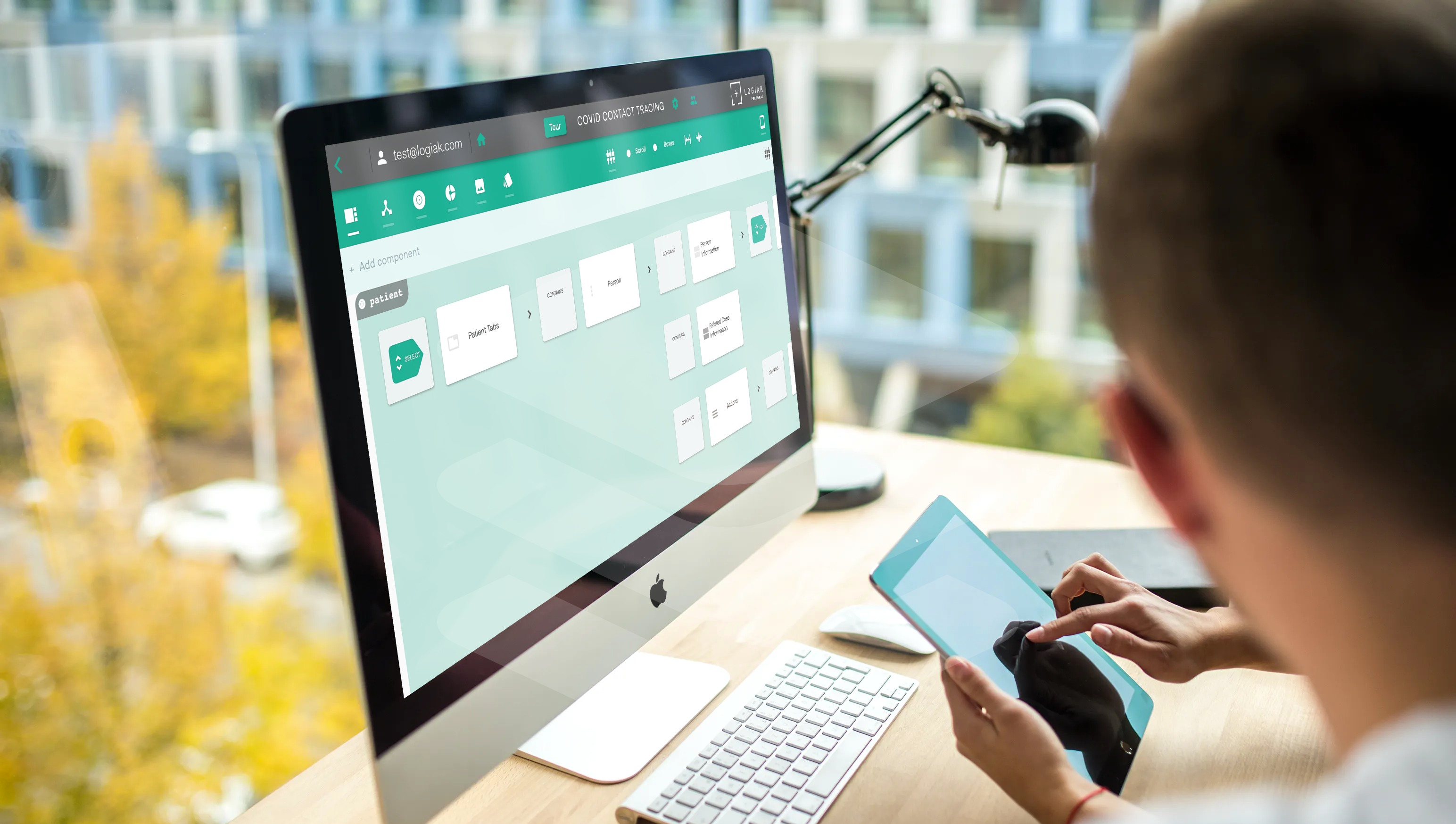
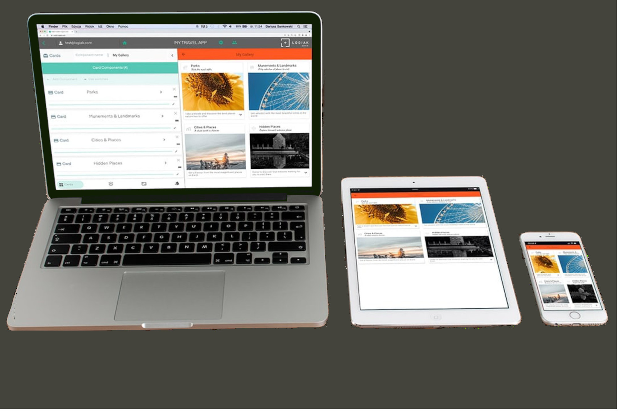


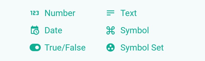
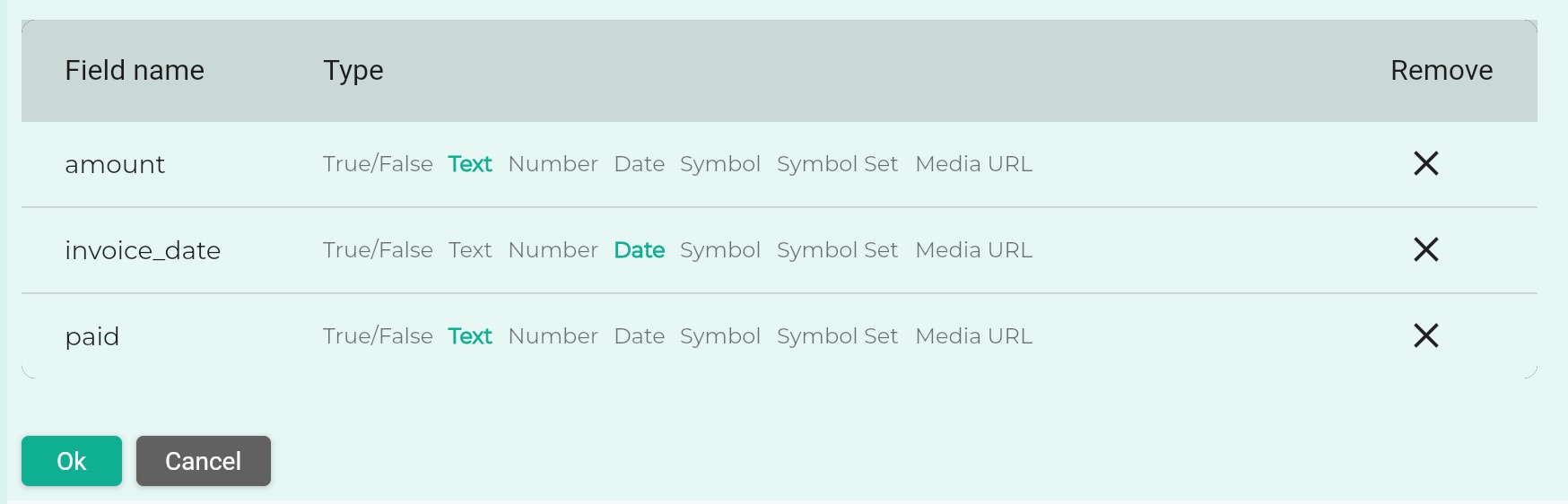
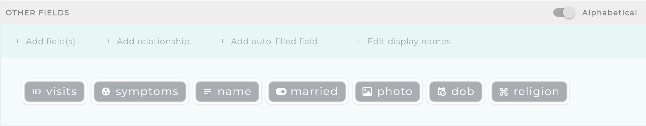
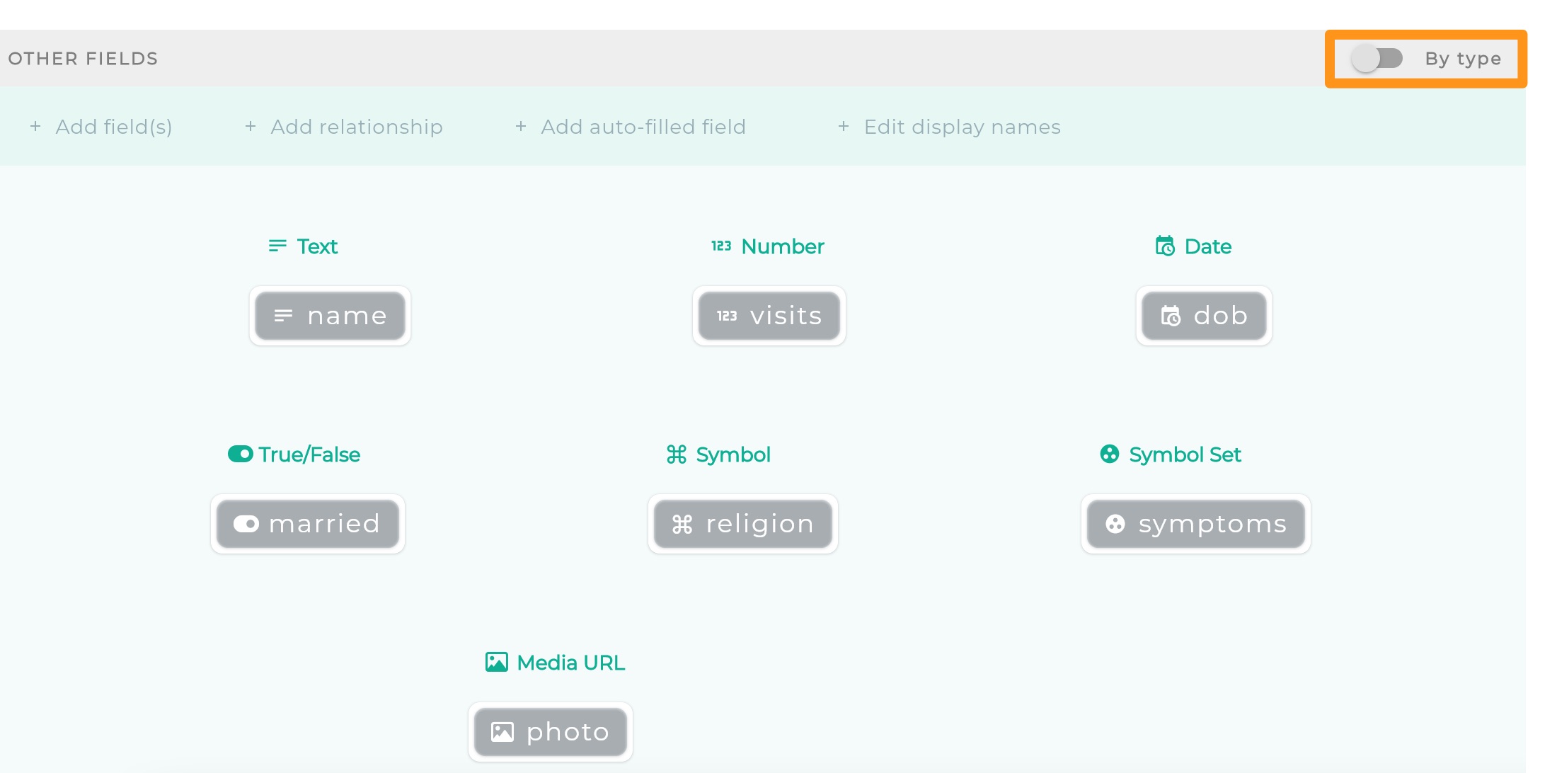
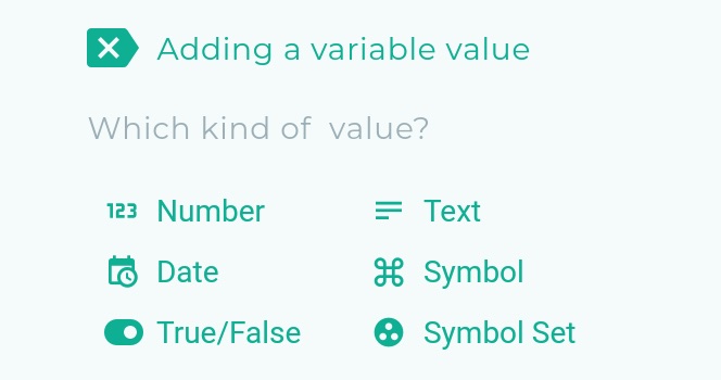
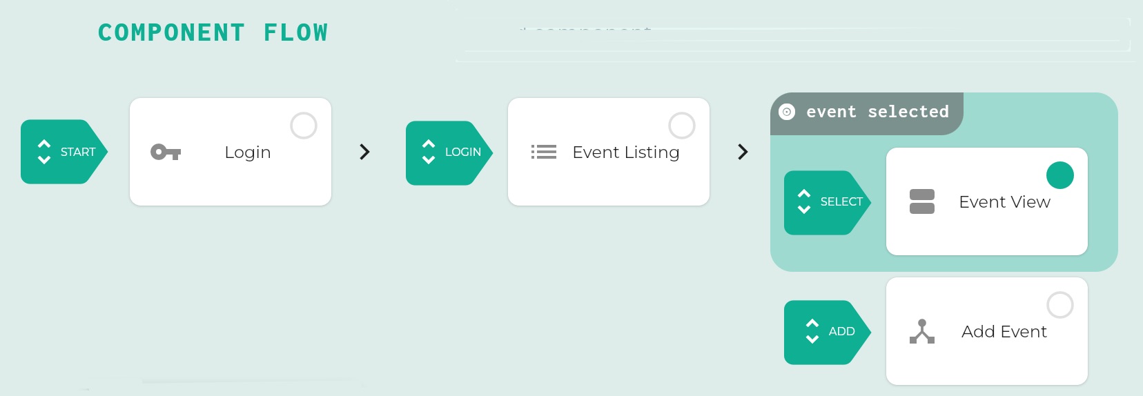
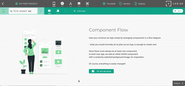
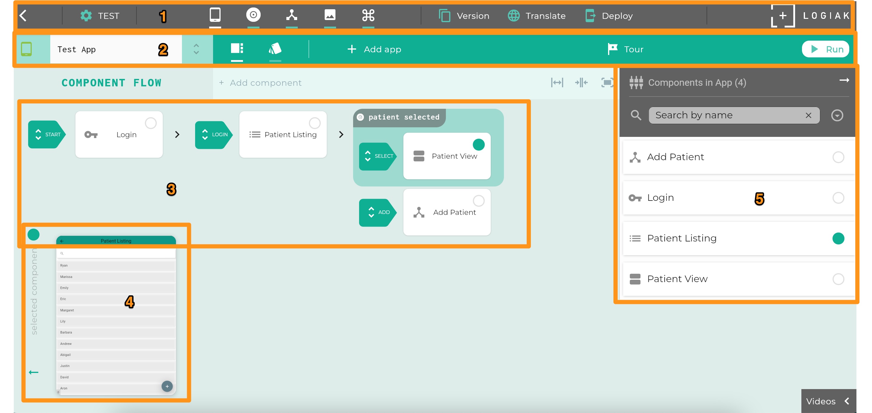

 The buttons give you access to, respectively,

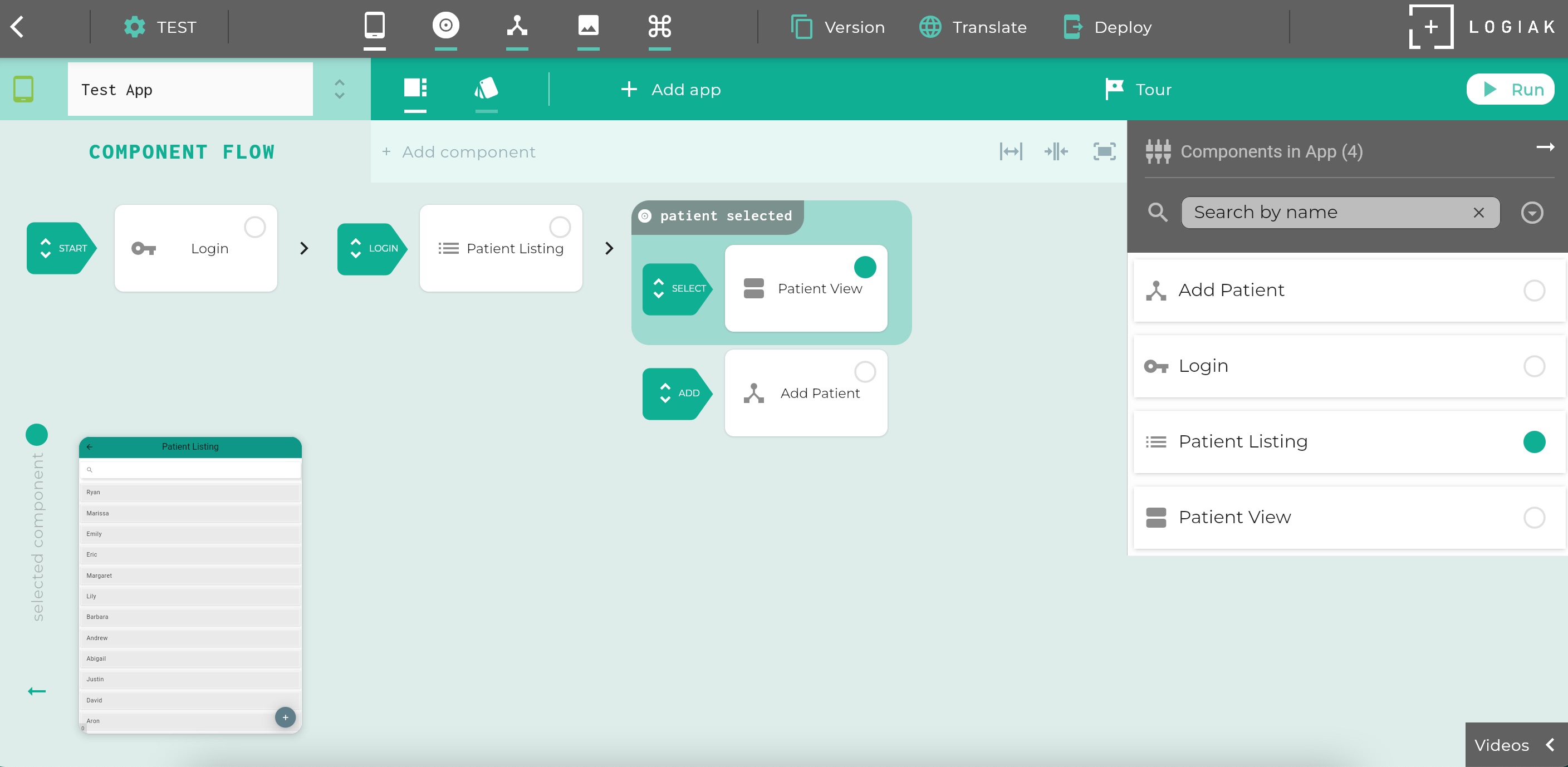
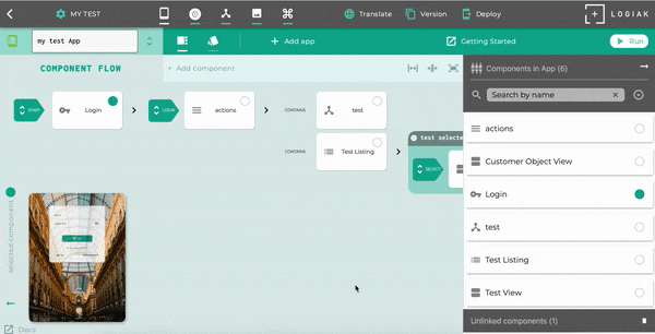
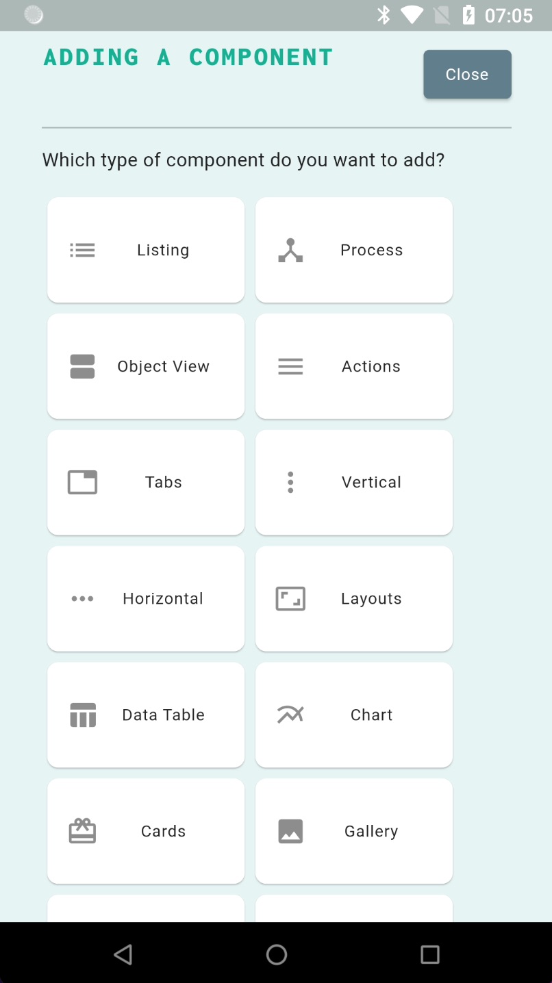
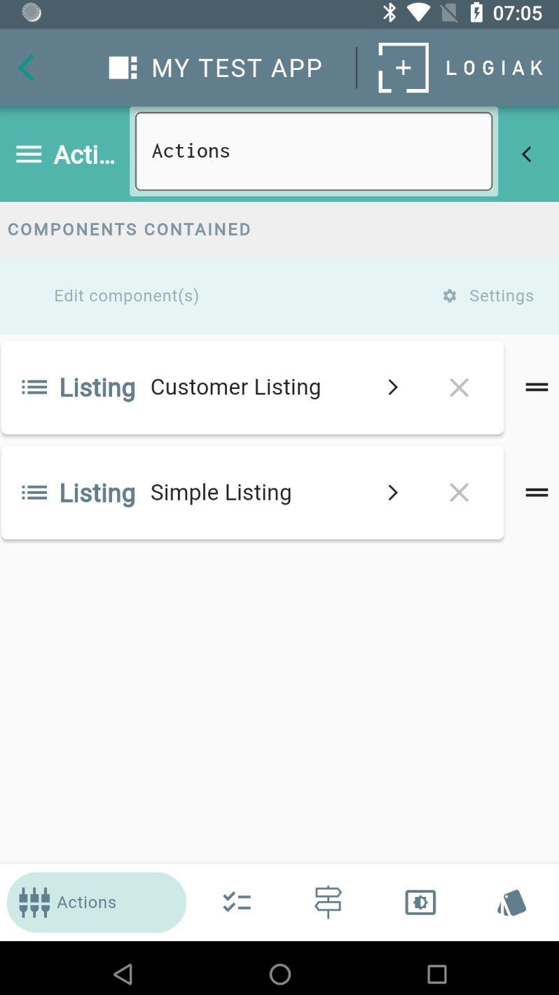
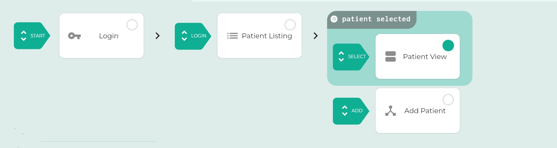

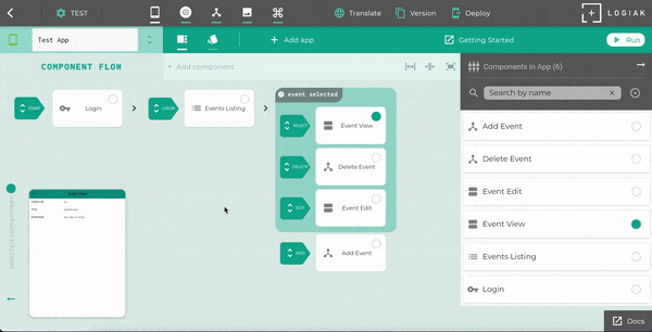