This is the multi-page printable view of this section. Click here to print.
Main Components
The most generally powerful components in Logiak
- 1: About Main Components
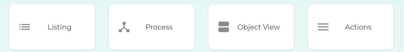
- 2: Listing
- 3: Process
- 4: Object View
- 5: Actions
1 - About Main Components
As with chess pieces, not all components are equal
Just like pieces in a game of chess, not all components are made equal. Some have more capabilities than others.
The most powerful components are the ones shown here. We group them together as the Main components.
Used together with Container components, these components can satisfy a remarkably wide range on needs.
PROCESS is Queen
In Logiak, PROCESS is the most powerful component, because it brings Processes into the App
Process is a bit like a system in itself. A bit like a programming language.
A Process has sub-components in that it can contain different kinds of interactions and actions it contains.
LISTING
LISTING can do a lot.
It shows you data from the database.
You can define sophisticated filtering.
But it can also “tee-up” (to mix metaphors) an Object instance to be selected by the user and passed to Processes and other components downstream
ACTIONS
ACTIONS can actually be considered a container component - you put other components into it.
But it is super-powered for Workflow purposes.
It gives access to the components contained, as links (which can be image links), and allows you to specify when those links should be
- visible or not
- enabled or disabled
- marked with a tick
OBJECT VIEW
OBJECT VIEW can be used to view data from an instance, but also to edit it
2 - Listing
Listing is one of the central components in Logiak
What is a LISTING?
A Listing presents records of an Object type, one after the other, a row for each record.
Listing is a powerful Component because of the transitions you can define.
How to create a LISTING?
To create a LISTING, you have to first have defined an Object that you want to list.
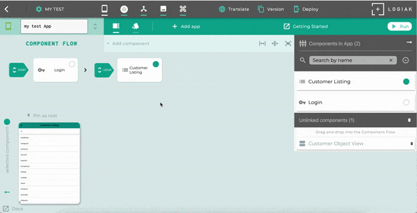
In this video showing how to create a LISTING, we had defined an Object called “event”.
Creating an Events Listing
LISTING Transitions
LISTING has four transitions where you can add Components and extend the functionality of your App.
At their very basic, you might think of these transitions as supporting CRUD functionality (Create, Read, Update, Delete).
| CRUD | LISTING Transition | Object is selected (downstream created) |
|---|---|---|
| Create | ADD | no - object is added, but not selected |
| Read | SELECT | yes |
| Update | EDIT | yes |
| Delete | DELETE | yes - delete transition selects an object for deletion |
To create simple CRUD functionality for a Logiak App, it is sufficient to create a LISTING, and add a Component for each of these transitions.
Building a First App shows how to do this very quickly using auto-create.
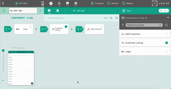
1. SELECT transition
This is all about: what happens when the user click on an item in the list?
Simple read functionality
If you create an Object View for the same Object type which is being listed, and attach that as the SELECT transition of the list, a user would be able to click on an item in the list and view the data contained in the instance.
Beyond simple read functionality
However, you don’t need to limit the SELECT transition to an Object View.
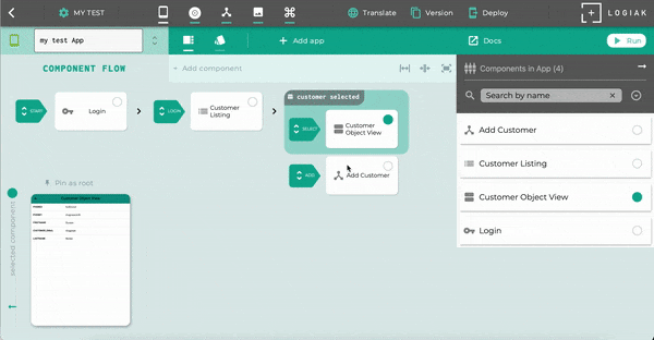
The SELECT transition is important because the user selects an Object instance from the list,
The selection of an object creates a downstream within which Logiak remembers the object chosen and can pass it on to other Components.
You can define a whole sub-tree of Components in the Flow with the selected object in mind, to
- show the data in the object
- if the object has relationships, perhaps show a filtered list of related objects (e.g. invoices for a selected company)
- offer the user a workflow of Actions all related to the chosen object
So, yes you can attach an Object View so that the user can look at the data, but you can instead attach a Container, such as a Tabs Component, and make the Object View one of the Tabs, while adding other Listings and Actions in other tabs..
2. ADD Transition
If you have a list, you may want the user to be able to add an item.
For example, if we have defined an event object, and we present the user with a list of events, you might want the user to be able to register a new event and it appear in the list.
We do that in Logiak by attaching a suitable component as the ADD Transition.
This usually means
- defining a Process - an interactive dialogue - to elicit information from the User
- wrapping the Process in a Process Component
- attach the Process Component as the ADD transition
3. EDIT Transition
A third functionality you may want to have is for a user to be able to edit the data in an instance, or at least the values of certain selected fields.
This can be done with an Object View, set to edit mode.
4. DELETE Transition
If you have a list, you may want the user to be able to delete an item.
For example, if we have defined an event object, and we present the user with a list of events, you might want the user to be able to delete any specific event from the list (and from the database).
We do that in Logiak by attaching a suitable component as the DELETE Transition.
This usually means
- defining a Process - an interactive dialogue - to confirm the delete with the user, and to a delete instance update action
- wrapping the Process in a Process Component
- attach the Process Component as the DELETE transition
What can you do with a list?
You can
-
define filters to restrict which instances to display
-
define user filters which users can turn on and off
-
define what appears in each row by using a template
-
make what appears conditional on true/false fields of the Object listed
-
define custom layouts for rows
-
define custom layouts for rows which are adaptive to display width
-
define what component appears when the user selects an instance (clicks on a row)
-
define what component appears when the user decides to add an instance (clicks on the action button)
-
define what component appears when the user wants to edit an instance (long clicks on a row)
-
define what component appears when the user wants to delete an instance (swipes left on a row)
-
lists have a search control built-in
-
define sort fields and thereby display a sort control to the user
Formatting List Rows
Some basics to know about list rows:
- Every row represents an Object instance .
- Any of the values from within the Object can be shown to the user.
- If the Object being listed has a relationship with another object, fields from the related object can also be available to be shown to the user.
There are two ways to define what gets shown for each row.
- Using a template, and choosing fields to provide values for the template
- Configuring your own custom layouts, which can also involve making the rows adapt to different display widths
TEMPLATE row formatting
Configuring list rows using Templates is the simpler and more limited of the two ways, and it is the one selected by default.
CUSTOM LAYOUT row formatting
Filtering what instances appear in the List
There are two kinds of filters you can define:
- implicit filters
- user-controlled filters (filters that the users can turn on and off)
When a LISTING is initially created, by default it displays ALL instances of the chosen object found in the database.
You can specify filters which constrain which instances are shown.
Implicit filters
Implicit filter: show only cities in China with a population > 10 million
User filters
User filters are configured almost exactly the same.
Instead of being implicitly applied to the Listing at all times, User Filters instead are represented by controls with which the user can turn them on and off.
The only difference in the configuration is that one is able to define a user-friendly label for each control.
User filter: show only cities with a population > 10 million
Sorting the List
Sorting is specified by selecting one or more fields from the listed object.
You specify a field order (for neted sorting) and a default direction of sort (ascending or descending) for each.
Whichever sort fields are defined here, they become available to the user via a dropdown on the list. Precisely, the display names associated with the fields appear in the drop-down. An arrow control permits the user to switch direction of sort.
Adding sort controls to a Listing
Scaling - is the List usable on a mobile device when there are thousands of records?
The LISTING component can deal with many thousands of records.
As an illustration, we downloaded the city Data, and defined a Table Object to be able to incorporate the data into a Project
The data contains 42,905 rows.
We created a LISTING component to present 42,905 rows (i.e. without any filter applied).
The number of instances is shown by the number in the bottom left-hand corner..
See also
Cards which functions a lot like Listing
3 - Process
A PROCESS component is a wrapper for a Process
PROCESS components are the most powerful components
Processes are interactive dialogs with the user which can be used to calculate and compute using complex logic, and update the database, affording great flexibility and power in processing data.
To bring a Process into an App, what you do is to create a Process component to “wrap” the Process.
Once you have a Process component representing a Process, you can drag it into the Component Flow the same as any other kind of component.
Where to read about Processes
So this page of information is short because a Process component is just a “wrapper” which lets you locate a Process within the Component Flow .
To read about creating a Process, please have a look here .
4 - Object View
Object View presents data from an instance
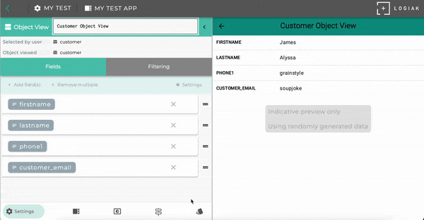
What is an OBJECT VIEW?
An Object View is a component for displaying and editing values within an object instance (a record).
An Object Type defines fields and relationships and an Object instance has values for each of these.
An Object View normally displays field names and values.
How to create an OBJECT VIEW
As with several other components, to create an Object View, you need to select an Object Type.
The Object View is then configured to show instances of that given type.
An Object View has to be located downstream of the selection of an instance of that type.
Selecting and ordering Fields to show
When an Object View component is initially created, all non-autofill fields are included in the view.
The fields of the object shown, and their ordering, can be modified at any time as shown here..
How to remove fields

Note
Removing fields from the Object View component, does not remove the field from the Object definition itself.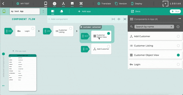
How to re-order fields
How to add fields
How to use Object View as Editor
It has two modes: you can use it so that the user can view the data within a record, or you can give the user the opportunity to edit some values
You can switch between these modes.
Note
When used as editor, the values of all fields included in the Object View are editable by the user.
Relationship fields within an Object View
Relationship fields can also be shown within an Object View.
Using template to show related record
A relationship field is really a pointer to another record of another type.
For example, suppose we have a health application and we are dealing with records of patients and their visits: each visit is a visit of a particular patient, so the visit object type has a relationship to patient.
When we view a visit record, we want also to show which patient, but how exactly? Which fields should we show?
To configure the display of the patient within a visit Object View, we use the same templates as in the Listing component.
You select a template, and then choose fields of patient to display.
Relationship fields are clickable and cause the related instance to be selected
Because relationship fields point to another object instance, we exploit an opportunity here to give the user the ability to select that instance and create a new downstream .
Hence there is a tab in the Object View editor where you can select which component is to be used for the SELECT transition, if the user indeed clicks on the relationship field in the object view.
Using multiple Object Views in a Container Component
If the object you are displaying has many fields, you might want to consider creating a view based on a Container Component, such as Vertical (but of course you could use any other Container) , and partitioning the fields into groups.
For example, you might have an Object View with basic information from a person’s record - name, address, etc. and separate group of fields displayed in a second Object View..
Composing two Object Views together in a Vertical
Media fields within an Object View
One of the Logiak’s data types is Media URL.
Values of such fields can point to images, audio files, or videos.
The Object View will render medias pointed to.
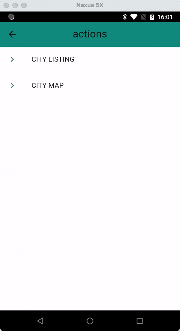
5 - Actions
Actions can be a simple list of links, or can be used for workflow purposes
Actions
An Actions component is useful if you want to present the user with a list of options or tasks.
Each of those options or tasks is a component: like the Container components, an Actions component is configured by selecting one or more other components to put into it.
By default, the Actions component presents the possible actions as clickable links.
Using Switches to control the user’s Workflow
An Actions components presents a choice of possible tasks or functions to the user.
Where an Actions component is located within a Downstream area, where an Object has been selected, the Actions component can be configured to adapt to the values in the true/false fields of that Object.
It is possible to configure a single action to be:
| By default | Can conditionally be |
|---|---|
| Shown | Not shown |
| Enabled | Disabled |
| Not marked | Marked with a tick |
Since the values of the true/false fields of the object can be updated by Processes, this gives an easily modifiable system which presents tasks to the user appropriate to the current circumstances.
Or, it can present a sequence of tasks to the user so that the user completes one after the other and ticks indicate which ones have been completed and which remain to be done.