This is the multi-page printable view of this section. Click here to print.
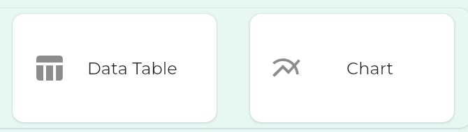
Data Components
Components to present aggregated data
- 1: Chart
- 2: Data Table
1 - Chart
Chart presents common visualizations of numerical data
Chart types
With the Chart component, it is possible to create
- Bar Charts
- Line Charts
- Scatter Charts
- Pie Charts
First Charts
Let us dive straight in and make some charts from some data
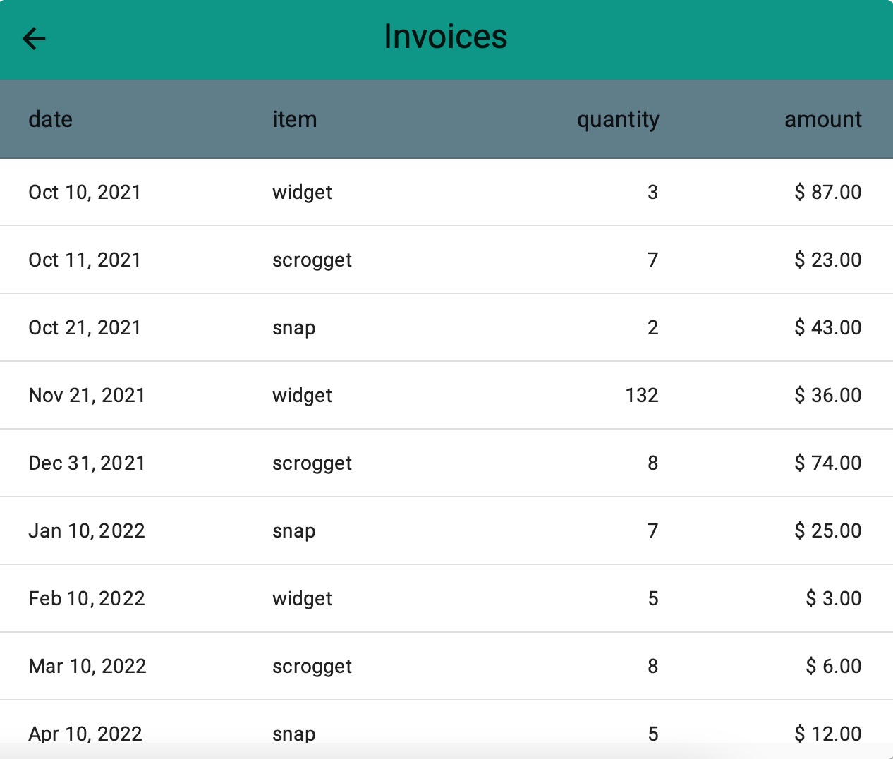
Invoices for sproggets,widgets and snap
We’ve define an Object called invoice with some typical fields and a relationship to a customer
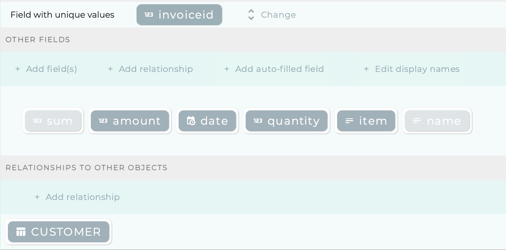
And, supposing we sell three kinds of product - sproggets,widgets and snap - we have defined some sample instances of invoice:
1. Example Bar chart - showing total units sold
Now let us make a chart which will show us how many units of each product we’ve sold.
this takes just 2.10!
Bar chart to show quantities of products sold, by product
2. Example Line chart - showing amounts grouped by week
Now let us make a line chart which will show us how income has been developing, taking week as the period of analysis (i.e. amounts in the same week are summed together and considered one amount)
this takes just 1.14!
Line chart to show income grouped by week
3. Example Scatter Chart - showing product success in size of spots
A Scatter Chart scatters dots which represent two values:
- one value determines the y-position of the dot
- the other value determines the radius of the dot
this takes just 1.46!
Scatter chart to show turnover and units sold per product together
Aside for the SQL-curious
The data looks like this:
mysql> SELECT   invoiceid,amount AS "amount", quantity AS "quantity", item AS "item"   FROM invoice;
+-----------+--------+----------+----------+
| invoiceid | amount | quantity | item     |
+-----------+--------+----------+----------+
|         1 |     87 |        3 | widget   |
|         2 |     23 |        7 | scrogget |
|         3 |     43 |        2 | snap     |
|         4 |     36 |      132 | widget   |
|         5 |     74 |        8 | scrogget |
|         6 |     25 |        7 | snap     |
|         7 |      3 |        5 | widget   |
|         8 |      6 |        8 | scrogget |
|         9 |     12 |        5 | snap     |
|        10 |      5 |        8 | widget   |
|        11 |     64 |        5 | scrogget |
|        12 |      4 |       30 | snap     |
|        13 |      5 |       64 | widget   |
+-----------+--------+----------+----------+
The query and results underlying the scatter chart look like this:
mysql> SELECT    sum(amount) AS "amount", sum(quantity) AS "quantity", item AS "item"   FROM invoice group by item;
+--------+----------+----------+
| amount | quantity | item     |
+--------+----------+----------+
|    167 |       28 | scrogget |
|     84 |       44 | snap     |
|    136 |      212 | widget   |
4. Example Pie Chart - showing product income proportionally
this takes just 1.06!
Pie chart to show turnover from products proportionally
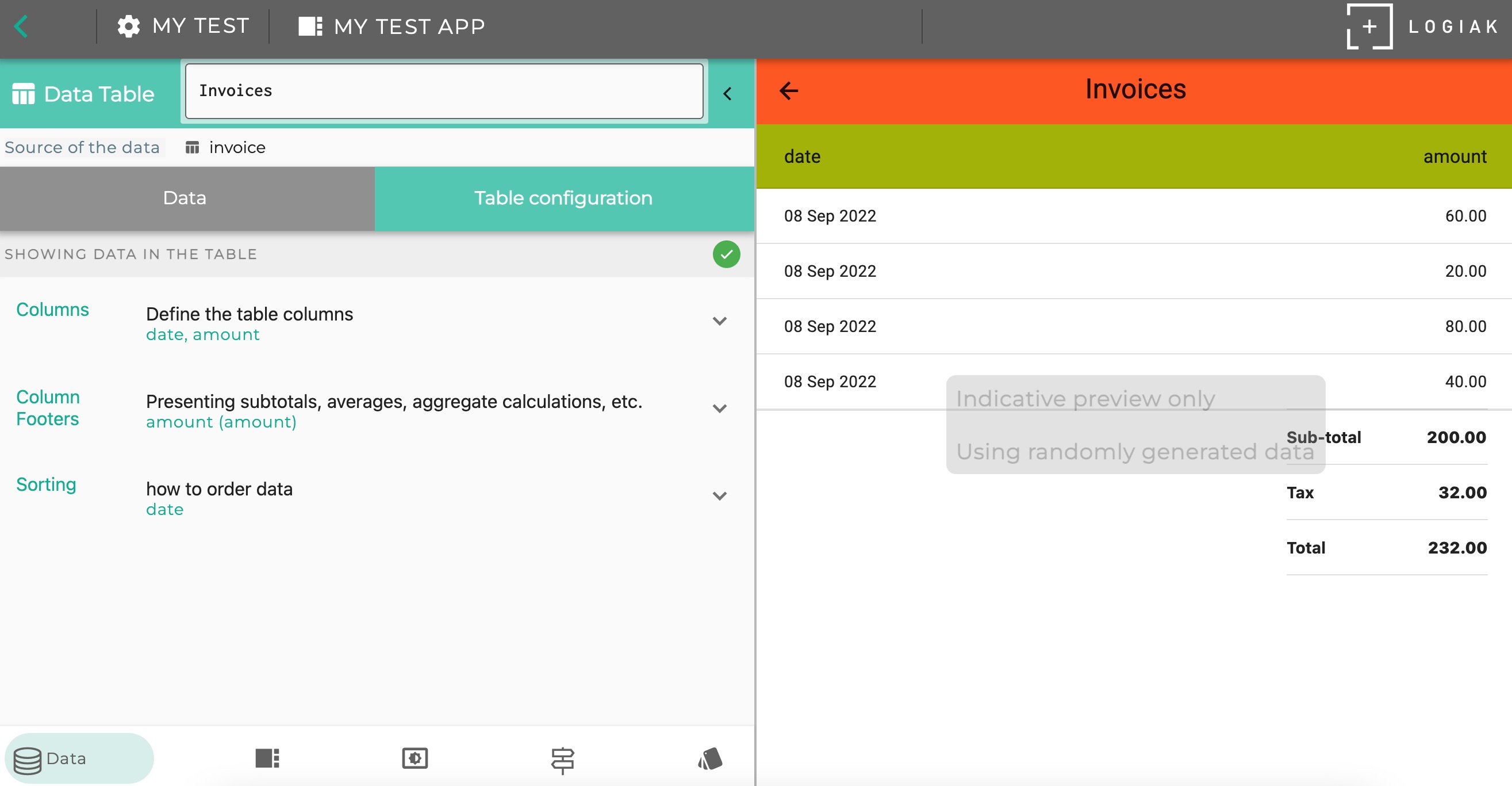
2 - Data Table
Data table presents numerical data in columns
A Datable has similarities with a Listsing , in that each row in the table represents a record and is selectable.
How to create a datatable
It is straightforward to create a datatable.
- Choose which kinds of records - which object type - you want to present
- Select the fields you want to be in the table
- Choose number and date formatting
- Choose which column to sort by
this takes just 1.49!
Adding Footer Calculations
It is possible to add Footer Calculations to the table.
Footer calculations are one or more rows of calculations, like this
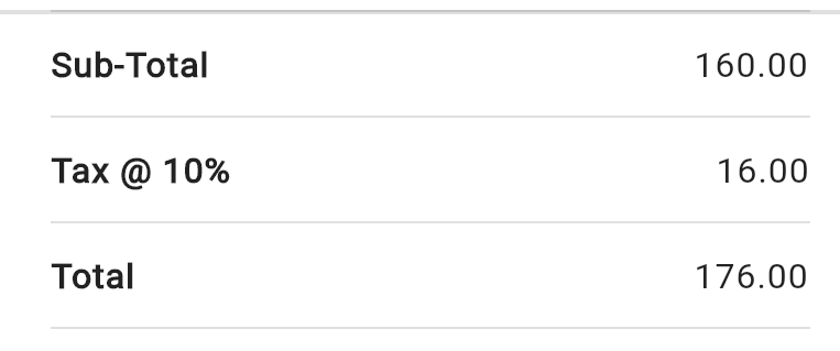
The first row is an aggregate calculation based on a specific numerical column on the table, and then subsequent rows are calculations based on this figure.
So here, as in Process, we use symbolic names to refer to values.
How to configure a footer calculation
Step 1 : do the main calculation
First you choose
- a column you have added to the table which contains numbers (i.e. represents a number field)
- an aggregate calculation. One of:
- count
- sum total
- average
- maximum
- minimum
- symbolic name for the value which is being calculated
Subsequent Steps : calculations making use of named values
Now you can add as many steps as you want.
At each step, you can refer to values by their symbolic names, and use them in new calculations.
Footer Calculation Example
Suppose we had chosen to calculate a “sum total” of a column represent an invoice amount, and suppose we had introduced the symbolic name subtotal for the amount calculated.
Then we could add a second calculated value, let us use the symbolic name tax
by providing expressions where you can use the name of the aggregate value as variable
e.g. we could achieve the above example by choosing to calculate the Sum of a column and give it the value name 'sub' , then we could define a second value to represent 10% of the Sum (maybe call it 'tax') by giving the expression
(sub * 0.1)
Then we could define a third value (maybe call it 'total') like this:
‘(sub + tax)’
For each value, you provide a label which is what the user sees next to the value in the column
this takes just 1.26!
Display Modes

There are two different ways of presenting the data to the user.
One, suggested by the name of this component, is to present the data as a table.
The second, is to use the configuration possibilities to calculate a number you want to highlight, and then present that calculation, without the accompnaying table, perhaps on its own.
1. Default - as table
2. Calculation highlight mode
Making a calculation highlight component
You can compose such a “highlight” with together with other components in a Container Component