This is the multi-page printable view of this section. Click here to print.
Adaptive
1 - Overview of making Apps Adaptive
If your users have a variety of devices of different widths, unless your App adapts to the different widths it may look clumsy, or at least be failing to expoit the screen resources available to it.
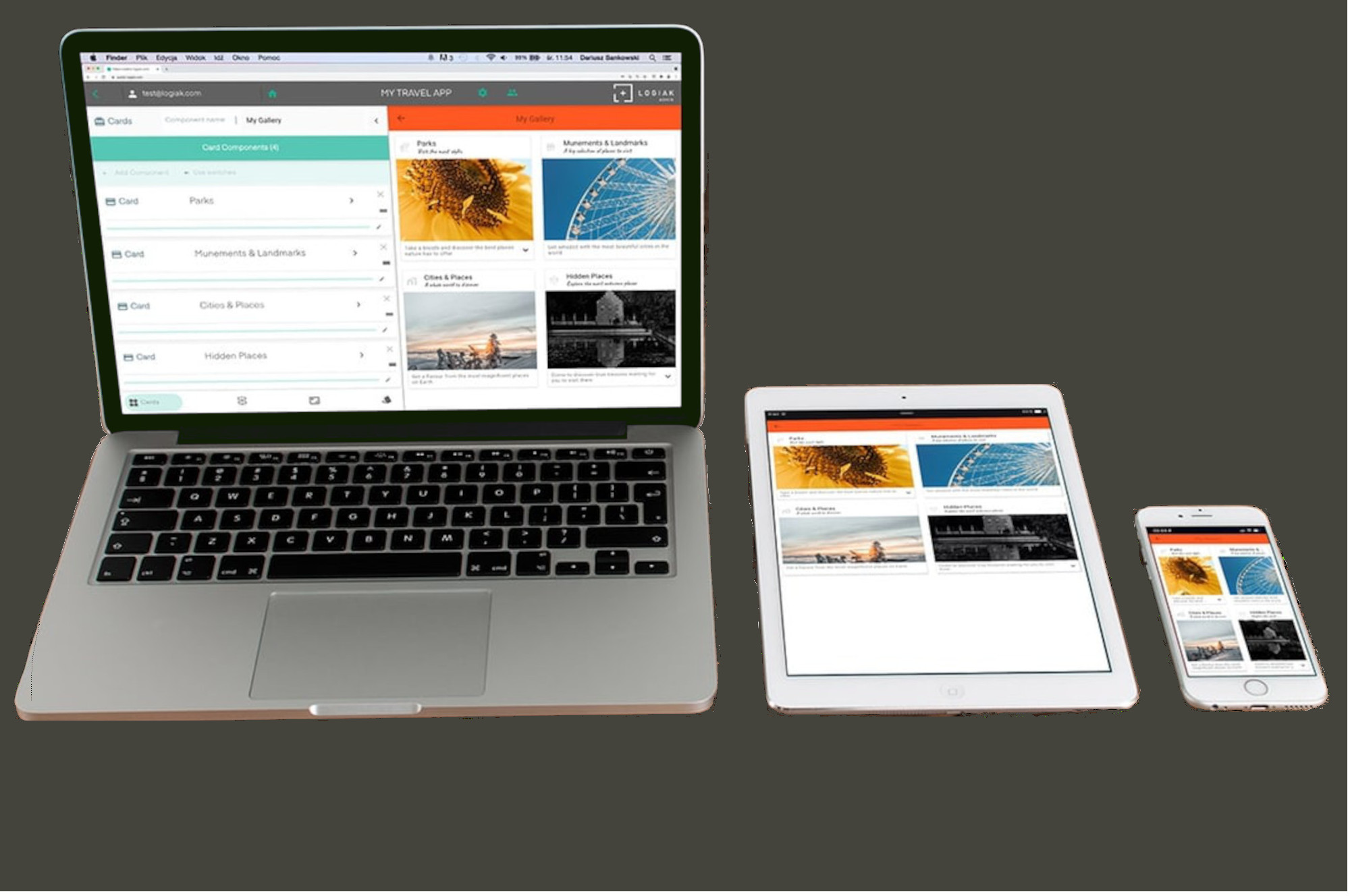
There are various ways you can make a Logiak App adapt to different display widths.
Custom Layouts
Available for
- List Rows
- Object Views
- Custom Layouts Container
Width Controls on Components
- Available for all components
Master-Detail views
Available for
- Listing
- Actions
2 - Logical Pixels
Logical Pixels
In describing screen widths, we use not a physical pixel measurement, but rather a virtual - logical - pixel measurement, derived from Flutter.
Find out device dimenions using Runner App
To find out the dimensions of any device in logical pixels, download and install the Logiak Runner App and you will see the dimensions at the bottom of the first screen
Runner App bottom row
Here, the current version of Logiak is shown on the left, and the dimensions of the current device, in Logical Pixels, on the right